architecture

Advancing Green Building Innovation Through Design Charrettes by stephanie calvet

There’s a wealth of resources available for anyone minded to go the route of sustainable building, including plenty of information, best practices, assessment tools, and precedents. Builders are looking to deliver a practical, marketable and cost effective product. While developing more responsibly may be a goal for some, barriers to changing practices often come down to cost and lack of consumer awareness. Unfortunately, in the reality we currently find ourselves in, the most effective way to encourage sustainable strategies for building projects is through legislation and financial incentives. Savings By Design (SBD) is one such initiative. The first program of its kind in Canada, SBD was launched in 2012 by Enbridge Gas Distribution in collaboration with Sustainable Buildings Canada (SBC) to facilitate an easier transition to green building innovation. As a key stakeholder, Enbridge’s interest is in total energy savings and therefore it devised a way to help make higher-efficiency performance more attainable to commercial and residential builders by providing funding and support during the design, construction and commissioning stages of projects. It also fulfills a mandate of the Ontario Energy Board.

The overarching goal is that buildings achieve 25% energy savings -- or more -- over the minimum requirements of the Ontario Building Code (OBC) 2012.

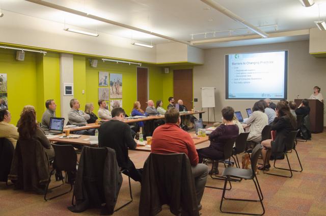
Enbrige-sponsored IDP charrette at Earth Rangers Centre. Photo by Stephanie Calvet.

What makes the program unique is its collaborative, results-driven, process-based approach. Those enrolled have access to SBC’s broad network of green building experts who collectively evaluate a building proposal in its planning or early schematic phase and whose feedback can significantly improve the outcome of its final design. The methodology that is used is called Integrated Design Process (IDP) and it is focused on designing for the entire building life cycle. It helps builders identify optimal solutions for enhancing energy efficiency, occupant health and ecological benefits through customized workshops.

At the heart of the program is the IDP 'charrette', a pivotal full-day activity that brings these building industry professionals together to explore a number of design scenarios in an open discussion forum. It also gives the building team the opportunity to define priorities for improvement and to test those concepts through energy modelling.

UrbanToronto's Stephanie Calvet recently attended one of these charrettes.

Held at the Earth Rangers Centre in Woodbridge, Ontario, this full-day event gathered a team of individuals with a wide range of expertise – engineers, contractors, building specialists, modelling experts, and independent observers. At the table was the developer/client Great Gulf with a proposal for a large suburban development consisting of 450 homes with a mix of detached and townhome styles.

Prior to the charrette, a Visioning Session between proponents and SBC was held in order to ascertain clients’ sustainability objectives with regards to their project. This initial meeting focuses on aspirations and core purposes and it establishes the goals that ultimately guide the charrette.

'Energy team' charrette participants review energy modelling results. Photo by Stephanie Calvet.

Depending on the scale and complexity of a project, participants are organized into teams. In accordance with IDP, the program also considers factors beyond energy efficiency that contribute to building sustainability. For this particular project, two groups were created: the more technical ‘energy team’ focused its efforts on the building envelope and mechanicals (space and water heating); and, the ‘sustainability team’ addressed site strategies and indoor environmental quality.

The objective of the ‘energy team’ is to study a preliminary project design and identify methods for it to meet energy efficiency performance targets. Although many elements contribute to heat loss, the biggest losers are, by far, the windows and walls. Therefore, when considering energy improvements, it is most logical to consider providing the best possible building envelope that meets the budget prior to upgrading mechanical systems.

From the perspective of the developer, the objective is to understand the potential impacts to cost and schedule to exceed the code regulations and other potential energy targets while also meeting the expectations of the buyer, maximizing density and profitability. For residential builders, there is an incentive of up to $2,000 per home (up to a maximum of 50 homes or $100,000) for achieving energy performance 25% better than OBC 2012.

The program requires that the buildings be modelled to show net energy savings.

'Energy team' charrette participants review wall assebly energy modelling results. Photo by Stephanie Calvet.

During the charrette the team examined measures, assemblies and technologies to achieve modelled performance improvements over the benchmark reference (code) building. Assessments were done using BIM software that can model the impacts of the modifications on building environmental performance as they are considered, on the fly, with the SBD real-time model as an evaluation tool. Exterior wall composition was studied in great detail, as were glazing options and the effects of basement full under-slab insulation vs perimeter only. Alternative configurations at a similar cost were also explored, presenting builders with different avenues to meet their criteria.

The incorporation of external shades, LED lighting, programmable thermostats, and Energy Star appliances as potential upgrades was also discussed.

The ‘sustainability team,’ on the other hand, addressed site design approaches such as: water conservation, soil and waste issues, and the benefits of low impact development.

With an emphasis on creating tightly contained buildings to minimize heat loss – a strategy that’s been in place since the 1950s – there has been renewed awareness for the need to improve indoor air quality (IAQ), as it relates to the health and comfort of building occupants. Source control, filtration and the use of ventilation to dilute contaminants are the primary methods. Facilitators at the event presented practical guidelines for designing healthful indoor environments (i.e. specify low-VOC products) and suggested strategies for quality control (i.e. seal and protect ductwork during construction).

The team also discussed material options to upgrade durability as well as marketing opportunities for builders exploring the integration of sustainable practices into their brand. Some ways to make the case may include negotiating with suppliers, creating economies of scale, and demonstrating return on investment.

Working sessions continued throughout the afternoon and SBC gave an informative presentation of stormwater management best practices. Participants reconvened at the end of the day for a summary of discussions and a presentation of the modelling findings.

Enbrige-sponsored design charrette held at Earth Rangers Centre. Photo by Stephanie Calvet.

In conclusion, the builders came away with various options to go forward and were pleased to discover that with slight modifications to the homes’ existing design, exceeding reference energy performance by 25% is well within reach. A final report that summarizes the results of all these efforts will be presented to them.

The charrettes have become a sought-after tool for driving sustainable thinking in the Canadian building industry. Programs like Savings by Design not only incentivize builders to develop more responsibly through financial incentives but they also provide access to a multi-disciplinary team of designers and experts to help them achieve their goals.

For more information on the Savings by Design program, visit the website  http://www.savingsbydesign.ca/

Stephanie Calvet is an architect and architectural writer based in Toronto. She can be found at www.stephaniecalvet.com
Toronto's Harmony Village Sheppard Offers Boomers Healthy Active Living by stephanie calvet

(this is an article I wrote for UrbanToronto) For some time now real estate and aging-related research experts have been predicting the massive sell-off of big homes by baby boomers seeking smaller quarters. With the kids out of the nest and retirement approaching, people are looking to simplify their lives and trim expenses, housing being the major one. This expected downsizing trend has yet to be reflected in national housing data, and many doubt it will become a large enough exodus to affect home prices. Boomers have solid reasons for moving from their existing home, however.

CEO of City Core Developments, Jack Pong, is confident of this demographic shift and his company’s new market research supports his theory. Their online survey polled 508 randomly selected Ontario homeowners 50 years of age and older who are considering purchasing or renting real estate, and it showed that 59 per cent are looking to downsize within 5 years. Top reasons cited were: reducing maintenance work, lowering the cost of living, moving to a smaller home, and increasing their ability to travel more. Many plan to tap home equity to help finance their retirement.

Rendering of Harmony Village Sheppard, image courtesy of City Core Developments

“This approaching wave of downsizing will further boost the condo market, especially for facilities that are offering the upscale comforts and lifestyle communities that Boomers will be demanding,” explains Pong. “This current survey confirms that this demographic places the highest importance on maintaining an independent lifestyle in an urban setting.”

Pong is the developer behind Harmony Village Sheppard, a residential complex planned for today’s baby boom and senior generations in Toronto’s Scarborough district. Now set for public launch, the Page+Steele/IBI Architects’-designed development will consist of two 33-storey towers joined by a shared four-storey podium structure at Sheppard and Warden Avenues. The feel is more traditional than "urban village vibe", and it is meant to promote an integrated community that offers comfort and convenience.

Living Wall at Harmony Village Sheppard, image courtesy of City Core Developments

The vision for the project as set forth by its developer was to reach the next generation of seniors by moving beyond what is currently available in the market, and exploring new opportunities to provide a life enriching environment. Harmony Village Sheppard offers a new approach to condo living and is designed to help residents sustain a healthy and physically and socially active lifestyle without having to leave home. The “age-in-place” concept provides a full range of amenities and services people need as they move toward retirement, including on-site home healthcare and full meal plans. Universal design concepts are also built into suites; think lowered light switches, raised electrical outlets, and easy-access shower entrances.

Restaurant at Harmony Village Sheppard, image courtesy of City Core Developments

The 35,000 sq. ft. indoor amenity space comprises: a state-of-the-art aquatic centre; multiple dining venues including a fine dining restaurant and cappuccino bar; entertainment room; library; and, full service beauty salon. On-site year-round leisure and event programming will offer a plethora of activities from art classes and cooking demonstrations to gardening and swimming. And, just as thoughtfully considered as the interior are the exterior spaces, coordinated by NAK Design Group, such as a lushly landscaped forecourt, Zen garden and community terrace where residents can enjoy rooftop planting beds.

Zen garden at Harmony Village Sheppard, image courtesy of City Core Developments

Stephanie Calvet is an architect and architectural writer based in Toronto. She can be found at www.stephaniecalvet.com

Sustainable Design a Key Component of DUKE Condos by stephanie calvet

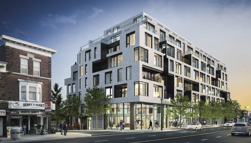
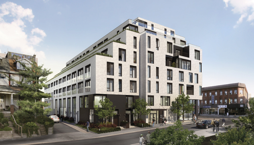
(this is an interview I gave and article I wrote for UrbanToronto) Stephanie Calvet sat down with Michelle Xuereb, architect and sustainability strategist at Quadrangle Architects, to discuss the green aspects of DUKE Condo’s design. The mid-rise building, which takes its name from an amalgam of Dundas and Keele streets in The Junction, is under development by TAS.

indesign-project-duke_1

TAS has been trumpeting the lengths they are going to, to create a sustainable condominium building in Toronto's Junction neighbourhood since launching DUKE Condos last year. It is encouraging to see a developer raise the bar beyond what the building requirements call for.

For TAS, it is about building community, about being a good neighbour, and understanding there is a social, economic, cultural and ecological side to everything. TAS is motivated to build their business philosophy, outlined in their ‘Four Pillars of Sustainability’, into all of their projects.

Was the decision at DUKE to ‘go green’ to the degree that it is in anticipation of new energy efficiency regulations in the building code?

For this site, they have to comply with City of Toronto Tier 1 and the Green Roof Bylaw. Anything above that is their own initiative.

High window-to-wall ratios are a current condominium design practice in Toronto, a feature that seems market-driven, not rooted in energy performance. How do we reconcile that with the fact that significant energy savings are available in building envelopes with less glazing?

I think it is actually more developer driven, and also driven by economics. Putting up a window wall system is straightforward and quick – it makes everything happen faster. Sales took off on this building and it is not floor-to-ceiling glass. I believe you have to put something out there so people realize they want it. DUKE has a specific character and people are attracted to that – and the scale is right, the materiality feels good, and it is just standard materials: windows, brick, and some metal siding. It is quite simple but it is a different approach than just cladding in glass.

Which aspect of the building’s design do you think has the biggest impact in terms of sustainability? Through which methods did you assess net energy savings?

The envelope is key. It’s about getting window-to-wall ratio down— 40-50% is where you want to be—using the best glazing possible, and reducing thermal bridging as much as possible. The window will always be the weakest link in the building so the more you can shrink that aperture, the less heat you’re losing. At DUKE we’re using aluminum frames and the glazing is argon filled with a low-e coating. At Quadrangle, we design what we think is the right thing to do and we have to be asked to do less. We feel we have to lead that way. The bonus from the recent Toronto Green Standard changes is that it makes it a level playing field for all developers – everyone has to do this. We do energy modelling early in the process.

indesign-project-duke_5

There’s great citywide interest in local and organic food. DUKE’s south side terraces are being lined with built-in planters that can be used for home gardening. Are you ‘leading the way’ by incorporating this feature into the design or is it in response to social shifts and increased demand for urban agriculture in residential developments?

There are various non-profit organizations out there advocating food policy in buildings, trying to push legislation, trying to speak to developers about how to make food happen. We too are working with these companies to help promote and push these initiatives – for one, we put food production ideas in our renderings. There’s no reason your front garden can’t have edible food. And TAS has been doing it from their side as well. We are all hoping that it really takes off. And the planters came out of another reason as well: affording neighbours to the south some privacy by having the depth of this green buffer, rather than just a railing. When there are multiple reasons why an element makes sense, it’s likely to stay ingrained in the building, and not get value engineered out.

Standard suites include engineered hardwood flooring, water-conserving fixtures, energy efficient appliances, programmable thermostats, and Energy Recovery Ventilators (ERV) to reduce energy demands and enhance air quality. Have these innovations come down in price so that the developer can provide them as part of the standard offerings?

There are a lot of things that have become more standard, like low-VOC flooring or paint, and it has become a requirement to provide energy metering to each suite. ERVs haven’t really come down in cost – the additional ductwork costs everybody more – but TAS has elected to do this anyway because it’s about improving indoor air quality and it’s something they can market.

A total of 25% of the parking stalls will be equipped with an electrical outlet for plug-in and provisions were made for future energizing of the other spaces. Will you provide a central bank of dedicated charging stations? What does that mean for the electrical capacity of the building for each space to have the possibility of EV chargers? Why go this route instead of the (less costly) car-share option?

This is a goal of TAS’ to do this. At one point we had a car share vehicle space within the building but there’s enough within the neighbourhood. The way things are going in the future, it will become more and more economical to have a plug-in electric vehicle. People in North America are pretty attached to their individual car ownership. To provide infrastructure for people to have plug-in electric is about future-proofing the building. But as for how it’s specifically going to work at DUKE, whether they will run it to a panel that is individually metered, we haven’t finalized it yet.

indesign-project-duke_2

As per the city’s Green Roof Bylaw, certain % coverage of the roof is required to be a green roof, based on the building’s gross floor area. Which system will you provide at DUKE?

It will be a drought-resistant, low-profile, extensive green roof (vs intensive – where you can plant trees and shrubs). Probably a tray system. Green roofs raise your top of roof that much higher, so you have to be careful of how you distribute the heights because you lose potential area if the roof is too thick, plus you have to consider structure. There is always a trade-off.

The benefits of a green roof are multifold. Do you believe that in the near future, sky-gardens will become both desirable and inevitable as part of a growing cityscape?

I wish it would become more prevalent because we see it as a positive attribute. Right now, green roofs cost more money and the market isn’t necessarily looking for it, so we’re not there yet. And the Bylaw % requirements aren’t high enough in terms of how much you are obligated to provide for anything more than something quite basic, i.e. a low-profile extensive roof. If the developer wants to build a lot more, it’s just additional expense and if they can’t use it as a marketing tool, chances are they won’t opt to go that route.

How do you think we can best encourage that sustainable strategies be followed on all building projects, from conception through construction to furnishing?

There have to be financial incentives and legislation, otherwise it won’t happen, as well as the fact the City of Toronto itself has taken a leadership position on this: 15% better than the current building code. That level is really the 2017 version of the code. It’s those sorts of energy initiatives – being a certain percentage better than code – that have been happening at the municipal and the provincial level, which have been pushing the envelope.

There is always cost involved with change, i.e. change from traditional to sustainable construction practices. Consumer awareness about conservation and low impact development issues is key and people might be interested in ‘doing the right thing’, but when the rubber meets the road, they aren’t always willing to pay more. What could be the facilitating mechanism that will encourage consumers to make the extra effort for eco-friendly avenues knowing that payback will come later?

I’d say it’s the consumer, the purchaser. At the end of the day, it’s the cost per square foot, and they want to know they are getting a certain kind of countertop. Right now, what I’m hearing from marketing folk is that people don’t want to pay for ‘green’ initiatives, they think that the buildings should come with them. The green is just part of the story that people are expecting to see as opposed to it being an add-on, and having to pay more for it. To me what would be interesting would be a developer who would work really hard to bring those numbers (maintenance fees) down and the way to do that would be to provide an extremely durable building.  

Stephanie Calvet is an architect and architectural writer based in Toronto. She can be found at  www.stephaniecalvet.com

OAA Presents Green Building Strategies with Architecture 2030 by stephanie calvet

(this is an article I wrote for UrbanToronto) There are plenty of global initiatives in place to encourage the building industry to do its part in eliminating greenhouse gas (GHG) emissions through sustainable design. The most transformative one by far is the 2030 Challenge, a rigorous plan of action advocating for a carbon-neutral built environment by the year 2030. The Ontario Association of Architects (OAA) is bringing this ambitious initiative to Ontario with an educational program to assist the province’s architecture and construction community to achieve the Challenge’s goals in a way that creates environmental, economic and social value.

To do so, the OAA is partnering with AIA+2030 (American Institute of Architects) and offering its members 10 four-hour learning sessions, created to provide specific strategies to becoming 'carbon-neutral', which is defined as using no fossil fuel, GHG-emitting energy to operate.

The initiative, dubbed OAA+2030 Professional Series, is adopted and updated from the AIA+2030 Professional Series, a partnership between Architecture 2030 and AIA Seattle. Numerous professional organizations and governments have endorsed The Challenge as part of their commitment to promote sustainable design. The City of Seattle was one of the first cities to sign on, initiating the Seattle 2030 District, an interdisciplinary public-private collaborative working to create a groundbreaking high-performance central area where all buildings – new and existing – will be built and renovated to aim for carbon neutral status.

Algonquin1

Sessions run from late January through to the end of October 2014, in both Toronto and Ottawa, and give architects and design professionals the knowledge and leverage to guide decisions that will create sustainable, next-generation buildings. The comprehensive program is the first of its kind in Canada and covers topics like climate-responsive design, lighting strategies and renewable energy opportunities.

In 2002, architect Edward Mazria founded Architecture 2030, a solutions-based non-profit non-partisan organization, in response to global climate change. According to its findings, buildings not only consume much more energy than any other sector but, as the party responsible for nearly half of U.S. annual CO2 emissions*, have been identified as the largest contributor to climate change. Its mission is to rapidly transform the built environment from the major contributor of GHGs to a central part of the solution to the climate and energy crises. At a fundamental level, it involves changing the way communities and infrastructure are planned and built. The foundation of its work lies in the widely adopted 2030 Challenge, which asks the global design community to implement the following targets:

  • All new buildings, developments and major renovations shall be designed to meet a fossil fuel, energy consumption performance standard of 60% below the regional average for that building type.
  • At a minimum, an equal amount of existing building area shall be renovated annually to meet a fossil fuel, energy consumption performance standard of 60% of the regional average for that building type.
  • The fossil fuel reduction standard shall be increased to:
    • 70% in 2015
    • 80% in 2020
    • 90% in 2025
    • Carbon-neutral in 2030

These targets may be accomplished by implementing innovative sustainable design measures, generating on-site renewable power and/or purchasing (20% maximum) renewable energy.

Algonquin Centre_interior

“The 2030 Challenge is not meant to replace any current green building rating system but rather it challenges all systems to a higher level of sustainable achievement,” says Richard Williams, member of the OAA Sustainable Built Environment Committee and Toronto moderator of the OAA+2030 course. “It sets a progressively higher bar for the design and development community to rise toward.”

And the principles and practices for realizing low-carbon and resilient built environments are increasingly accessible. At Greenbuild last November, Mazria announced the official launch of 2030palette.org, the organization’s latest innovation to drive global implementation of the 2030 Challenge. The website, which provides a wealth of best practices and recommendations as well as links to outside sources, approaches green architecture at every scale, from single building elements to entire regions.

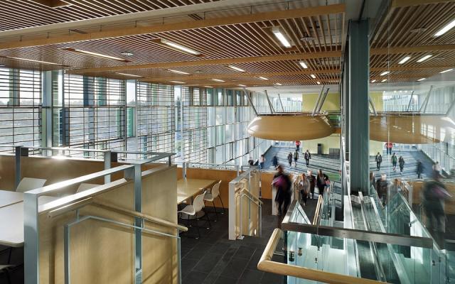
The Royal Architectural Institute of Canada (RAIC) offers building case studies to examine on its website. Amongst those are the Algonquin Centre for Construction Excellence, designed by Diamond Schmitt Architects and Edward J. Cuhaci and Associates Architects, pictured above.

For more information on the OAA+2030 Professional Education Series, visit: http://www.oaa.on.ca/.

*The Building Sector was responsible for nearly half (44.6%) of U.S. CO2 emissions in 2010. By comparison, transportation accounted for 34.3% of CO2 emissions and industry just 21.1%. According to the U.S. Energy Information Administration (EIA), the Building Sector consumes nearly half (47.6%) of all energy produced in the United States. Seventy-five percent (74.9%) of all the electricity produced in the U.S. is used just to operate buildings. Globally, these percentages are even greater.

Green Building Goal Within Reach of More Builders and Developers by stephanie calvet

(this is an article I wrote for UrbanToronto) We all know that going green is good for the environment, our health, and hopefully our pocketbooks. As much as it's important for us all as individuals to consider what kind of an environmental impact we make, it can be tough finding ways to make significant changes individually. As a group of people with similar interests—that being the UrbanToronto readership in this case—there may be more opportunities to participate in change if UrbanToronto takes the time to report on what’s happening in this arena.

With 20% of Canada’s greenhouse gas emissions coming from our buildings, a more fully involved development industry has the potential to effect a significant amount of positive change for our future. In addition to the environmental impacts, the corporate world has a sound financial case to strive for energy efficiency as well, for example reduced operating costs particularly in the face of the inevitable rise of fuel prices, and improved marketability and goodwill when the companies are perceived to be socially and environmentally responsible.

At all levels the government is supporting change as well, driving increasingly stringent building codes, supporting the uptake of energy efficient and renewable technologies, and adopting building performance standards like LEED or Toronto's Tier One and Tier Two Green Standards as optional construction paths.

Considering the inherent benefits to pursuing improved energy efficiency and environmentally conscious building practices, it makes sense as to why these two groups are active in this area. Knowing this, it may seem counter-intuitive that an energy distributor would be a source of financial incentives supporting builders in this pursuit, but that's the case. As part of its social responsibility and in support of a demand side management mandate implemented and governed by the Ontario Energy Board, Enbridge Gas Distribution has created a market transformation program it calls Savings by Design (SBD). This green building initiative is promoted to new construction builders and developers, constructing part 3 and part 9 buildings in the Enbridge Gas Distribution franchise area. As we sit squarely in the heart of this territory, the program could be "coming to a building near you", so we are learning about it and passing on the info, hoping to be a part of the change too.

DCL Medical Centre-2

Launched in January 2012, in collaboration with Sustainable Buildings Canada, the comprehensive Savings By Design program targets four key areas: energy, stormwater, resource use, and engagement. To help make higher-efficiency performance more attainable, Enbridge is providing funding and support during the design, construction and commissioning stages of projects. To qualify, projects must be in the planning or design phase, have a minimum aggregate area of 100,000 sf.

“This is something totally new that Enbridge Gas Distribution has never done before,” we were told by energy advisor Mary Sye, who developed the program in collaboration with manager Shannon Bertuzzi, several key stakeholders and business partners. It brings together owners and green building experts at the earliest phase of a project to explore a wide range of strategies, from resource conservation to renewable energy generation, and identifies the mix of technologies that can be incorporated into the design to maximize the building’s environmental performance.

The building is then modeled to estimate the potential natural gas and electricity savings, and a report is created. According to energy advisor and colleague, Carmine Faiella “At the end of the day, applicants have a picture of how much more efficient than the Ontario Building Code their proposed project is going to be.”

There's a lot to know about the program, and as UrbanToronto likes to get technical, we will be looking at various aspects of it over the next while, hoping to explain how this program should improve the buildings in which you will live and work in the future by looking at some of SBD's early adopters. For our initial installment, we were pointed in the direction of DCL Healthcare Properties Inc., the first company to take part in SBD.

DCL Medical Centre-5

Healthcare buildings are energy-intensive, making it a sector ripe for more initiatives that promote green thinking. DCL is trying to do just that. Its CEO, Frank Deluca, toured medical clinics in Romania, marveling that not only were they highly sustainable—certified to BREEAM Excellence, the world's leading design and assessment method for sustainable buildings—but they were built at one-third the cost of similar facilities in North America.

A visit to his own doctor’s uninspiring office in Ontario left Deluca with nothing to marvel about. He points to outdated and inefficient medical facilities, strained by the growing demands of an aging population. So, Deluca seized the opportunity presented by the SBD program to partner with municipalities in constructing clinics to take the burden off regional hospitals and, at the same time, showcase what is possible in green healthcare building design.

Now, DCL is developing one of the most highly performing, privately owned healthcare projects in North America. The project is aiming to achieve a number of industry firsts, including North America's first proposed BREEAM certified green medical office building. With over 250,000 green buildings certified to BREEAM globally and over a million registered for assessment, DCL could be set to lead a new charge in green building design for Canada.

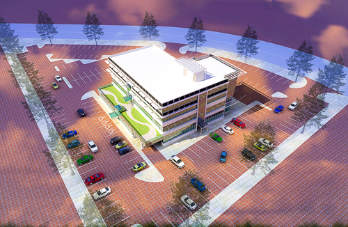
DCL's business model is based on replicating an energy efficient standardized design in targeted growth communities across Ontario. Niagara Falls, deemed “prime for the Boomer Urban Exodus,” was selected as the site for the first DCL Medical Centre. Other locations being considered include Ajax, Oshawa, Ottawa, Stouffville, and a dozen more. Each clinic will be a “community healthcare hub,” occupied exclusively by medical service providers; general practitioners, dentists, opticians, pharmacy, laboratory and ultrasound facilities. “If we cluster functions within one location,” notes Deluca, “we already have a positive impact on the environment.”

DCL Medical Centre-4

The core configuration is a 4-storey, 50,000 sq ft structure that can be scaled up or down by adding or removing floors, depending on the needs of the local community. Integrated ‘smart’ building technologies will allow tenants to regulate temperature, lighting, communications, and security. For improved indoor air quality, it features operable windows for natural ventilation, low VOC interior finishes and UV technology for air scrubbing. “Tenants will immediately see the benefits,” adds Deluca. “But it goes beyond that because, as an owner, I am also interested in energy efficiency. Making the interior and exterior lighting system 100% LED has a huge advantage for us from an energy savings standpoint.” Other sustainable measures include geothermal heating and cooling, daylight harvesting (the building is 60% glazing), light shelves and Hempcrete walls.

DCL’s interests run deep because not only will it build the facility, but the firm will also own and manage its operations long-term. “Because I envision a 10 to 20 year holding period, I am very concerned about what I select to put in that building," says Deluca. “As the owner, there is a real motivation to make sure it is running at a high performance level.”

DCL Medical Centre-3

Enbridge facilitated an intensive brainstorming session called an Integrated Design Process charrette where a multidisciplinary team of industry experts evaluated the building proposal through the analysis of its form, materials, context and technical systems and then created a baseline model to illustrate its potential performance. They helped identify optimal solutions for improving energy efficiency, occupant health and comfort, as well as ecological benefits.

Deluca remarked on the success of the session, “You need an integrated team. Everybody has to be thinking together at the same level – ‘What’s our goal?’” Design improvements that resulted were numerous, including the shaping of the atrium in order to minimize heat build-up, strategically locating high performance glass, and, with Deluca’s encouragement, the decision to run an energy-saving variable refrigerant flow system on two of the four floors, instead of forced air. That type of HVAC technology is not typically used in healthcare buildings in Ontario. “We’ll use our facility as a giant test lab,” added Deluca.

When Deluca first heard about the SBD program, he was surprised. “Why would Enbridge give me the tools to figure out how to be that energy efficient? I commend them. I quickly learned there are a lot of smart, passionate people within that program who are trying to push the sustainable and high performance benchmark. I support it because it is a fantastic opportunity to have them on board, helping with this initiative, and I got to build a great team through the design process. Why not take advantage of all that available intellectual capital?”

DCL Medical Centre

The Niagara project is moving ahead quickly. With site plan approval and discussions with practitioners well underway, DCL is hoping to break ground by June, 2014. Other sites may not be far behind. The new medical facility not only advances sustainable building practices in healthcare but also seeks to far exceed targets and establish a new standard for ‘green’.

For more information on the Savings by Design program, visit the website http://www.savingsbydesign.ca/

Nest Condos Adds Density and Vibrancy to Toronto's St. Clair W by stephanie calvet

(this is an article I wrote for UrbanToronto) The rising demand for urban life calls for increasing residential density. In Toronto, the Official Plan calls for much of the new development to be built along our main thoroughfares; it's called the Avenues plan. Developers and architects who are sensitive to context can create architecture that contributes in a meaningful way to the visual identity of these predominantly low-rise corridors. A growing number of innovative infill developments on Toronto's Avenues prove that mid-rise can be attractive and practical. Examples of this sort are popping up on Ossington, Queen (both East and West), King Street East, Dundas Street West, and so on.

urbantoronto-9448-33166

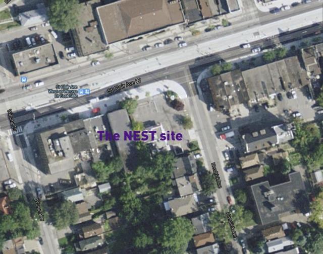
One such residential development coming to the market is called The Nest, by Toronto builder The Rockport Group. This 9-storey condominium block will anchor the southwest corner of St. Clair West and Hendrick Avenue in the city’s budding Hillcrest Village. On part of the site now stands a KFC wrapped by a swath of parking. We are happy to see that coming down.

A mature neighbourhood that dates back to the early 1900s, Hillcrest is populated with large turn-of-the-century homes and lush tree-lined streets. The area was originally a large estate known as Bracondale Hill until 1909 when it was divided up into an exclusive subdivision. These days, the established low-rise neighbourhood is popular for its parks, independent shops, cafés, supermarkets and streetcars along St. Clair Avenue. The Nest is the first significant new structure on this stretch of St. Clair since the rebuilding of the St. Clair streetcar line in 2010.

NestAerS900

The convenience of the new separate right-of-way for the streetcar is now attracting new retailers, restaurateurs, and residents alike. The Nest itself will contribute 10,000 sq ft of ground level retail to the street.

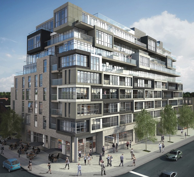
Designed by Toronto-based RAW Design, the building looks like an asymmetrical stacking of box upon box. The surface of the façade jogs in and out, with projecting bays clad in complementing shades of greys and white, and balconies or terraces strung in between. This interplay of volumes and voids creates a unique texture and spatial composition. From an interior perspective, the building’s layout forms units in a range of sizes and configurations - 48 different types amongst its total 123 suites, to be exact. Each has floor-to-ceiling windows to maximize sightlines and sunlight inside.

NestAerNWCrop800

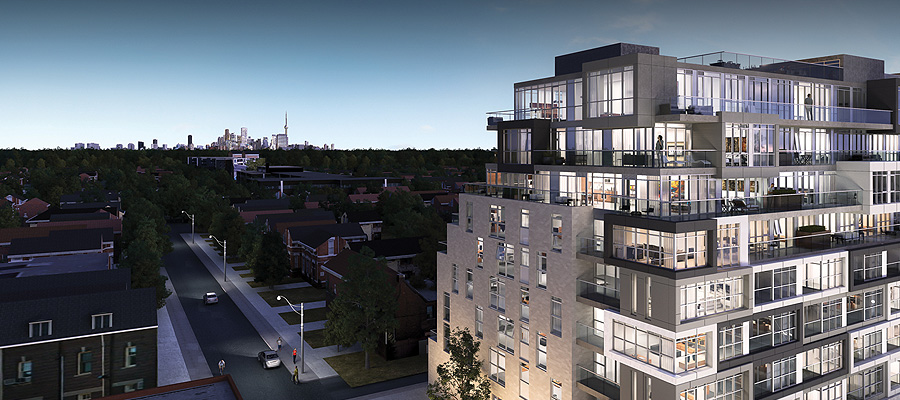
Above the 5th floor, the structure begins to terrace back on the south side, providing suites with views looking towards the city skyline. North-facing residences overlook bustling St. Clair Avenue. The building is clad in brick and German-engineered glass-fibre reinforced concrete or ‘fibreC’, a sustainable product that evokes natural materials like stone, twigs and straw. Nearly every dwelling has private outdoor space, which varies in size, up to nearly 570 sq ft at the penthouse level.

NestSWAerDay640

For large gatherings, the building provides residents with communal multipurpose space on both the main and roof levels. “We like projects where we can create a community where people can feel at home,” said Jack Winberg, chief executive officer for The Rockport Group. A large, welcoming flex space on the first floor comprises a full kitchen, library and fireplace, opening onto an outdoor patio. Similarly, comfortable indoor amenity space on the rooftop is extended into what is envisioned as an ‘outdoor living room’ and provides plenty of lounge area and a built-in kitchen/BBQ station for multi-group entertaining. A green roof on the east side wraps the building to the south, softening the terrace’s edge.

NestAmen960

The builder partnered with local firms II by IV Design for the suite and common area interiors and Janet Rosenberg & Studio on the design of the landscaped portions.

NestRoof960

Rockport has taken an approach to whole-building sustainability in this project which exceeds the City’s Tier 1 Green Standards with various measures to help to decrease its carbon footprint, including: geothermal heat pump; insulated windows; energy efficient lighting; low-flow fixtures; and, individual suite metering for utilities consumption.

The Nest is interesting not just for its variety and inventiveness but its green initiatives. Perhaps this thoroughly modern, modestly scaled addition will serve as a model for the sort of development this city needs. With Nest and other similar buildings in the works, hopefully they will convince sceptics that intelligently designed mid-rise is a viable option in a growing city that has almost taken the term ‘vertical living’ to the extreme. Innovative infill urban communities such as this one add to the eclectic urban fabric that is Toronto.

Toronto's CentreCourt Developments’ Core Condos Step Onto The Scene by stephanie calvet

(this is an article I wrote for UrbanToronto) Core Condos is the latest addition to CentreCourt Developments’ portfolio of downtown residential towers targeting the urban professional. With INDX, Karma, and Peter Street Condominiums underway, Core Condos is another opportunity for those who want to live, work and play in the downtown core.

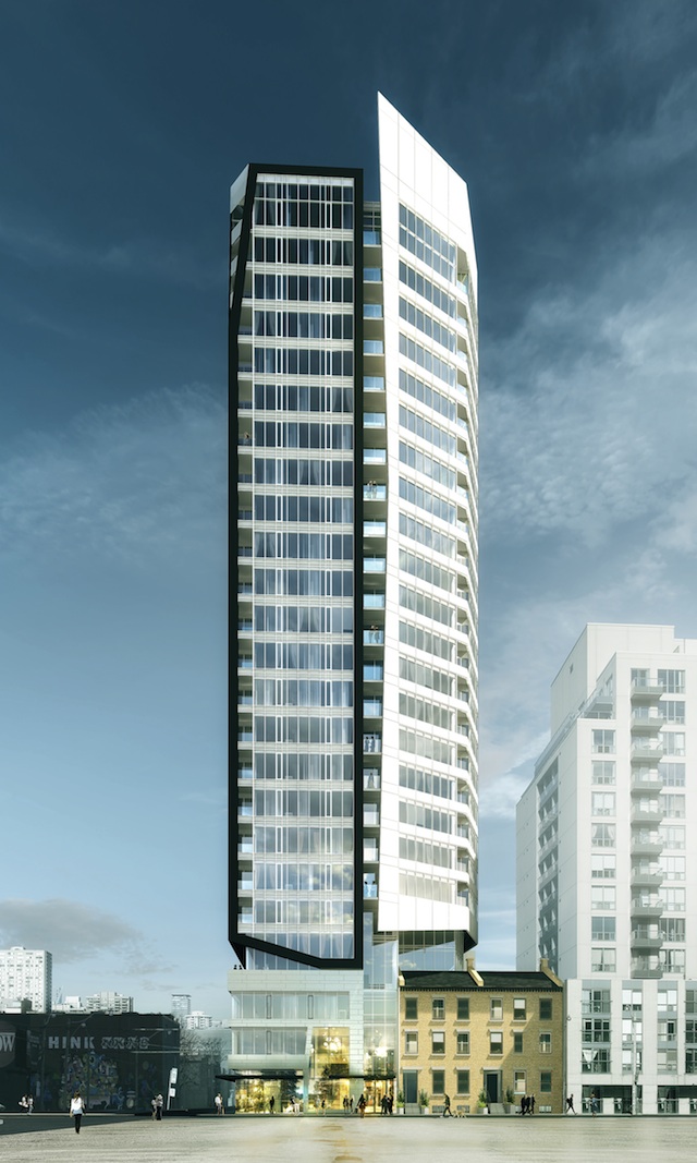
Core Condos Podium

The site for the new 24-storey tower is the northeast corner of Shuter and Dalhousie Streets, just blocks from the Eaton Centre, St. Michael’s Hospital and Ryerson University. It meets the developers’ corporate philosophy in two key aspects: in terms of location, it allows their demographic buyer to be in close proximity to work, transit and amenities; and secondly, in terms of value. “How we offer value proposition to the end consumer is really a combination of great design, both interior and exterior, and price point,” says Andrew Hoffman, president and founder of CentreCourt Developments.

The project went through several iterations until the City and the previous developer Queensgate reached an agreement on height and general massing. Queensgate continues on as a joint venture partner with a minority interest in the project but it is CentreCourt, who bought the land in November 2013, that is leading the development. Armed with a new vision—while still working within the building envelope parameters established earlier—it has partnered once again with Page + Steele / IBI Group Architects for the overall building design and with Cecconi Simone on the interiors.

CoreCondosExtW640

The tower exterior is divided into two components separated by an architectural slot, which helps to break down the massing. It is clad in curtain wall glazing and metal panel with skewed facets that are largely sculpted. The white, slightly taller element looks east while the western face is outlined with a defining black trim and interrupted by balconies. From a design standpoint, the building has a distinctive look that “suits the urban professional who wants something in terms of architecture that is modern and stands out from the rest,” says Shamez Virani, Vice President of CentreCourt Developments.

CoreCondosExtS640

The project will provide a total of 220 residential units ranging in size from 390 square feet to 775 square feet, a small commercial space at grade, and 84 parking spaces in a five-level underground parking structure. The building’s main residential entry will be located on Shuter Street and the retail entry and parking and service access will be situated on Dalhousie.

On the site currently are buildings numbered from 64 to 70 Shuter Street, listed on the City of Toronto's Inventory of Heritage Properties. According to the Heritage Impact Assessment prepared by E.R.A. Architects, two of the four existing buildings, 64 and 66, have undergone an “extensive remodelling of their exterior and interior” and as a result, will not be retained. The podium will incorporate a portion of the roof, two chimneys, and south façade of 68 and 70: a 3-storey, 19th century Georgian-style row house with buff coloured brick and limestone lintels and sills by architect John Tully, who also designed Walnut Hall, similar row houses which once stood further down the street.

64-70 Shuter Street

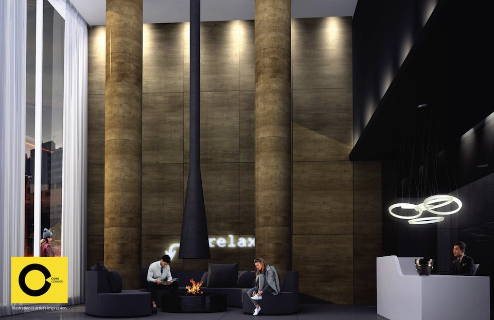
The team developed a building amenity program that, from its standpoint, is in line with what its end user, the young professional, wants and needs, practically speaking. Features such as pool and spa are replaced in favour of a large 3,000 square foot open-concept lounge space with café/bar, beanbag and hanging chairs where residents can “socialize and just kick back, outside of their suite,” adds Hoffman. A landscaped exterior terrace wraps the N, E, and W sides of the building, also at the fourth level. In the same vein, the ground floor lobby is a double-height space with fireplace and central seating that is intended to impress every time a resident enters/exits the building. Residents are likely to walk to work and to neighbouring amenities, as opposed to being more reliant on a vehicle.

Entrance lobby at Core Condos

Core Condos is currently in pre-development and will be launched for sale early this year.

Panel Discussion Tackles Designing for Diversity by stephanie calvet

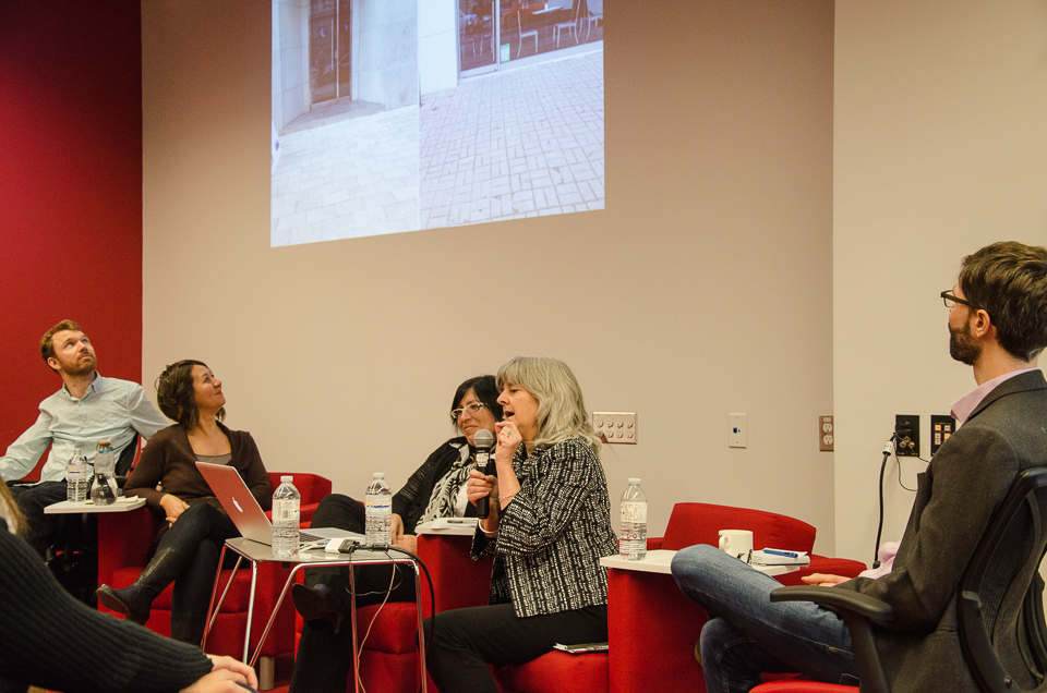
(this is an article I wrote for UrbanToronto) The term ‘diversity’ in its cultural sense is frequently referred to in Toronto but it encompasses a much broader range with respect to language, gender and age, including people with disabilities and special needs. The Inclusive Design Institute (IDI) at OCAD University, Canada’s first research hub focused on digital inclusion, designs information and communication systems to work with all potential users. It hosted a panel discussion entitled Traverse – Stories from the Built Environment that brought together speakers in multidisciplinary fields to share their perspectives and present examples of accessibility in such areas as: architectural design, transportation, environmental policy, legislation, and computer technology.

QA_accessibility-5

Vancouver's recent ban on doorknobs in new construction in favour of easier-to-manoeuvre lever handles is a progressive move in the broader discussion of inclusion. Removing barriers in our built environment doesn’t just help those with disabilities but improves the standard of living for all. Curb cuts are a frequent analogy of ‘universally accessible’ design. Not only for those in wheelchairs, they are better for the elderly, for people with strollers, or those bearing groceries. The IDI makes a distinction between Universal and Inclusive Design: the former has its origins in architecture and industrial design and is linked to a fairly constrained categorization of disabilities. Inclusive design, on the other hand, takes everyone into account. It recognizes commonly ignored non-visible disabilities, such as cognitive impairment or environmental illnesses.

349368773_a6910b0814_b

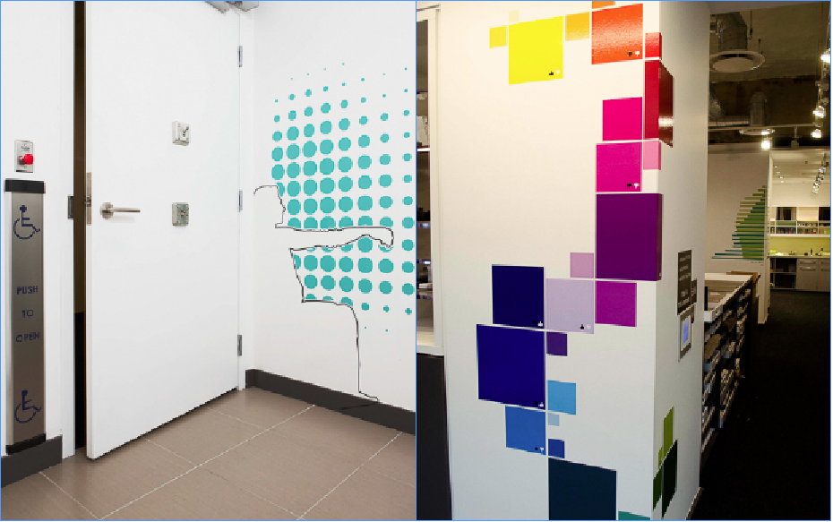
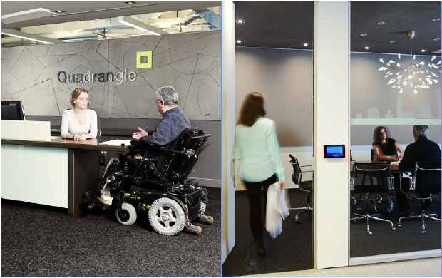
Accessibility has a certain stigma about it. It is oftentimes associated with ‘static’ design but those notions are being challenged. When Quadrangle Architects relocated to a new space, they conceived a fully accessible office that showcases how universal design can be beautiful and creative. Panellist Susan Ruptash, the firm’s Managing Principal, illustrated some of its features: easily adaptable modular furniture systems; generously-sized rooms and corridors; and, a single-use universal toilet room with the silhouette of a person in a mobility device and dots in decreasing size to indicate the reach range (below left). The firm cleverly uses graphics as a way to educate its own staff on clear floor space requirements and colour contrast minimums (below right). “The graphics are a bit esoteric and we like their storytelling aspect – they become an opportunity for conversation,” says Ruptash.

Screen Shot 2013-12-05 at 2.03.18 PM

Full-glass panels are demarcated with vision strips (below right) that integrate profiles of building projects and corporate branding which the firm saw as a way to “show our clients how it can enhance the design of space and not be seen as a limitation.” Because people perceive space in a number of different ways, the architects also incorporated theories of wayfinding in the office’s layout using varying colours, materials, and textures.

Quadrangle sees advocating for a more accessible world as one of its key roles. It espouses the philosophy that integrating universal design from the beginning results in a far better outcome than modifying existing space, which is more costly and often results in inferior design.

Screen Shot 2013-12-05 at 1.58.12 PM

Panellist Luke Anderson – a paraplegic himself – has experienced more barriers than most. The professional engineer has taken on the challenge to change the environment of ordinary life, and is gradually doing so through the work of StopGap, a non-profit company he co-founded. Its most recent initiative, The Ramp Project, provides retrofit ramps in various sizes and colours to make existing structures – those burdened with a curb – immediately accessible. Because it is not permanent, the ramp is not required to meet the requirements of the Building Code. It is a low-cost, low-tech makeshift solution to a problem and even comes with assemble-it-yourself instructions. Now launched in 12 communities across the country, these ramps are being snapped up by shop owners eager to make their businesses more welcoming to all. And the bright colours definitely draw attention. It is an initiative – not a protest – and as much about raising awareness of the barriers as improving access to individual buildings. Retrofitting later is more costly.

Screen Shot 2013-11-28 at 9.40.17 AM

And the barriers extend beyond the built environment. Our physical and digital worlds are increasingly merging. The IDI and its offshoot Inclusive Design Research Centre (IDRC) create products, software, and adaptive technology that support inclusion. They see disability as a “mismatch between the needs of the individual and the user interface." Accessibility, then, is the adaptability of the system to the needs of all.

Despite what we might think, the majority of us are not ‘typical’ or ‘average.’ While Universal Design creates a common design that works for everyone, Inclusive Design seeks to accommodate the needs of each individual and the digital realm gives designers the freedom to do just that. It is a one-size-fits-one approach instead of one-size-fits all. Jutta Treviranus, the institutes’ Director, describes how they are “working on a way to deliver to everyone something that is personalized – what you need, how you need it, when you need it.” She has played a leading role in developing accessibility legislation, standards and specifications internationally. The IDRC designs broadly implemented innovations and technology such as Tecla, a bluetooth box for mobility impaired mobile phone users. To learn about these, and find more open resources promoting accessible information and communication, visit http://idrc.ocad.ca/.

Screen Shot 2013-12-06 at 1.52.02 PM

The discussion not only brought exposure to issues of inclusion but it also reinforced how real value comes from the conversations that designers have with each other and the need for ongoing collaboration. Using principles of inclusive design, we can create attractive designs that are AODA compliant and user-friendly, allowing everyone the opportunity to participate.

IN Series is a series of public presentations and events on a wide variety of topics from the engaging and thought provoking field of Inclusion: Accessibility, Health, Education, Art, Culture and Design hosted by the Inclusive Design Institute (IDI), at OCAD University. The IDI is a hub of applied research that addresses the challenge of design that is inclusive of the full range of human diversity with respect to ability, language, culture, gender and age, including users with disabilities, language needs and various cultural preferences.

60 Atlantic: Converting Liberty Village heritage building for today – Part II: Interiors by stephanie calvet

(this is an interview I did and an article I wrote for UrbanToronto) The adaptive reuse of 60 Atlantic Avenue by developer Hullmark will create 27,500sf of office space and 12,500sf of retail and restaurant space in a former factory in the heart of Toronto’s Liberty Village. In this 2nd part of a 2-part article, UrbanToronto’s Stephanie Calvet sat down with designer Caroline Robbie of Quadrangle Architects to discuss the interiors fit-out. Anchor tenant INVIVO Communications, an innovative company working at the intersection of science, biology and technology, will move into the top floor early next spring.

Screen shot 2013-11-06 at 12.58.03 PM

PART II: Q&A with Interior Designer Caroline Robbie:

Both the neighbourhood and this building itself have a history as a creative community. Are you collaborating with local artists and artisans in this project and if so, how?

We try to bring an element of custom art into every project we do, whether it is internally generated through custom graphics or through collaborations with artists and industrial designers. The building’s history is being celebrated through a custom version of a Goads Fire Atlas illustration that will be used to film a glazed corridor. The original image was enhanced by our design team to highlight the building. While it is still in the design stage, artist Zac Ridgely is developing a custom feature light fixture for the INVIVO space.

Screen shot 2013-11-08 at 3.01.26 PM

I understand that Quadrangle uses part of its office space as a ‘testing lab’ for design services that it offers, such as investigations in graphics for frit patterns on glass. Have you done similar explorations that have benefitted this project?    

We ‘mock-up’ new ways of manipulating images and materials in our studio on a regular basis. This helps not only determine construction methods but it lets us live with something for awhile and gain insights and opinions from the larger studio group. The Goads Fire Atlas film developed for the corridor has been mocked up for some time in a prominent circulation space in the studio.

Screen shot 2013-10-22 at 4.11.15 PM

In a previous interview you said, “buildings need to learn, grow, and change over their lifetime – it’s about adaptability and flexibility.” Does this building have good bones? Is it an example of what you call “durable architecture”?

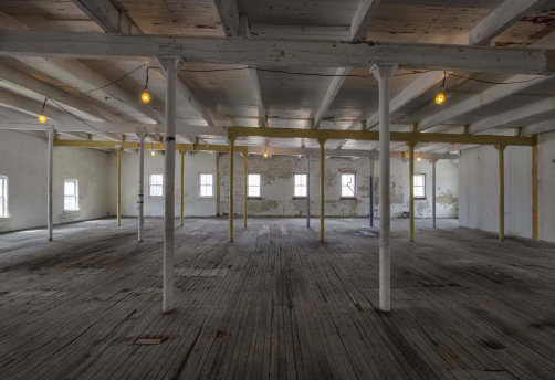
The one constant in life is change so something as permanent as a building needs to be inherently adaptable. This building and Liberty Village are great examples of the reuse potential of Toronto’s industrial past. 60 Atlantic’s durability lies in its building quality as well as an ability to accommodate changing needs over its lifetime. The beauty of the interior space once extraneous elements were removed was remarkable. We have tried to touch it gently so that the bones are visible.

11031-70-for blog

The following questions are specific to the interiors fit-out for INVIVO Communications, an interactive agency that provides innovative digital solutions – games and apps – to the global pharmaceutical and medical device industries.

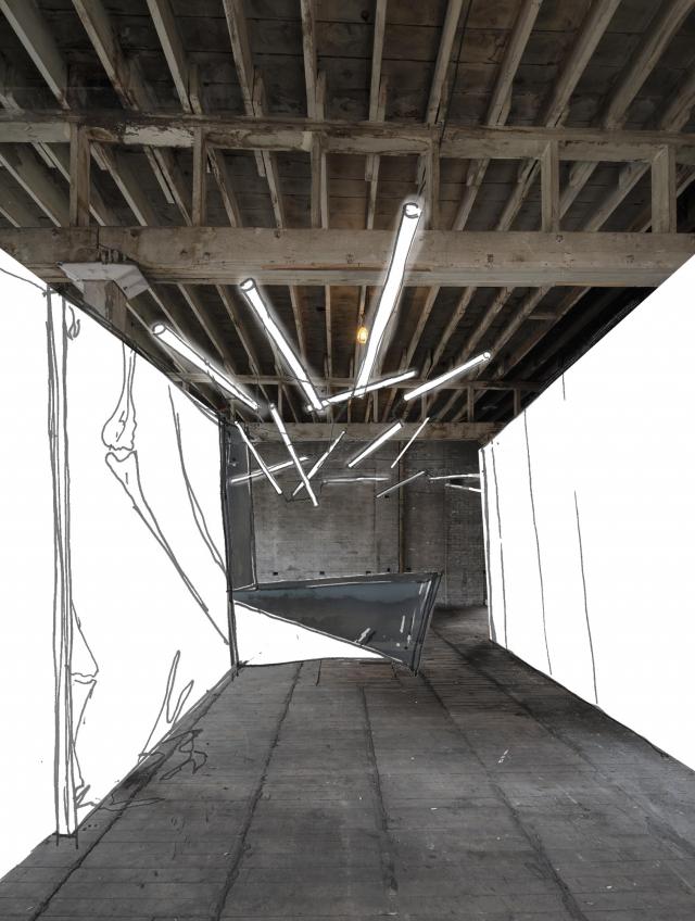
The entire office’s lighting design strategy with, for instance, splayed linear tube lighting, is intriguing. What is the guiding concept behind it and what sort of imagery have you incorporated into the workspaces?

INVIVO has healthcare at the core of its purpose, but their culture is about innovation, animation and app development. The environment is definitely not clinical and we needed to respect their playful nature while providing an effective workplace that spoke to the nature of their business. The central design organizing principle is about white matter, the lesser known component of the central nervous system that consists of glial cells and myelinated axons that transmit signals from one region of the cerebrum to another and to other brain centres. White matter is a fine meshwork-like structure that we have referenced in the free-form lighting throughout the main circulation spine of the space.

Viso_lighting-splayed

As you juxtapose the old with new, the basic with the high-tech, what are the qualities that the interiors will evoke?

We hope that the most characteristic quality is of comfort. The mix of materiality and technology, linked through the energetic culture of INVIVO, will allow the space to embody the modern workplace.

Working in a sector where technology is constantly changing, a company like this one likes to stay on the cutting edge. How will that be reflected in the interiors? Which trends play a part in the design?

We tend not to follow trends but instead make sure we are paying attention to the influences on the businesses of our clients. Technology is such a key component of the business – it has played a big role in the planning. The IT department has been pulled out of a backroom and into the fulcrum of the studio. In our experience, technologies move too fast for us to think we can design to anticipate what will be needed so we defend open, unprogrammed space as it will allow the flexibility that will inevitably be needed.

Quadrangle_invivo sketch

Toronto is the North American base for medical illustration and INVIVO is one of the fastest-growing companies in the field. Just as there is a need for flexibility to update the ‘feel’ of the brand as it evolves, what sort of flexibility is there in the design of the physical space? Are there provisions for expansion?

There is growth potential on the floor within open office clusters and the overall space planning has incorporated enough balance between spaces for focus and spaces for collaboration that project flow is not inhibited by the design of the space.

Are there any specific technical (communication, wiring etc.) requirements that are appropriate for a company at the forefront that is constantly revolutionizing user experiences and that has a futuristic component?

There are no extraordinary technical components in the design other than to provide a very flexible power and data delivery system throughout the space.

Quadrangle_reception-sketch

Blue and green were integral colours to INVIVO since its beginnings and have always been part of the branding. Did you utilize the colours in the interior design of the office and if so, where?

No, we haven’t incorporated the branding colours as we are leaving the design of the space intentionally white as a background palette for the artwork that is created by the artists and developers at INVIVO.

Corporate giants like Google, with their unconventional workplaces, have embraced the idea that creative work environments help stimulate minds and inspire innovation. If you subscribe to the notion of a studio culture that allows the space to offer all varieties of collaboration, how do you go about making it happen?

Rather than try to force behaviours, it is better to allow people to hack space. We worked to ensure that the space has good light, great views, is comfortable and has the resources they need like wifi and power, in the right places. Once those elements are in place, companies dependent on innovation provide the right tools, which in turn allow their people to foster creative thought.

For efficiency, the base building design team (architectural, engineering and construction) is coordinating M&E systems with INVIVO directly for their use.  How have you proceeded with the rest of the spaces considering the additional tenants have yet to be determined?

We have tried to ensure that base building systems like vertical shafts and electrical feeds are in unobtrusive positions while still providing coverage for flexible multi-tenant floor layouts.

60 Atlantic: Converting Liberty Village heritage building for today - Part I: Exteriors by stephanie calvet

(this is an interview I did and article I wrote for UrbanToronto) 60 Atlantic Avenue is a two-storey former industrial building in the west half of Toronto's Liberty Village neighbourhood. Developer Hullmark bought the listed heritage property a couple of years ago and is transforming the outmoded building for today's needs, creating office, retail and restaurant space. UrbanToronto’s Stephanie Calvet sat down with key players Richard Witt and Caroline Robbie of Quadrangle Architects to discuss the 1898 building’s reinvention from both the exterior (Part I) and interior (Part II) perspectives.

urbantoronto-7401-25331

PART I:  Q&A with Architect Richard Witt

The property at 60 Atlantic Avenue is part of a collection of surviving institutional and industrial buildings that give the area its character. What opportunities did restoration of the structure (not strict preservation) vs tearing down and building anew, afford you?

Keeping the building sets up a very different development and value proposition for the site. If it was a new building, it would certainly have been taller, denser and likely not have the same public space that fits neatly into the ‘L’ of the existing building. The existing building’s internal character has a lot of value once stripped out and it is great to see that being restored.

The building does not display a high degree of craftsmanship but it was determined to have design value as an industrial building from the turn of the 20th century and is listed on the City of Toronto Inventory of Heritage Properties. What restrictions were put in place on what you could do here?

Retaining the building is the biggest restriction. The conventional economic wisdom would be to tear it down and put something much larger in its place. For many developers the requirement to retain it would not have been very desirable. Luckily Hullmark sees the value in that character  – economically as well as culturally, ecologically and urbanistically. There was also the requirement for preparation of a Heritage Impact Statement, prepared by heritage consultant Phil Goldsmith, which outlined a number of considerations, including: the important parts of the building (historical entrance, character of the windows) as well as an analysis of the building’s history, which allowed us to have a discussion about which parts of the building did not need to remain.

Screen shot 2013-11-06 at 1.26.01 PM

Since 1991, Artscape occupied the property as its head office with artists' studios. It infused the neighbourhood with energy and played a catalytic role in the reinvention of Liberty Village from a campus of under-utilized industrial buildings to an important cluster of creative sector employment. In which ways do you see this former winery, newly reinvented as a flagship office, having an alternative effect beyond the boundaries of the actual site?

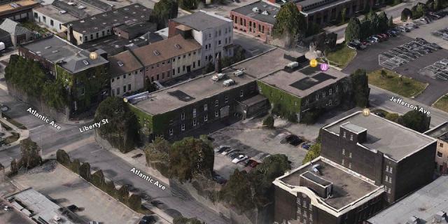
It is not a single tenant building. So far there is one tenant (InViVo Communications) confirmed for the top floor. As far as I’m aware the upper ground level is still available and there are a number of likely candidates circling for the lower ground level. The occupancy of the building will be much greater than it was previously, which is a big contribution to the neighbourhood energy, and the more than one third of the building will be restaurant or retail uses which connect through to new openings on Liberty and Jefferson streets, as well as occupying a new sunken courtyard [see image below] on Atlantic Ave. There will be a lot of two directional traffic in and out of the building, which will have a big effect on the entire area.

Screen shot 2013-11-06 at 1.04.30 PM

For decades, Hullmark focused primarily on large residential developments around the GTA. Recently it has set its sights on transforming neighbourhoods in popular urban areas of the city. What synergies between the two firms make it possible to partner up successfully?

I’ve always liked the simplicity and clarity of a quote by Hullmark founder Murphy Hull “I had a vision. Over time and with hard work that vision came true.” Hullmark’s vision as city builders aligns with something that Quadrangle have been doing for our entire history: taking buildings of latent value and potential and reinventing them as something new and relevant. In addition to 60 Atlantic we are also doing projects of similar objective at 545 King W and 100 Broadview [below]. Hullmark is still doing large residential developments and, under the direction of Jeff Hull, has been transformed into a more urban-focused developer.

100broadview-bldg

If adaptive reuse can be seen as a financially viable style of historic preservation, why aren’t there more enlightened developers in Toronto ready to reclaim historical sites?

There have always been developers doing adaptive reuse in the city. We’ve been working with them for years on projects like City TV, the Candy Factory, the Toy Factory and many others. Although it may be financially viable, it is more work to achieve the same quantity as with a new build. There are always unknowns and surprises along the way and some of those can be expensive. It requires a lot of commitment and long-term vision from the entire team.

What is the interplay between the limitations of zoning (and its revisions) and the requirements of historical preservation? When does one take precedence over the other?

Zoning decisions have the right of appeal at the Ontario Municipal Board, but Heritage Board decisions do not have that same possibility. In the case of 60 Atlantic there was no Site Plan Approval application necessary though, so there was no potential for conflict.

Screen shot 2013-11-06 at 12.58.03 PM

The transparent circulation spine cleverly reveals rather than conceals the existing building behind it. What obstacles had to be overcome and which conditions fulfilled in order to arrive at the solution?

The addition was a means to deliver more regular leasable space and not have to make costly additions to the building to accommodate things like elevators, new plumbing, and adequate structure for heavy mechanical equipment. It is also a way to create a clear difference in expression from the existing and new work. It was easier to do it that way than the alternative. The only real obstacle was matching up to the existing building which is not very regular, and built in phases at different levels.

The building has small punched windows along its façades that lent themselves well to Artscape’s studios and office spaces (and long prior to that, a winery). Are you incorporating larger glazed sections and/or skylights to accommodate the new program’s open plans, and if so, how?

The building was built in two phases, east and west at slightly different heights. The central north south portion was a through-carriageway. Our first objective in working with existing buildings is to understand what is original and what was subsequently added, which in the case of this building was a lot. There were also lots of elements like loading docks, which had been retrofitted as windows with dodgy brick infill. By taking out all of these pieces we were left with a series of large openings, which could be fitted with glazing and become a new layer of expression that more accurately reflects the original condition.

Screen shot 2013-10-22 at 4.11.15 PM

Does this project epitomize Quadrangle’s philosophy of not just locking a building in time but rather adding layers as the city evolves? (i.e. glass is not verboten under heritage conservation guidelines)

The new glazed elements, new circulation, connections to the street on all sides and new sunken courtyard all engage the surrounding community in a way that the building didn’t before. By renovating and turning a former utilitarian warehouse into a vibrant employment and amenity hub, the building both reflects its history and becomes relevant to the future of Liberty Village. So, Yes.

Adaptive reuse is in and of itself a sustainable approach. Are you pursuing LEED certification for this development?

We are not pursuing LEED certification, although we discussed it in the beginning and were conscious of our responsibilities throughout. We reviewed the requirements and did a lot that goes beyond the code requirements including some significantly more advanced mechanical systems. In the end we didn’t pursue it because of the cost of the LEED process itself.

Screen shot 2013-11-06 at 12.06.45 PM

Liberty Village is undergoing a rapid transformation characterized by thousands of new condominiums set amidst historic industrial buildings. Its east side has become, in the words of architectural critic Christopher Hume, “an over-developed condo enclave,” with little consideration to human scale. What would be your advice for city planners or developers to prevent the same saturation on the west side?

The west side of Liberty Village has the opposite problem to the east. It is almost all designated employment lands with a much lower height limit. I think we are moving beyond the days of single occupancy land-based planning (work somewhere, live somewhere else, shop somewhere else, etc.) and there is a lot of discussion about introducing residential permission to this part of Liberty Village. Permitting residential to a maximum as well as a minimum amount of commercial space would be a good way to build a true mixed-use community and encourage the growth of employment simultaneously.

urbantoronto-9122-31497

For 21 years the building was home to Artscape and to 48 affordable artist studio spaces. Not immune to the pressures of the real estate market, the non-profit organization was forced to close this location in 2012. Low cost raw studio space in downtown Toronto is disappearing fast. Can you contemplate ways by which artists and low-profit creative outlets can remain in these neighbourhoods they helped revitalize?

I don’t know if that’s even desirable. I remember that Third Rail art show in Liberty Village when people were living in big warehouses with chemical toilets, and that seems a 100 years ago. Part of being an artist is being ahead of the curve, and once the space around has become popular and mainstream perhaps it is not such a place of creation. Architects have a similar role in residential purchases – a lot of my friends live around Roncesvalles, which was affordable 10 years ago. I don’t think that many architects five years out of university could afford a house there now and where they’re going is probably going to be a great and vibrant area in a few years…

This intervention is simple, sensitive and aware of its context. How do you integrate with the existing fabric of the former industrial precinct while simultaneously anticipating its urban future?

A lot of architectural direction comes from a consideration of broader influences. By looking at the economic patterns of the area, the qualities of the urban context, movement patterns, social activity and a lot more, an obvious design intent reveals itself. Then it is just the business of building articulation. When it comes to making a great city the most important thing is design at an urban level, an understanding of the buildings’ relationship to, and role in, the broader urban fabric. If you have good architects you get beautiful buildings, but that doesn’t make a great city. Ideally you have both, which is what I think we will have at 60 Atlantic.

Stephanie Calvet is an architect and a writer specializing in architecture and design. She can be found at www.stephaniecalvet.com

The Interview: Richard Witt of Toronto's Quadrangle Architects by stephanie calvet

(this is an interview I did for UrbanToronto)

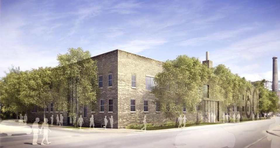
UrbanToronto’s Stephanie Calvet sat down with Richard Witt, principal at Quadrangle Architects, to discuss the inspiration for DUKE Condo’s design. The mid-rise building, which takes its name from an amalgam of Dundas and Keele streets in The Junction, is under development by TAS.
indesign-project-duke_1

How is DUKE different than other recent mid-rise downtown condo projects (King W, Ossington, etc.) in terms of trends and features?

For one, it is a bit bigger than most of the others I’ve done. For example, Cube Lofts has 21 units, Abacus has 42, 838 Broadview Avenue has 40, and Beach Club Lofts has 47 units. DUKE has over 100 units so there is a bit more economy – but the principals are the same. Secondly, DUKE represents a bit of a shift in the market, where mid-rise and avenue intensification is being pursued by a more established developer of historically bigger projects, design-oriented TAS. DUKE also engages with the laneway in an attempt to 'de-service' it to an extent, through the implementation of live/work units (it creates a front door address to the lane and brings in pedestrians rather than just parking and garbage trucks). Lastly, the architectural expression is set up to anticipate a fluid market demand and potential shift: rather than being a composed elevation, it is a direct expression of the unit mix which can be altered through the sales process.

indesign-project-duke_2

What are the guiding design principles that have facilitated the incorporation of a mid-rise into an existing mixture of low-rise buildings, many of which have a historical character?

Although the buildings around have been there for some time, I wouldn’t characterize the context as heritage rich in terms of its buildings specifically, and heritage is a word that’s overused in this city to mean old. The greater history lies in the neighbourhood and area, in terms of the way it has evolved. Quadrangle has historically been known as a company that works to build communities and responds to contextual clues and this project is no different. There are a number of buildings of different shapes and sizes and this project, through its scale modulation and multiple datum lines, picks up on all of those clues. Additionally, it anticipates the future development to come, so when the one-storey buildings are replaced with future buildings of unknown scale, the response to that future context is also anticipated.

As stated by architect Peter Clewes, “In Toronto, we tend to look at the street as a series of individual buildings, not a streetscape.” Considering this is an infill project, how do you think this building adds to the existing streetscape?

That may be the way he’s working, but we always looks at streetscapes and broader context. We do a lot of master planning work which involves understanding walkability, block sizes, designing for end users, mixture of uses on the street and we also work across a lot of sectors including residential, retail, and office, so we understand how they all come together. DUKE provides street-related retail with good height and proportion, innovative live/work unit response to the laneway, and street-related townhouse-type units that form part of the streetscape. The only side of the building in which we don’t address the street is the party wall to the west where there is no street.

image01

There is an interesting breakdown of unit typologies in the project. Given that the price point for mid-rise tends to be much higher, and given that the units are quite differentiated amongst themselves, who is your main target market?

The target market is anyone who likes the character of the Junction and what that neighbourhood is all about. We have worked with local artists and manufacturers to create a building that reflects those values. The unit mix is extremely varied, to anticipate first-time buyers who want to move to one of Toronto’s coolest areas, people who have owned a house in the area for 40 years and want to live in a condo but stay in the area and everyone in-between.

Did the project require an amendment to an existing zoning by-law? And if yes, how has the project been received by the community?

Yes, it has already received approval for that at Community Council. The community response has been overwhelmingly positive: a lot of supportive comments and encouragement to push the design. I think it is a very enlightened community that deserves a great building. The main concern as with all projects these days is traffic – we have done what we can with this building, but a 100-unit building cannot address the traffic and transit problems Toronto is facing…

indesign-project-duke_5

Does the project meet TAS’ ‘Four Pillars of Sustainability’ (social, ecological, cultural, economic) and how?

Absolutely. Community engagement and commitment to working with the artisanal nature of local industry has been a primary principal in launching the project. We have used the design, specifically interior and sales centre (designed by local interior designers Mason Studio) as a vehicle to promote their work via the sales centre and inspiration for the interior design of the building itself (also by Quadrangle). The ecological considerations are primarily manifest in the high ratio of wall-to-window in the building (more insulation) but also in many features throughout, such as the planters on the south side which can be used for growing vegetables, the energized parking spaces (see below) and the high level of metering for all services in the individual units.

Does the building follow the apparent trend of providing a low parking-to-unit ratio and what is the ratio for DUKE?

No, the Municipal Authorities are being much more restrictive in their permissions since the introduction of the new by-law last year. The building is providing parking exactly in accordance with the new (and more onerous) by-law. However we have looked for ways to promote sustainable transportation beyond the abundance of available transit, and have made a specific effort to provide energizing to about 25% of the spaces, and well as provision for future energizing of the other spaces, should the need arise.

Screen shot 2013-10-18 at 1.15.28 PM

Has the double-height retail space been designed in such a way to entice lively commercial venues and deter, for example, the usual corner banking outlets that do not enliven the corners of the city?

It has a very high ceiling, and a potential combination or separation of up to three units. It’s not the right proportions for a bank, and not a great corner for it – my hope is a couple of uses, perhaps a gallery/showroom and some kind of café.

indesign-project-duke_3

What was the inspiration for the common area interior spaces?

The neighbourhood and artisanal industry base.

Was Mason Studio only involved in the showroom design or was it also involved in the interiors of the project itself?
Quadrangle did the architecture and was responsible for the interior design of the building units and common areas. Mason Studio was responsible for the design of the sales centre. However there was a fair bit of cross pollination in the design meetings since the sales centre features much of the interior design for the building, and Mason was in those meetings discussing with us.

indesign-project-duke_4

How will these transitory functions currently held at the building site, such as free mass outdoor yoga sessions and farmers’ markets, contribute to the project’s acceptance by the community?

Hopefully the nature of those events will move forward with the occupants that inhabit the building. TAS has shown enormous philanthropy in utilizing their site for these kind of events and that seems to have engendered a lot of goodwill towards the project.

So far, what has been the greatest challenge on this project? 

The nature and constraints of an urban infill project with so many influencing factors creates a lot of challenges – in the way the building responds to the stable neighbourhood to the south, permits light on to the sidewalk, and stays at a reasonable scale. We face these challenges on every mid-rise project but, though the principals are the same, the response is always different.

Are there any trends in condo building in Toronto that you’d like to see disappear in the near future?

Yes. Lack of imagination, which mostly expresses itself in generic boxes clad entirely in low insulation glazing with “modern design” as the excuse.

Lastly, where do you look for design inspiration?

Nowhere specific, but I'm always on the lookout!

Doha sights and sounds by stephanie calvet

I've been fortunate to have the opportunity to spend time in the Middle East. First stop: Doha, Qatar. The next photos are of the Souq Waqif. The labyrinthine market looks deceptively ancient. Although the site dates back 100 years, it has recently been restored to revive the memory of the area. Over the years, the market fell into disrepair and was abandoned as shopping malls grew - and they grew, big-time. Now, the cobbled lanes and whitewashed buildings, made using traditional Qatari architectural elements such as mud rendered walls and exposed timber beams, look to be from a bygone era. Restoration or reconstruction? I'm not sure.

Souq Waqif_Doha

Souq Waqif_Doha

The shopping destination is renowned for selling traditional garments, spices, handicrafts, and animals (alarmingly, lots of dyed pets). Each narrow, covered alley sells a different commodity. I expected to see people haggling over a sale but it was all very civilized, probably because Qatar has the highest per capita income on the planet. There are shisha lounges, galleries, luxurious boutique hotels and Egyptian, Iraqi and Lebanese restaurants. There is also a Falcon Souq nearby (apparently falconry is a big hobby for Qatari men) and a camel pen in the parking lot.

Souq Waqif_Doha

Souq Waqif_Doha

Souq Waqif_Doha

Souq Waqif_Doha

Souq Waqif_Doha

Doha_Souq Waqif

These next shots are of Hey'Ya: Arab Women in Sport, an exhibition celebrating female athletes - amateurs to Olympians - from the Arab world. It featured a series of large portraits of sportswomen from 20 different countries by French celebrity photographer Brigitte Lacombe.

Arab Women in Sport_Katara

Doha_sights-10Arab Women in Sport_Katara

Next up:  Katara. It is home to a bunch of institutions including the Doha Film Institute, the Qatar Philharmonic Orchestra and the Arab Postal Stamps Museum, connected by a network of lanes shaded with wide-stretched canvas canopies. Katara seeks to promote cultural awareness and acceptance by organizing festivals, exhibitions, seminars, and all forms of artistic expression in this newly created "cultural village" beside the sea...

Katara_Doha

Katara_Doha

Katara_Doha

Katara_Doha

Katara_Doha

Katara_Doha

Katara site plan

Open to the sea stands a gargantuan marble amphitheatre, presumably used for concerts and performances. I saw a total of 3 people exploring the vast complex when I visited (not counting a bevy of golf cart drivers). All of this in the blazing Gulf sun ... I couldn’t help wondering who this is actually for.

Katara amphitheatre_Doha

Building has been going strong in Qatar. It has seen the development of new residential areas, new ports and airports, as well as  lots of new infrastructure. There is even more envisioned for Katara -- Phase IV will be a mixed-use development as an extension to the Cultural Village.

Katara Phase IV

Redevelopment of Toronto's St. Lawrence Market North in Limbo by stephanie calvet

(this is an article I wrote for UrbanToronto) An initiative to redevelop the St. Lawrence Market North site is caught in limbo as the City and the architects work to resolve budget and funding issues in what has already been more than decade-long process. A 2008 competition to replace the aging 1960s north building (a Canadian Centennial project) and to improve the St. Lawrence Market complex resulted in a winning design for which ground is still a long way from being broken.

Next up in the ongoing saga is the consideration by the Government Management Committee and City Council. Toronto's Deputy City Manager, Chief Financial Officer, and Chief Corporate Officer recommend that design work continue, and the necessary budget adjustments be referred to the 2014 Capital Budget Process.

The forecast for the building, based on the Architect's latest design submission, has risen from $74.89 million to $91.46 million. Additional funding of $15.293 million is required in order to advance the project, despite considerable reductions to the Winning Design (below left). It was envisioned as nearly all-glass with exterior wooden louvers, and its five-storey-high central courtyard would bring in plenty of natural light and provide a clear, perfectly framed view north to St. Lawrence Hall. The Architect's revised proposal (below right) accommodates the major program requirements and while significantly less dynamic and permeable in form and spirit, still maintains the essence of the Winning Design.

urbantoronto-8271-26956

The original estimate was prepared in 2008/09. The revised project costs are a result of a few significant factors: inflation/escalation; atypical conditions discovered at the site require additional monies for excavation; and, preliminary cost estimates were unsuitably based on a unit cost allocation of a typical structure that doesn't have the level of complexity of this distinct design.

The current St. Lawrence Market North building has been largely underutilized and an initiative to maximize the site's full potential has been ongoing since 2002. In 2008, City Council authorized a design competition to select an architect for the development of the north property. The winning submittal came from Rogers Stirk Harbour + Partners (the "Design Architect"), in association with local firm Adamson Associates Architects.

The principal benefits that will result from the project's completion include:

  • Significant improvement to a city landmark and tourist destination
  • Improved compatibility with the heritage character of other buildings in the neighbourhood
  • Increased parking capacity (through the construction of 250 new underground spaces)
  • Service improvements resulting from the consolidation of Court Services operations into one location
  • Creation of new interior spaces that can be used for a variety of community and commercial purposes
In 2011, the City executed a consulting agreement with the Architect to develop the Winning Design within the City's Original Program of Requirements, but the Architect has been unsuccessful to date in doing so. As a result, the Architect has provided an adjusted design to meet the minimum functional requirements, including 14 Courtrooms and JP Offices, 250 parking stalls, Court and Police Service administrative offices, Art Gallery, Restaurant, Kitchen Incubator and Farmers Market area.

The Winning Design included features which have been eliminated or reduced in the current design:

1)  Building Height Reduction - height of building has been reduced from 6 floors (including mezzanine) to 5 floors. Space programming efficiencies have been realized by relocating non essential file storage space from the office floors to residual areas of the parking garage. The revised design also eliminates the 4th floor mechanical area by changing the design from a centralized mechanical system to a decentralized system distributed across all floors.

2)  Green Roof Reduction – the Winning Design included a separate green roof suspended over the main building roof, excluding the atrium. The revised design includes a green roof as part the building roof.

3)  Sustainability Target Reductions – the Winning design stipulated designing to LEED Gold, with the 'goal' of LEED Platinum. The revised design proposes designing to the Toronto Green Standard of Tier 1 (which contributes towards LEED Silver certification).

4)  Sun Shade System Reduction - the Winning Design included operable exterior wood louvers, including maintenance catwalks, on the east and west sides of the building. The current design includes a fixed louver system of composite material with an aluminum core and the elimination of the catwalks.

The Architect has informed the City that there are no further design reduction options available other than further reductions to program space, which is unacceptable to the City. As a result, in order for the project to proceed, additional funding is required. The final project cost estimate, based on 100% design, will not be known until the Architect completes the Design Development and Bid Document stages.

Below are exterior and interior renderings of the initial winning design and the adjusted design proposals.

urbantoronto-8271-26954

This report will be considered by Government Management Committee on June 17, 2013 and then by City Council on July 16, 2013, subject to the actions of the Government Management Committee.

UPDATE: Don't like the cheapened plan for St. Lawrence Market North? Tell Toronto City Council.

Architect Craig Webb expands on plans for Mirvish+Gehry Toronto by stephanie calvet

(This is an article I wrote for UrbanToronto) Close to five months since UrbanToronto first broke the story of the extraordinary Mirvish+Gehry development plan for Toronto's Entertainment District, a second public consultation regarding the proposal was held on the evening of Tuesday February 19th at Metro Hall. Hosted by Ward 20 Councillor Adam Vaughan, on hand to give details and answer questions were Craig Webb, representing architect Gehry Partners, Peter Kofman representing developer Projectcore, and owner of the site and driving force behind it, theatre impresario and art collector David Mirvish.

Image

Prior to the presentation, the public had an opportunity to view schematic floor plans, sections, elevations, and a scale model of the proposal within the context of the neighbourhood. Where the first consultation in December introduced the proposal to the public and recorded the resultant concerns of those in attendance, in this meeting Craig Webb opened with a far more detailed account of the plans for the development as they currently stand. He was accompanied by members of the technical team from Gehry Partners and developer Projectcore.

Image

Webb began by expressing the firm's excitement to be working in Toronto again, four years after the completion of the addition to the Art Gallery of Ontario (AGO). Webb reminded the audience of Gehry's subsequently reawakened connection to his hometown and his continued desire to create projects of significance to the city. To provide a glimpse of the working process, Webb showed Gehry's first loose sketch of his vision revealing three towers as very sculptural forms rising from a combined base.

Image

Later in the presentation Webb flashed the image below of a recent model, as he did at the OCAD University announcement the previous week for the Princess of Wales Centre for Visual Arts, and stated "this is where Frank really wants to take the project", no doubt a confounding moment for those straining to understand how the expressive quality captured will translate to a finished building design. The idea is to create podiums with a unified design from which three towers emerge as if from clouds, each with a unique architectural identity.

Image

Webb explained that at the AGO it was important to Gehry to relate that building to the smaller scale of the nearby residential houses, thus that design was scaled horizontally. In contrast, the firm is taking a different approach at this location, sited as it is amongst larger buildings. The team has been looking at how to integrate the scale of the historic city with what's coming in the future, a dilemma that any city builder wrestles with. Toronto has a lot of very tall buildings that are sprouting up right now, but according to Webb, the "interrelation with the street facade is really the key to this project." When studying the existing streetscape, the team identified two key readings: 1) the historic buildings of 4 to 5 storeys establish a lower datum line; while 2) the adjacent Lightbox and similarly tall buildings of 6 to 8 storeys establish a second datum line. The podium height of the new project takes its cue from that second level.

Gehry's office has had what Webb characterizes as vigorous conversations with City Planning about what the King Street 'wall' or 'edge' should be, and about how it should engage the sidewalk. Both sides are working to establish what the goals are for that frontage, in terms of accessibility, openness, and sidewalk width. A partial section through the site (image below) illustrates how the building meets the ground and gives one a sense of the generous sidewalk space that Gehry is trying to achieve. "We really think that the sidewalks need to be widened from what's currently 3-3.5 metres up to 6 metres in some areas so we intend to push the building façades back." The section exceeds City standards in terms of providing an adequate pedestrian zone, a planting zone, as well as additional area which is intended to be used as public gathering space, including restaurant spill-out.

Image

It's this all-important podium that, as Webb describes, "creates edges of the public realm, which creates the cityscape, and which in turn creates neighbourhoods". The strategy that Gehry is taking is to "create a very landscaped and terraced podium to this building. It starts at the street edge and—moving up the building—at the level of the first datum, the building begins to step back, terracing the façade and creating outdoor spaces. We're trying to create a multi-level environment with a lot of public use. The ground level is mainly retail and restaurant spaces, and those public spaces will step up across the terraces, bringing people higher up into the building. Instead of being a single layer of public uses, we're expanding it vertically."

"We intend to undulate the building façade back and forth so that it's not just a straight, street wall, but it has some relief to it and has pockets where restaurants are expected." The images below are of gestural models used by the firm as a starting point to understand the architectural flow and movement of the building. "The intention is to create a lot of transparency, colour, graphic, and excitement."

Image

When it was first revealed in the fall, the model above ellicited some groans from those who misunderstood its intent and were not able to see beyond what they perceived as "toilet paper" adorning it. In the model below a potential treatment of the podium is more developed. Webb expects many more models will be created before a final plan is formulated.

Image

Webb emphasized that although the models do not represent a finished design, the interior designs are further along than a massing study. They have been worked out very carefully in terms of structure, elevator core servicing, and even preliminary suite layouts.

Webb walked the audience through the floor plans, beginning with the ground level plan, pictured below. "Our intent is to activate all four sides of the site." Instead of merely relying on bustling King Street, the team feels there are advantages to putting retail frontages on the more intimate side streets as well.

Below, retail space is indicated in blue, while the residential lobby components, whose 'front door address' Gehry feels is more appropriately suited to the smaller streets, is orange. Loading and parking access is shown in brown, while commercial office entry areas appear in red. OCAD U's entrance, shown in yellow, is on Duncan Street, the school's main south campus artery, while direct street access to the Mirvish Collection is indicated in green from Pearl Street.

Image

The podium itself is 6 storeys in height and retail and restaurant spaces wrap the lower 3 floors. Creating a diagonal connection through the project site between King and John streets is a public arcade access that will climb from street level via stairways and escalators, and culminate on the 3rd floor. The street level lobbies to the upper level retail areas are indicated in light blue in the image above.

Image

Level 2 is programmed with more retail and an atrium space that connects to the floor below. In addition, a restaurant with terrace is envisioned on the NW corner, overlooking what the City is planning as the 'John Street Cultural Corridor.'

Image

Active public uses and landscaped south-facing terraces continue on the 3rd floor, with the first section of the extensive, 3-storey Mirvish art collection, also beginning here. OCAD U’s expanded facilities, organized on two floors in the Phase 1/easterly tower, include a faculty exhibition space here on level 3, and the art instruction and studio space on level 4.

Image

Some commercial office space is planned for the podiums on levels 4, 5, and 6, and it can be seen in red above and below. The Mirvish Collection galleries continue on these levels as well.

Image

Image

Image

A residential terrace, with outdoor amenity and garden space of varying sizes and orientations, are provided on top of both podiums at the 7th level. Residential indoor amenities, which can open to the exterior, are also situated here. Condominium units rise on the floors above, with the towers at 82, 84, and 86 storeys. The unit count is approximately 2700, but that will likely change as the layouts are developed, and around 300 parking spaces are currently proposed.

Webb ended his presentation saying "When we started the project, David Mirvish asked Frank to create three great sculptures for the skyline of Toronto. That's what we intend to do. We're not there yet but we're going to rise to the challenge."

In the Public's Interest by stephanie calvet

Three of the world’s leading practitioners of public-interest architecture addressed The Importance of Being a Socially Sustainable Architect” at IIDEX Canada. Liz Ogbu, Michael Murphy and Janna Levitt related their experiences in the non-profit and private sectors through case studies of compelling work.

1) A former innovator at IDEO.org and Design Director at Public Architecture, Liz Ogbu opened by re-stating the UN’s original definition of sustainability: “development that meets the needs of the present without compromising the ability of future generations to meet their own needs,” drawing attention to social consciousness rather ‘green building’, a term more commonly used nowadays.

Public Architecture engages firms and non-profit organizations in the design of sustainable, public-oriented projects that enhance interactions and communication. Investigating the great potential of waste, it developed “Design for Reuse Primer”* a resource listing projects that incorporate used materials into the language of the building. It demonstrates how to make projects viable to the community by describing the processes and lessons learned in each case study: how materials were worked into the design, how funding was achieved. By telling their story, and “linking fact and emotion” (what it was before, what it could be in the future), it speaks to something greater.

And not only full-fledged buildings have design impact. IDEO.org’s project in Kenya is a small-scale business: a kiosk selling water and products. SmartLife seeks to eradicate poverty by means of public interest design initiatives that integrate building with medical, nutritional and hygienic considerations.

Because of their capacity to reflect on both the big and small scale, “architects have the ability to be systems thinkers, not merely designers of buildings,” says Ogbu. It is a multi-dimensional role: Architect as instigator, facilitator, collaborator, translator, advocate, and designer.

2) Michael Murphy is a founding partner of Boston’s MASS Design Group, a not-for-profit firm that best represents the role of designers in public health. Through the development of hospitals in Rwanda and Haiti, MASS has acquired lessons that may also prove to be particularly relevant to USA and Canada, where the largest growing industry is healthcare infrastructure.

These lessons highlight the importance of: 1) Patient Centricity; 2) Natural ventilation; 3) Transparent systems; 4) Programs for long-term wellness, not reimbursables; 5) Controlling infection to save lives (and avoid litigation!); and  6) Civic infrastructure.

In the USA, healthcare buildings suffer from a plethora of problems, including labyrinthine plans, a lack of natural light, and a prevalence of airborne diseases. Murphy encourages North America to “look beyond its borders and not only produce different business models but rethink the facility into a community model.” A simple strategy, like revisiting the typical layout of a ward in the Butaro hospital in Rwanda, led to an increased connection to the outdoors. By implementing forward-thinking approaches, facilities’ design can be beautiful and dignified, more humane and less reminiscent of a “conveyor belt.”

3) Janna Levitt is a Principal of Toronto-based Levitt Goodman Architects, a firm that espouses the learning through making practice by in-house building and doing experimentation alongside. “As architects, every opportunity is an opportunity to innovate,” says Levitt, also an active lecturer, critic, and community activist. The social sustainability aspect of their projects looks at maximum use/re-use, cultural opportunities, and the need to be open to innovation.

The adaptive reuse design of the Native child and Family Services building called for a green roof that could be used by urban First Nations people for counseling, playing, and ceremonial purposes but, when running short on monies, was put in jeopardy. Levitt Goodman worked with the client to secure funds to get it built, not typically in an architect’s scope.

The conversion of a medical building into single room occupancy at Leonard Avenue required a clever consideration of pre-manufactured trailers and shipping containers and a balancing of logistical and procedural elements. In addition to responding to the program and meeting the client’s mandate that no tenant need move out during the renovation, the architects went the extra mile to propose cost-effective rooftop housing as “garden apartments in the sky,” envisioning a way to greatly enhance the residents’ quality of life.

The above-mentioned ideologically-driven architects are each a force to be reckoned with in their own right, although common to all three is their ability to identify design problems and come up with design solutions. As proponents of socially sustainable architecture, they highlight the importance of understanding the needs and desires of the ultimate end users, not just the paying clients, and emphasize the value of working collectively in order to arrive at innovation.

*Public Architecture’s “Design for Reuse Primer” is now available for download. http://www.publicarchitecture.org/reuse/  Images courtesy of firms.

Architects and Illustrators by stephanie calvet

London’s newly established Anise Gallery just wrapped up its first illustration exhibition – a collection of art works by 25 members of the esteemed Society of Architectural Illustration (SAI).

The SAI is the world’s oldest organization of its kind, and represents a community of professional illustrators, animators, model makers and photographers who contribute to architecture through a wide range of disciplines. The gallery showcased a variety of these techniques, from traditional methods such as watercolour and pencil to the latest in computer-generated technology, photo-real imagery and animation.

Located on the historic riverside street Shad Thames, the gallery shares a converted warehouse space with design studio AVR London, a collective of artists and architects who create visionary 3D renderings for architects and developers to be used in the promotion and marketing of their work. Anise Gallery – as a literal and figurative extension of the firm’s workspace and its creative process – is dedicated to fostering and celebrating illustrative talents in multi media.

Architectural renderings frequently start out as freehand sketches – the most immediate method of communicating and visualizing ideas while still leaving plenty of room for interpretation. They hint at the direction a design may take and are then further finessed and formalized. Subsequently, with 3D software those ideas can be converted into realistic shapes that will eventually result in physical structures.

The compilation of works on display included lively travel sketches (carnets de voyage); perspectives laboriously detailed with the finest of pencil markings; and photorealistic digital images that, while based upon accuracy, still maintain a looseness and painterly effect. A series of captivating renderings featured the London skyline and highlighted the city’s latest addition, the glass-robed Shard, Europe’s tallest skyscraper, which is set to open in June.

Anise Gallery is located at 13a Shad Thames, London.