(This is an article I wrote for UrbanToronto) Close to five months since UrbanToronto first broke the story of the extraordinary Mirvish+Gehry development plan for Toronto's Entertainment District, a second public consultation regarding the proposal was held on the evening of Tuesday February 19th at Metro Hall. Hosted by Ward 20 Councillor Adam Vaughan, on hand to give details and answer questions were Craig Webb, representing architect Gehry Partners, Peter Kofman representing developer Projectcore, and owner of the site and driving force behind it, theatre impresario and art collector David Mirvish.
Prior to the presentation, the public had an opportunity to view schematic floor plans, sections, elevations, and a scale model of the proposal within the context of the neighbourhood. Where the first consultation in December introduced the proposal to the public and recorded the resultant concerns of those in attendance, in this meeting Craig Webb opened with a far more detailed account of the plans for the development as they currently stand. He was accompanied by members of the technical team from Gehry Partners and developer Projectcore.
Webb began by expressing the firm's excitement to be working in Toronto again, four years after the completion of the addition to the Art Gallery of Ontario (AGO). Webb reminded the audience of Gehry's subsequently reawakened connection to his hometown and his continued desire to create projects of significance to the city. To provide a glimpse of the working process, Webb showed Gehry's first loose sketch of his vision revealing three towers as very sculptural forms rising from a combined base.
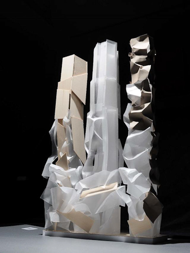
Later in the presentation Webb flashed the image below of a recent model, as he did at the OCAD University announcement the previous week for the Princess of Wales Centre for Visual Arts, and stated "this is where Frank really wants to take the project", no doubt a confounding moment for those straining to understand how the expressive quality captured will translate to a finished building design. The idea is to create podiums with a unified design from which three towers emerge as if from clouds, each with a unique architectural identity.
Webb explained that at the AGO it was important to Gehry to relate that building to the smaller scale of the nearby residential houses, thus that design was scaled horizontally. In contrast, the firm is taking a different approach at this location, sited as it is amongst larger buildings. The team has been looking at how to integrate the scale of the historic city with what's coming in the future, a dilemma that any city builder wrestles with. Toronto has a lot of very tall buildings that are sprouting up right now, but according to Webb, the "interrelation with the street facade is really the key to this project." When studying the existing streetscape, the team identified two key readings: 1) the historic buildings of 4 to 5 storeys establish a lower datum line; while 2) the adjacent Lightbox and similarly tall buildings of 6 to 8 storeys establish a second datum line. The podium height of the new project takes its cue from that second level.
Gehry's office has had what Webb characterizes as vigorous conversations with City Planning about what the King Street 'wall' or 'edge' should be, and about how it should engage the sidewalk. Both sides are working to establish what the goals are for that frontage, in terms of accessibility, openness, and sidewalk width. A partial section through the site (image below) illustrates how the building meets the ground and gives one a sense of the generous sidewalk space that Gehry is trying to achieve. "We really think that the sidewalks need to be widened from what's currently 3-3.5 metres up to 6 metres in some areas so we intend to push the building façades back." The section exceeds City standards in terms of providing an adequate pedestrian zone, a planting zone, as well as additional area which is intended to be used as public gathering space, including restaurant spill-out.
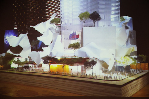
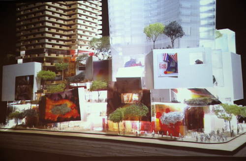
It's this all-important podium that, as Webb describes, "creates edges of the public realm, which creates the cityscape, and which in turn creates neighbourhoods". The strategy that Gehry is taking is to "create a very landscaped and terraced podium to this building. It starts at the street edge and—moving up the building—at the level of the first datum, the building begins to step back, terracing the façade and creating outdoor spaces. We're trying to create a multi-level environment with a lot of public use. The ground level is mainly retail and restaurant spaces, and those public spaces will step up across the terraces, bringing people higher up into the building. Instead of being a single layer of public uses, we're expanding it vertically."
"We intend to undulate the building façade back and forth so that it's not just a straight, street wall, but it has some relief to it and has pockets where restaurants are expected." The images below are of gestural models used by the firm as a starting point to understand the architectural flow and movement of the building. "The intention is to create a lot of transparency, colour, graphic, and excitement."
When it was first revealed in the fall, the model above ellicited some groans from those who misunderstood its intent and were not able to see beyond what they perceived as "toilet paper" adorning it. In the model below a potential treatment of the podium is more developed. Webb expects many more models will be created before a final plan is formulated.
Webb emphasized that although the models do not represent a finished design, the interior designs are further along than a massing study. They have been worked out very carefully in terms of structure, elevator core servicing, and even preliminary suite layouts.
Webb walked the audience through the floor plans, beginning with the ground level plan, pictured below. "Our intent is to activate all four sides of the site." Instead of merely relying on bustling King Street, the team feels there are advantages to putting retail frontages on the more intimate side streets as well.
Below, retail space is indicated in blue, while the residential lobby components, whose 'front door address' Gehry feels is more appropriately suited to the smaller streets, is orange. Loading and parking access is shown in brown, while commercial office entry areas appear in red. OCAD U's entrance, shown in yellow, is on Duncan Street, the school's main south campus artery, while direct street access to the Mirvish Collection is indicated in green from Pearl Street.
The podium itself is 6 storeys in height and retail and restaurant spaces wrap the lower 3 floors. Creating a diagonal connection through the project site between King and John streets is a public arcade access that will climb from street level via stairways and escalators, and culminate on the 3rd floor. The street level lobbies to the upper level retail areas are indicated in light blue in the image above.
Level 2 is programmed with more retail and an atrium space that connects to the floor below. In addition, a restaurant with terrace is envisioned on the NW corner, overlooking what the City is planning as the 'John Street Cultural Corridor.'
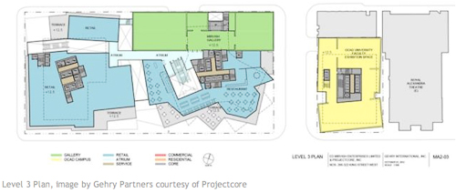
Active public uses and landscaped south-facing terraces continue on the 3rd floor, with the first section of the extensive, 3-storey Mirvish art collection, also beginning here. OCAD U’s expanded facilities, organized on two floors in the Phase 1/easterly tower, include a faculty exhibition space here on level 3, and the art instruction and studio space on level 4.
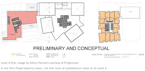
Some commercial office space is planned for the podiums on levels 4, 5, and 6, and it can be seen in red above and below. The Mirvish Collection galleries continue on these levels as well.
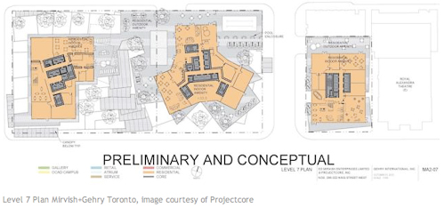
A residential terrace, with outdoor amenity and garden space of varying sizes and orientations, are provided on top of both podiums at the 7th level. Residential indoor amenities, which can open to the exterior, are also situated here. Condominium units rise on the floors above, with the towers at 82, 84, and 86 storeys. The unit count is approximately 2700, but that will likely change as the layouts are developed, and around 300 parking spaces are currently proposed.


