architecture
World Architecture News Awards include Big Wins for TO and Canada /
(This is an article I wrote for UrbanToronto) World Architecture News (WAN) recently announced the winners of the Retail and Leisure Interiors Awards 2012, the most illustrious interior awards around the globe. Whittled down from a bevvy of outstanding international submissions were a number of projects with a Toronto or Canada connection, representing a high percentage of the overall awards. Yay!
Project entries were divided into three distinct categories: Hotels and Service Retailers; Restaurants & Bars; and Retail Outlets (under 200sqm/over 200 sqm). Judges convened in London to select the winners based on the following criteria: "design excellence, originality, quality and mostly, the ability to communicate the historical aspect of a site through its decor.
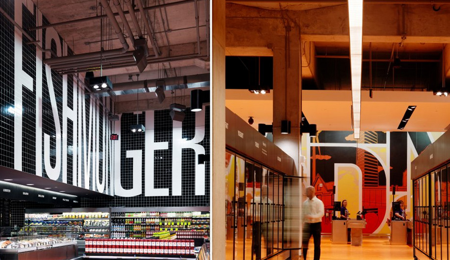
Taking 1st prize in the category 'Retail outlets over 200sqm' was the transformation of Maple Leaf Gardens, the former home of the Toronto Maple Leafs, into an urban food store and gastronomical mecca for the Loblaws grocery chain. Collaborating with Toronto’s Turner Fleischer Architects, the Aussie firm Landini Associates, who specializes in graphics, strategy and branding, animated the cavernous interior of what was once Toronto's most iconic sporting venue with bright hues of red and orange and larger-than-life typography. The building's history is celebrated through an integrated design approach that incorporates elements from its past: stadium lighting, murals, and a 12m x 12m Maple Leaf sculpture of old stadium chairs. Landini Associates won the big prize and then some, matching the client's initial request of “world's best food store” by creating a hub "Super" "Market" that not only seeks to engage the local community but draws visitors from far and wide.
Other wins didn't come for Toronto locations, but two more Toronto-based firms did very well.
In the category 'Restaurants & Bars', Toronto firm Yabu Pushelberg, known internationally for creating luxurious and refined interiors, won for the grand reopening of the legendary Pump Room restaurant in Chicago. The firm partnered with celebrated New York hotelier Ian Schrager in the re-imaginging of the Ambassador East as chic modern Public Hotel on Chicago's "Gold Coast."
Juxtaposing classic and modern elements, Yabu Pushelberg reinvented the Pump Room, capturing the glamour of the venue's celebrity-filled past and historic club-like atmosphere. The new interiors are striking: a neutral palate dominated by more than 100 hanging celestial resin orbs, bleached-oak tables, and swanky leather chairs. Just as the iconic space was revisited so was the menu, its original classics recreated by world-renowned chef Jean-Georges Vongerichten.
On the shortlist with no lack of accolades is the Joe Fresh New York City Flagship by Toronto interior design firm Burdifilek. The launch of the Canadian retailer into the U.S. market wowed the jury with a showroom that takes over two floors of an historic bank building at the corner of 5th Ave and 43rd St. It's a dazzling sight inside and out, an airy glowing interior showcased through SOM's iconic 1950s glass façade.
In order to protect the historic features of the modernist building—once-dubbed the “Crystal Lantern” by Lewis Mumford—none of the shop fittings were drilled into the floor, walls or ceiling. Instead, the design provides for custom free-floating wardrobes crafted from white, powder-coated metal with sandblasted Lexan panels that can be easily reconfigured by Joe Fresh’s merchandising team into vignettes. The wardrobes seamlessly incorporate monitors, mirrors or backlit billboards to feature clothing and accessories. Joe Fresh bold-coloured urban fashions stand out against the all-white interiors, much like the brand's clean aesthetic.
There is design life in Canada unconnected to Toronto, and an instance of it in Quebec has also landed a major prize.
Hôtel La Ferme by Montreal-based architectural firm Lemaymichaud took home 1st prize in the 'Hotel & Service Retailers' category.
This contemporary take on country hotels in Baie-Saint-Paul impressed the judges with its efforts to preserve the site's colour and authenticity by emphasizing 'craft' and 'local': locally-sourced materials and items, and the showcasing of artisans' work. La Ferme includes barn-inspired wood elements throughout and, fanned out across five pavilions, its 145 rooms and lofts feature various types of rooms with distinct personalities, from railway-themed sleeping quarters with pull-down beds to botanically-themed décor alluding to the site's past vocation in agriculture. The design pairs modern pieces against woven traditions of old, capturing the charm of the Charlevoix region and telling the story of the historic setting.
Architect Craig Webb expands on plans for Mirvish+Gehry Toronto /
(This is an article I wrote for UrbanToronto) Close to five months since UrbanToronto first broke the story of the extraordinary Mirvish+Gehry development plan for Toronto's Entertainment District, a second public consultation regarding the proposal was held on the evening of Tuesday February 19th at Metro Hall. Hosted by Ward 20 Councillor Adam Vaughan, on hand to give details and answer questions were Craig Webb, representing architect Gehry Partners, Peter Kofman representing developer Projectcore, and owner of the site and driving force behind it, theatre impresario and art collector David Mirvish.
Prior to the presentation, the public had an opportunity to view schematic floor plans, sections, elevations, and a scale model of the proposal within the context of the neighbourhood. Where the first consultation in December introduced the proposal to the public and recorded the resultant concerns of those in attendance, in this meeting Craig Webb opened with a far more detailed account of the plans for the development as they currently stand. He was accompanied by members of the technical team from Gehry Partners and developer Projectcore.
Webb began by expressing the firm's excitement to be working in Toronto again, four years after the completion of the addition to the Art Gallery of Ontario (AGO). Webb reminded the audience of Gehry's subsequently reawakened connection to his hometown and his continued desire to create projects of significance to the city. To provide a glimpse of the working process, Webb showed Gehry's first loose sketch of his vision revealing three towers as very sculptural forms rising from a combined base.
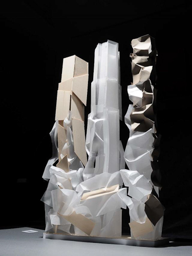
Later in the presentation Webb flashed the image below of a recent model, as he did at the OCAD University announcement the previous week for the Princess of Wales Centre for Visual Arts, and stated "this is where Frank really wants to take the project", no doubt a confounding moment for those straining to understand how the expressive quality captured will translate to a finished building design. The idea is to create podiums with a unified design from which three towers emerge as if from clouds, each with a unique architectural identity.
Webb explained that at the AGO it was important to Gehry to relate that building to the smaller scale of the nearby residential houses, thus that design was scaled horizontally. In contrast, the firm is taking a different approach at this location, sited as it is amongst larger buildings. The team has been looking at how to integrate the scale of the historic city with what's coming in the future, a dilemma that any city builder wrestles with. Toronto has a lot of very tall buildings that are sprouting up right now, but according to Webb, the "interrelation with the street facade is really the key to this project." When studying the existing streetscape, the team identified two key readings: 1) the historic buildings of 4 to 5 storeys establish a lower datum line; while 2) the adjacent Lightbox and similarly tall buildings of 6 to 8 storeys establish a second datum line. The podium height of the new project takes its cue from that second level.
Gehry's office has had what Webb characterizes as vigorous conversations with City Planning about what the King Street 'wall' or 'edge' should be, and about how it should engage the sidewalk. Both sides are working to establish what the goals are for that frontage, in terms of accessibility, openness, and sidewalk width. A partial section through the site (image below) illustrates how the building meets the ground and gives one a sense of the generous sidewalk space that Gehry is trying to achieve. "We really think that the sidewalks need to be widened from what's currently 3-3.5 metres up to 6 metres in some areas so we intend to push the building façades back." The section exceeds City standards in terms of providing an adequate pedestrian zone, a planting zone, as well as additional area which is intended to be used as public gathering space, including restaurant spill-out.
It's this all-important podium that, as Webb describes, "creates edges of the public realm, which creates the cityscape, and which in turn creates neighbourhoods". The strategy that Gehry is taking is to "create a very landscaped and terraced podium to this building. It starts at the street edge and—moving up the building—at the level of the first datum, the building begins to step back, terracing the façade and creating outdoor spaces. We're trying to create a multi-level environment with a lot of public use. The ground level is mainly retail and restaurant spaces, and those public spaces will step up across the terraces, bringing people higher up into the building. Instead of being a single layer of public uses, we're expanding it vertically."
"We intend to undulate the building façade back and forth so that it's not just a straight, street wall, but it has some relief to it and has pockets where restaurants are expected." The images below are of gestural models used by the firm as a starting point to understand the architectural flow and movement of the building. "The intention is to create a lot of transparency, colour, graphic, and excitement."
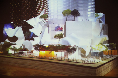
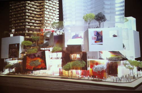
When it was first revealed in the fall, the model above ellicited some groans from those who misunderstood its intent and were not able to see beyond what they perceived as "toilet paper" adorning it. In the model below a potential treatment of the podium is more developed. Webb expects many more models will be created before a final plan is formulated.
Webb emphasized that although the models do not represent a finished design, the interior designs are further along than a massing study. They have been worked out very carefully in terms of structure, elevator core servicing, and even preliminary suite layouts.
Webb walked the audience through the floor plans, beginning with the ground level plan, pictured below. "Our intent is to activate all four sides of the site." Instead of merely relying on bustling King Street, the team feels there are advantages to putting retail frontages on the more intimate side streets as well.
Below, retail space is indicated in blue, while the residential lobby components, whose 'front door address' Gehry feels is more appropriately suited to the smaller streets, is orange. Loading and parking access is shown in brown, while commercial office entry areas appear in red. OCAD U's entrance, shown in yellow, is on Duncan Street, the school's main south campus artery, while direct street access to the Mirvish Collection is indicated in green from Pearl Street.
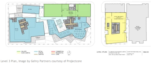
The podium itself is 6 storeys in height and retail and restaurant spaces wrap the lower 3 floors. Creating a diagonal connection through the project site between King and John streets is a public arcade access that will climb from street level via stairways and escalators, and culminate on the 3rd floor. The street level lobbies to the upper level retail areas are indicated in light blue in the image above.
Level 2 is programmed with more retail and an atrium space that connects to the floor below. In addition, a restaurant with terrace is envisioned on the NW corner, overlooking what the City is planning as the 'John Street Cultural Corridor.'
Active public uses and landscaped south-facing terraces continue on the 3rd floor, with the first section of the extensive, 3-storey Mirvish art collection, also beginning here. OCAD U’s expanded facilities, organized on two floors in the Phase 1/easterly tower, include a faculty exhibition space here on level 3, and the art instruction and studio space on level 4.
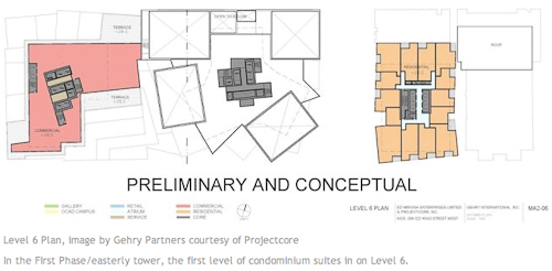
Some commercial office space is planned for the podiums on levels 4, 5, and 6, and it can be seen in red above and below. The Mirvish Collection galleries continue on these levels as well.
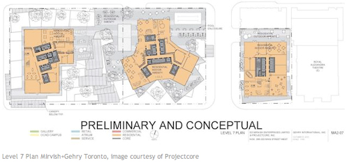
A residential terrace, with outdoor amenity and garden space of varying sizes and orientations, are provided on top of both podiums at the 7th level. Residential indoor amenities, which can open to the exterior, are also situated here. Condominium units rise on the floors above, with the towers at 82, 84, and 86 storeys. The unit count is approximately 2700, but that will likely change as the layouts are developed, and around 300 parking spaces are currently proposed.
Heritage Architect Julian Smith on ‘Re-imagining the historic urban landscape’ /
“What gives a physical place meaning? How do we decide which historic sites are culturally significant?” Cultural Landscape theory is an attempt to provide new answers to these often-debated questions. It emphasizes that the traditional distinction between the physical and the cultural landscapes is an artificial one and that nature and culture should not be seen as conflicting but rather as part of an all-encompassing ecosystem, a vision not unlike that held by indigenous communities. In such a view, human habitats display the diversity and richness of their different cultural subgroups and achieve a sustainable equilibrium with their environment.

As part of an ongoing series of talks, Toronto’s Centre for City Ecology recently invited leading heritage architect and educator Julian Smith to give a lecture entitled ‘Re-imagining the historic urban landscape ’ in which he explores the meaning of cultural landscape and how we create it in our communities. Smith has established an international reputation for his work in the conservation, restoration and adaptive reuse of historic properties, and cooperates with UNESCO and the World Bank, but his most challenging role is as Executive Director at Willowbank, an educational institution “at the cutting edge of a global shift towards a more ecological and sustainable approach to heritage conservation.”
Willowbank promotes cultural heritage and emphasizes the apprenticeship tradition (hands-on craft skills). In addressing Willowbank’s approach to the historic urban landscape, Smith prefaces with the distinction between historical landscapes, which have prior historic significance and can be observed, and cultural landscapes, which exist in the cultural imagination and have to be experienced to be understood.
Smith summarizes a 300-year history of motivations for Conservation into four biases: Antiquarian – the archaeologist spins great stories about culture from physical remnants of earlier civilizations; Commemorative – the historian protects and tells the story of the historic place through reconstructions or ‘stage sets’; Aesthetic – the architect/architectural historian recreates heritage vocabulary (think Colonial Williamsburg-inspired wallpaper); and, most recently, the Ecological bias that emphasizes a more holistic view of the interconnectedness of buildings/landscapes/artefacts as way of understanding the world whereas earlier biases expressly used the ‘object’ in isolation. This 21st century approach is based on the notion that artefact and ritual come together to create cultural reality.
When we talk about how communities understand place we are dealing with perceived realities, which consider the cultural landscape, not actual or physical reality, i.e. GIS map. Rituals map the city. Case in point: everyone in the audience was instructed to map a small common section of Toronto (an exercise Smith often has students do). The results typically demonstrate that when people think of cities, they plot their rituals, such as commute, festivals, or processions.
“One of the great things about cities is that you can have cultural landscapes that overlay each other and multiple cultural realities existing in the same place.” Smith cites a number of local examples of these places of overlap which frequently are the most fascinating parts of cities: Boulevard St. Laurent, a commercial and multicultural artery in Montreal; or, Kensington Market, a distinctive neighbourhood in downtown Toronto with an unpretentious, bohemian-esque vibe. In the latter’s case, nothing evolved according to planning principles but was rather the result of a pattern of (illegal) unregulated activity and that is precisely what gives this area its vitality. Smith thinks this part of the city deserves recognition as a cultural landscape that overrides both the province’s Planning Act and Heritage Act and needs to be protected as such.
Smith highlights Evergreen Brickworks, an innovative multi-use community environmental centre housed in a series of heritage buildings that successfully blur the boundaries between public and private spaces. He argues that architects/planners have been limited by architectural constraints or relied too long on property lines and rights when thinking of how we occupy the city. “Planners are still groping with what it means to lose those distinctions. Our approach has become so aesthetic and commemorative,” says Smith. “You have to maintain cultural landscapes of city layered on top of each other (otherwise you gentrify).” We need creative thinking; a dynamic definition of cultural change; and, to allow the evolution of buildings and places with contemporary layers such that they are in harmony, and not just freeze them in historic settings.
This type of discussion is particularly interesting for a dynamic environment like Toronto that is growing and changing at a rapid pace by virtue of the constant influx of people. It seems that only by integrating commerce, culture and community can we achieve a balance between urban growth and quality of life on a sustainable basis. The Centre for City Ecology, whose mandate is to “raise levels of urban literacy so that ordinary Torontonians can join in a robust conversation about city building,” engages the community to create meaningful spaces for a more liveable city. It hosts lectures at the Urbanspace Gallery at 401 Richmond St West, a heritage building providing spaces for the creative sector.
For more information on the lecture series, check the CCE's website http://www.cityecology.net/. Click here to see the video of Julian Smith’s November 14 presentation.
Glass Masters /
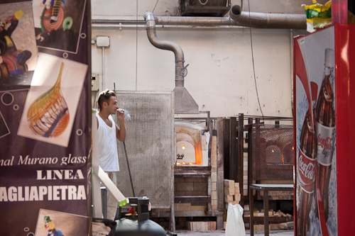
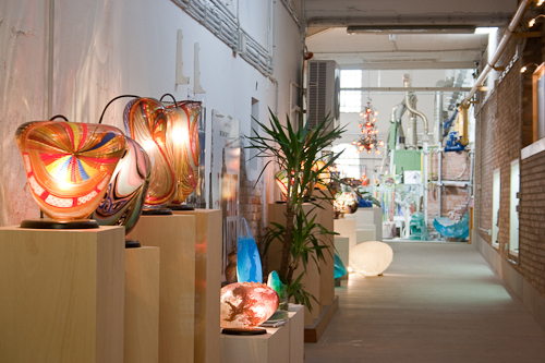
The glass master forms the shape by swinging an amorphous ball of glowing matter through the air, transforming it into a swirl of colour ultimately bound for the annealing kiln. Working demonstrations provide visitors with a glimpse of new manufacturing practices as well as ancient techniques used throughout Murano’s long glass-making history.

Visitors are quick to scoop up jewellery and tableware, and the occasional chandelier or mirror. But don’t be fooled – if it doesn’t say Vetro Artistico ®Murano, it’s not legit. Shopkeepers here are quick to point out that theirs are local products, not from China. (Imitation is rampant, particularly in Venice.) They display genuine goods bearing the original trademark, following stringent controls set forth by the Consorzio Promovetro whose intent is to “conserve and safeguard the island’s thousand-year-old artistic glasswork tradition, while promoting its marketing throughout the world.”
Beautiful examples of traditional, miniature, and contemporary glassware come from prestigious companies like Venini who feature the work of numerous Italian and international artists, and from studios and artisan factories of independent designers such as Carlo Moretti and Cesare Toffolo.
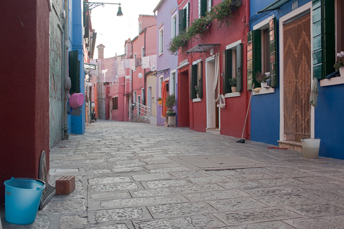
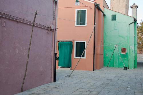
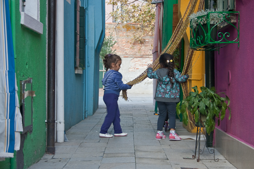
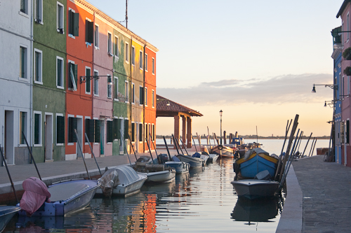
Murano is the largest of the islands in the Venetian Lagoon. The town plan is partly based on the unique morphology of Venice itself – it has nine islets joined by a long canal that weaves through. And just a vaporetto ride north is the tiny island of Burano, strung with brightly painted façades. Colour takes on a collective importance here. You’ve got to see it to believe it.
La bella Venezia /
Biennale : (re)visited /
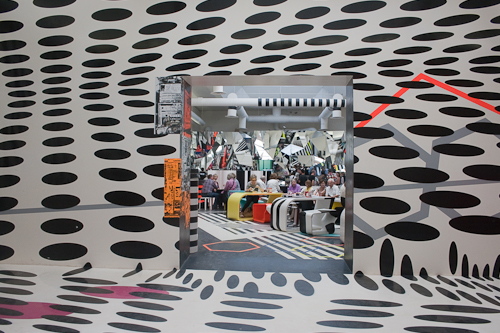
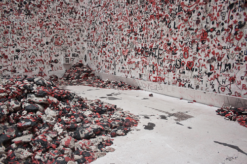
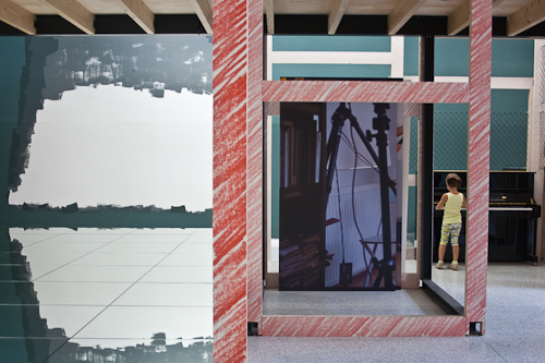
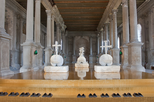
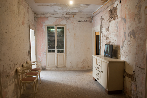
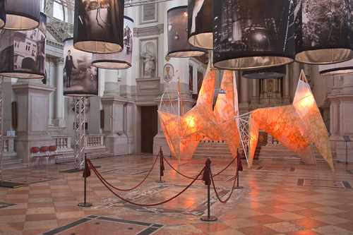
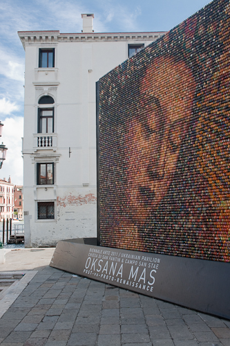
The 55th Venice Biennale 2012 takes place this summer, featuring the 13th edition of the International Architecture Exhibition, entitled Common Ground. In the spirit, here are some highlights from the Giardini and Arsenale venues of the 54th - International Art Exhibition, ILLUMInazioni.

Roma /
Walls of Dubrovnik /
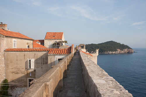
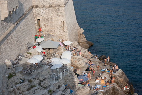
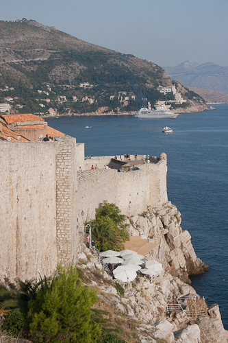
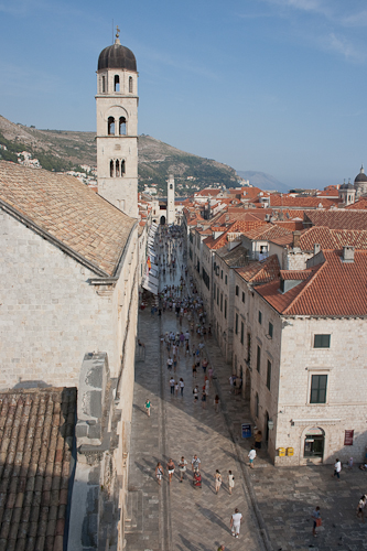
The historic walled city at the southernmost tip of Croatia is as exceptional from the ground as it is from the sky. Massive stone walls run high and low, encircling the Old Town of Dubrovnik and framing an uninterrupted course on the edge of the Adriatic Sea. Dotted with turrets and towers, the two kilometre-long climb reaches its peak at 25m, overlooking terracotta rooftops as far as the eye can see.
Though built during the Middle Ages, the Great Wall has been reinforced throughout its history, and remains remarkably intact. Some of its fortresses and defensive towers serve as jumping off points for bathers and are even used as bars. Having a nighttime drink on the cascading rock edge is a delightful sensory experience. It’s pitch black – just moonlight, candlelight, and the constant rhythm of the waves.

