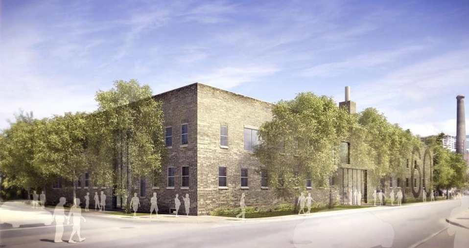
(this is an interview I did and an article I wrote for UrbanToronto) The adaptive reuse of 60 Atlantic Avenue by developer Hullmark will create 27,500sf of office space and 12,500sf of retail and restaurant space in a former factory in the heart of Toronto’s Liberty Village. In this 2nd part of a 2-part article, UrbanToronto’s Stephanie Calvet sat down with designer Caroline Robbie of Quadrangle Architects to discuss the interiors fit-out. Anchor tenant INVIVO Communications, an innovative company working at the intersection of science, biology and technology, will move into the top floor early next spring.
PART II: Q&A with Interior Designer Caroline Robbie:
Both the neighbourhood and this building itself have a history as a creative community. Are you collaborating with local artists and artisans in this project and if so, how?
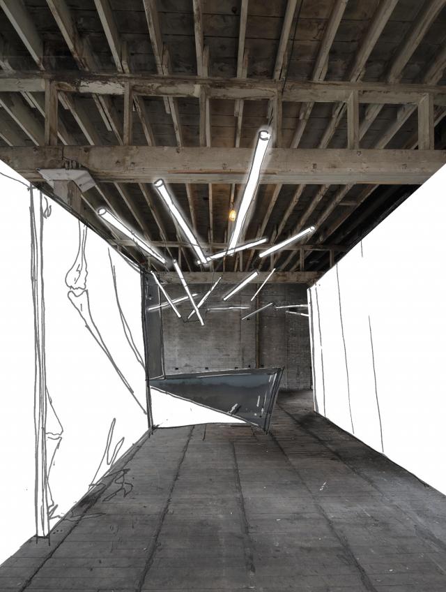
We try to bring an element of custom art into every project we do, whether it is internally generated through custom graphics or through collaborations with artists and industrial designers. The building’s history is being celebrated through a custom version of a Goads Fire Atlas illustration that will be used to film a glazed corridor. The original image was enhanced by our design team to highlight the building. While it is still in the design stage, artist Zac Ridgely is developing a custom feature light fixture for the INVIVO space.
I understand that Quadrangle uses part of its office space as a ‘testing lab’ for design services that it offers, such as investigations in graphics for frit patterns on glass. Have you done similar explorations that have benefitted this project?
We ‘mock-up’ new ways of manipulating images and materials in our studio on a regular basis. This helps not only determine construction methods but it lets us live with something for awhile and gain insights and opinions from the larger studio group. The Goads Fire Atlas film developed for the corridor has been mocked up for some time in a prominent circulation space in the studio.
In a previous interview you said, “buildings need to learn, grow, and change over their lifetime – it’s about adaptability and flexibility.” Does this building have good bones? Is it an example of what you call “durable architecture”?
The one constant in life is change so something as permanent as a building needs to be inherently adaptable. This building and Liberty Village are great examples of the reuse potential of Toronto’s industrial past. 60 Atlantic’s durability lies in its building quality as well as an ability to accommodate changing needs over its lifetime. The beauty of the interior space once extraneous elements were removed was remarkable. We have tried to touch it gently so that the bones are visible.
The following questions are specific to the interiors fit-out for INVIVO Communications, an interactive agency that provides innovative digital solutions – games and apps – to the global pharmaceutical and medical device industries.
The entire office’s lighting design strategy with, for instance, splayed linear tube lighting, is intriguing. What is the guiding concept behind it and what sort of imagery have you incorporated into the workspaces?
INVIVO has healthcare at the core of its purpose, but their culture is about innovation, animation and app development. The environment is definitely not clinical and we needed to respect their playful nature while providing an effective workplace that spoke to the nature of their business. The central design organizing principle is about white matter, the lesser known component of the central nervous system that consists of glial cells and myelinated axons that transmit signals from one region of the cerebrum to another and to other brain centres. White matter is a fine meshwork-like structure that we have referenced in the free-form lighting throughout the main circulation spine of the space.
As you juxtapose the old with new, the basic with the high-tech, what are the qualities that the interiors will evoke?
We hope that the most characteristic quality is of comfort. The mix of materiality and technology, linked through the energetic culture of INVIVO, will allow the space to embody the modern workplace.
Working in a sector where technology is constantly changing, a company like this one likes to stay on the cutting edge. How will that be reflected in the interiors? Which trends play a part in the design?
We tend not to follow trends but instead make sure we are paying attention to the influences on the businesses of our clients. Technology is such a key component of the business – it has played a big role in the planning. The IT department has been pulled out of a backroom and into the fulcrum of the studio. In our experience, technologies move too fast for us to think we can design to anticipate what will be needed so we defend open, unprogrammed space as it will allow the flexibility that will inevitably be needed.
Toronto is the North American base for medical illustration and INVIVO is one of the fastest-growing companies in the field. Just as there is a need for flexibility to update the ‘feel’ of the brand as it evolves, what sort of flexibility is there in the design of the physical space? Are there provisions for expansion?
There is growth potential on the floor within open office clusters and the overall space planning has incorporated enough balance between spaces for focus and spaces for collaboration that project flow is not inhibited by the design of the space.
Are there any specific technical (communication, wiring etc.) requirements that are appropriate for a company at the forefront that is constantly revolutionizing user experiences and that has a futuristic component?
There are no extraordinary technical components in the design other than to provide a very flexible power and data delivery system throughout the space.
Blue and green were integral colours to INVIVO since its beginnings and have always been part of the branding. Did you utilize the colours in the interior design of the office and if so, where?
No, we haven’t incorporated the branding colours as we are leaving the design of the space intentionally white as a background palette for the artwork that is created by the artists and developers at INVIVO.
Corporate giants like Google, with their unconventional workplaces, have embraced the idea that creative work environments help stimulate minds and inspire innovation. If you subscribe to the notion of a studio culture that allows the space to offer all varieties of collaboration, how do you go about making it happen?
Rather than try to force behaviours, it is better to allow people to hack space. We worked to ensure that the space has good light, great views, is comfortable and has the resources they need like wifi and power, in the right places. Once those elements are in place, companies dependent on innovation provide the right tools, which in turn allow their people to foster creative thought.
For efficiency, the base building design team (architectural, engineering and construction) is coordinating M&E systems with INVIVO directly for their use. How have you proceeded with the rest of the spaces considering the additional tenants have yet to be determined?
We have tried to ensure that base building systems like vertical shafts and electrical feeds are in unobtrusive positions while still providing coverage for flexible multi-tenant floor layouts.


