condo building

Live-Work Units by stephanie calvet

(this is an article I wrote for UrbanToronto) From a historical perspective, there is nothing groundbreaking about the live-work model. People have been living and working under one roof for centuries; think shopkeepers with their dwellings upstairs. Artists have built on that paradigm, transforming warehouses to accommodate the amenities of a home as well as open studio space to create and store finished artwork securely.

While commercial loft space – retrofitted with the necessary utilities – has always been a hot commodity amongst the creative community, the advent of live-work space has made the concept of living close to one’s work even more appealing, and – as developers realize – marketable.

This trend seems to fit well with our changing economy. With the recession many have shifted to self-employment, but more than that, the norms have changed. The stable, sequential career paths of a few decades ago are far less common, and a growing number of people work from home, facilitated by technology and online connectivity. Although many live-work spaces are marketed specifically towards retaining local, professional artists, the set-up gives greater opportunity to entrepreneurial residents. It describes a new take on an old idea.

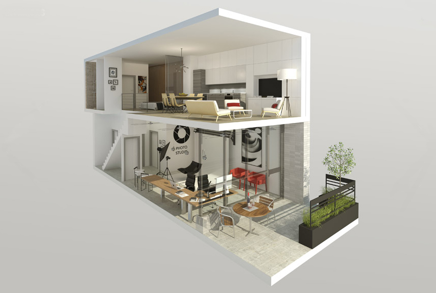
Interior Rendering

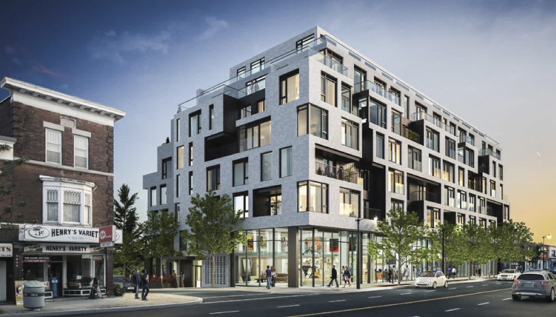
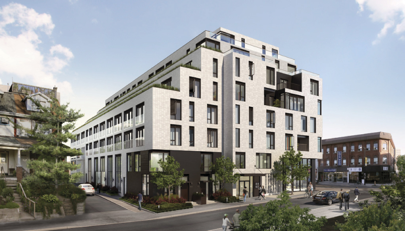
There are a number of facilities designed and built especially with a live-work purpose in Toronto’s building stock. One of the newest is DUKE, a mid-rise residential development by Quadrangle Architects for TAS in the retro Junction neighbourhood. The seven-storey structure will add 109 condos to the area, including five live-work units aimed at creative entrepreneurs.

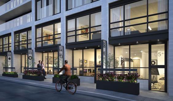
Street view of live-work units at DUKE Condos. Rendering courtesy of TAS.


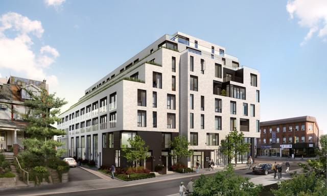
Southeast corner of DUKE Condo, designed by Quadrangle Architects for TAS.


While the building will turn its most animated face to Dundas Street West, featuring a mix of high-ceilinged retail shops at grade, located along the quiet laneway to the rear of the building, with south facing frontage, will be the 2-storey live-work units.

These suites are well suited to artists, designers, small business and anyone who needs a distinctive work address, with living quarters above.

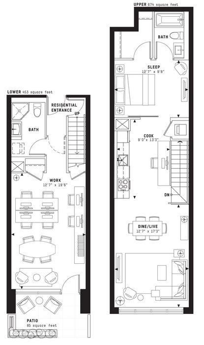
With direct access from the street, their lower level is designed such that the front can serve as a showroom or work area with a back section that has storage and a washroom.

Screen Shot 2014-05-06 at 9.22.23 AM


It is a reinvention of creative urban living where owners can conduct business during the day and return to their private quarters off-hours. The units are decently sized, averaging 1150sf with one model at 1548sf.  Each has a small patio at the front to provide a bit of privacy from the sidewalk.

image010


Also on offer are 2-storey townhomes nestled among the houses along Indian Grove – a more conventional living space for urban families.

Stephanie Calvet is an architect and a writer specializing in architecture and design. She can be found at www.stephaniecalvet.com

Totem Condos Stacks Up Well Against Average High-Rises by stephanie calvet

(this is an article I wrote for UrbanToronto) The poignant nature of the high-rise is to identify itself in the urban skyline. Toronto has developed a tall condominium vernacular of floor-to-ceiling glazing but if you ask many a Torontonian, the city is saturated with much of the same: the generic glass tower that does little to make a positive long-term contribution to the public realm.

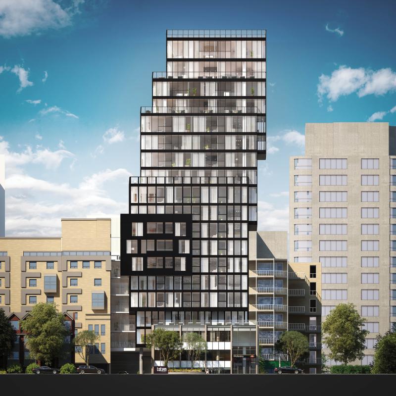
Totem Condos is a new residential building downtown by Worsley Urban Partners in conjunction with local architectural practice RAW Design. The 18-storey structure will house 120 units as well as a three-level below-grade parking garage with slots for cars and bicycles. The building has a very compact footprint and uses its space to the maximum, with very little left to waste.

Totem Condos, Worsley Urban Partners, RAW Design

RAW continues the evolution of the local condominium architecture with a proposal that sets itself apart from the rest. The building was conceived as a series of glass and dark steel framed boxes, carefully stacked. The eye is drawn skyward as the building’s geometry gently shifts left and right. Small blue ‘fins’ on the south elevation provide some additional visual interest, reflecting light in unique ways, and, when viewed from the interior, creating angled sightlines. In contrast to the sleek surfaces, stone cladding at the base provides texture where the building meets grade.

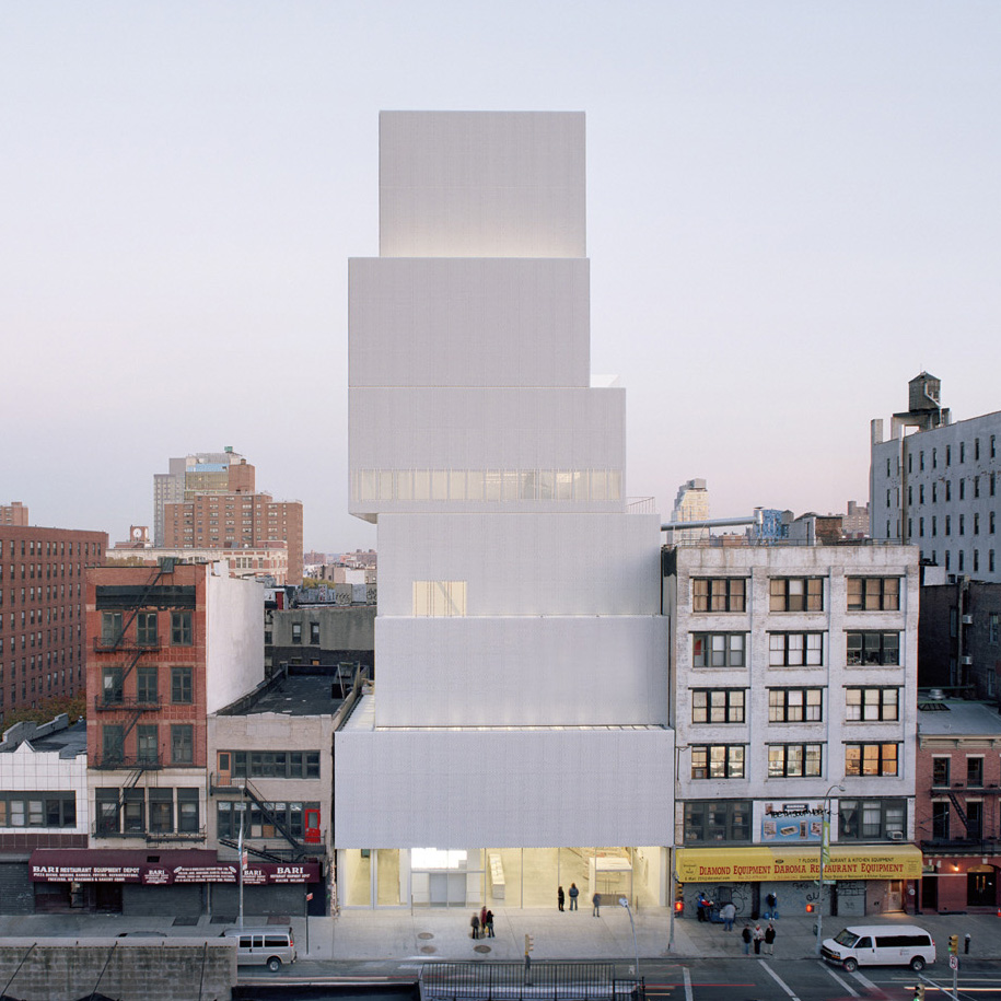
Lower Manhattan’s award-winning New Museum, a showcase for contemporary art and an icon of urban modernism, inspired the design. Taking cues from the block forms in its surroundings, the Museum stacks seven anodized aluminum mesh-clad rectangular boxes one on top of the other. The shifting of the boxes as they ascend yields a variety of open, fluid, and light-filled internal spaces and gives the building its dramatic shape.

New Museum of Modern Art, Hisao Suzuki, SANAA

The design firm responsible for the branding and marketing of Totem is The Walsh Group – and it’s not your typical ad agency. Under the creative direction of Shakeel Walji, the firm had a strong hand in influencing the built form. “We consult, direct the architect or interior designers working in conjunction with the developer to see what kind of look we want to create. It’s more of a collaborative effort between all parties involved and we like it that way because we feel the product is better, and we feel confident in moving forward in selling.” This sharing of creative control is not always welcome and can rub some team members the wrong way.

But Walji is quick to praise the building’s bold design, saying, “This is a better reading of a point tower in the city compared to most.” He refers to what he finds are all too similar forms in the skyline as a direct result of the need to comply with either mid-rise or high-rise guidelines, which he claims, limit innovation. His criticism is cutting. “The architects spend a lot of time developing the podium on which the building sits, take a coffee break as the building rises, and then there’s a cap at the top. Totem doesn’t have that reading at all.”

Totem Condos, Worsley Urban Partners, RAW Design

Totem is located in ‘the village’ on Dundonald, a leafy street lined with 2- and 3-storey Victorian homes that retains much of its early 20th century appearance as a residential subdivision northeast of Yonge and Wellesley. The site is currently home to the Commercial Travellers’ Association of Canada Building. The 2½-storey structure, built in 1956, was included on the city’s inventory of heritage properties in 2010, acknowledging the cultural heritage value of its Modern design, popular in post-war Toronto. Highly representative of the style, it features a grid of solids and voids with turquoise-hued glazed brick, travertine, aluminum and concreted cladding; façades are organized into bays where concrete piers divide tiers of strip windows with travertine spandrels and panels.

It is separated from the street by a small landscaped courtyard. The original structure will become the base of Totem, adding context, history and texture to the building’s design. Although the prevailing character of Dundonald is composed of low-rise buildings that make up the balance of the streetscape, the scale jumps up: immediately to Totem’s west is the 24-storey brick-clad Continental Tower apartment building from the early ‘70s. Behind it is 22 Condominiums, a glazed 23-storey residential tower at 22 Wellesley St. East by Peter Clewes of architectsAlliance.

Existing building on site of 17 Dundonald Street: Commercial Travelers Association of Canada Building

Although City Council has since overturned the office building’s heritage designation, large elements of its modernist façades will be retained and will inform the overall design of the development. Integrated into Totem’s base, the original building will be dismantled and re-built, while above, offset floor plates will cantilever at various levels.

“The City, the TTC (which owns adjacent land), the planners and councillor were very interested to see how we could make this building happen, how we could have a piece of architecture that we could all be proud of,” says Walji. “Our city needs more of this. We should keep elevating the things we offer.”

“When we have architects that develop buildings that are of some stature, that adds to the visual language of our cityscape. It will be more inviting, more tantalizing. NYC is a great example—every corner is like a little gem—it’s memorable.”

Totem Condos, Worsley Urban Partners, RAW Design

Building form aside, the amenities are pretty swish and, “above and beyond your basics,” notes Walji. The second level will house a gym, a private dining room, and a lounge/bar that opens onto a small exterior space for dining and BBQ.

A roof deck tops the tower and its programming provides the access to outdoors where the building’s mainly small recessed balconies fall short. Residents can enjoy a dining area and lounge with a fire pit and panoramic city views.

The building has a Walk Score of 100 and a large appeal of the location is the access to the Wellesley TTC station. Its street entrance is set in one of the four bays on the north façade, where the building's main entry was previously situated, under a protective angled canopy. Totem residents can walk through a secured passageway from the main floor lobby directly into the subway station. “This was the biggest selling feature used to entice brokers to investors and buyers”, says Walji “and it’s the first building in Toronto to have it.”

Totem Condos, Worsley Urban Partners, RAW Design

Stephanie Calvet is an architect and architectural writer based in Toronto. She can be found at www.stephaniecalvet.com

Mario Ribeiro of Triumph talks Howard Park Residences by stephanie calvet

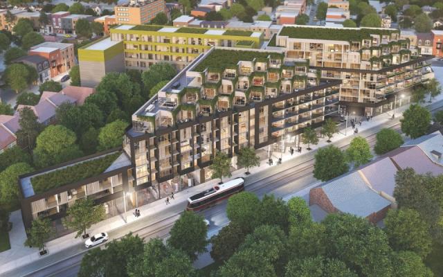
(this is an interview I did and article I wrote for UrbanToronto) UrbanToronto’s Stephanie Calvet sat down with C.E.O. Mario Ribeiro of Triumph Developments to talk about Howard Park Residences, an urban infill project at the intersection of Dundas and Howard Park in Toronto's Roncesvalles neighbourhood. The first phase, an 8-storey building (far right)   is under construction. Now the company is bringing its Phase Two western counterpart to the market. They will be joined by a multi-storey linking element, with the common entry and courtyard located between the two.

Looking north towards Howard Park Residences, Phases 1 & 2, image courtesy of Triumph Developments

7401374654_72c472c3d2_b

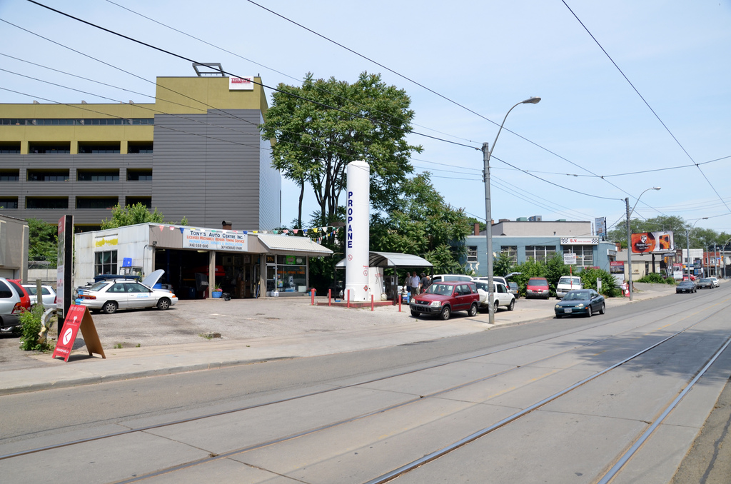
The site, with its odd triangular geometry, was previously home to a service station, aging garages and warehouses (see above). Removing these former industrial activities is an opportunity to tie eclectic Dundas and Roncesvalles Avenues, and to rethink the site as an active part of the public flow with a typology that combines high build density with a commercial program.

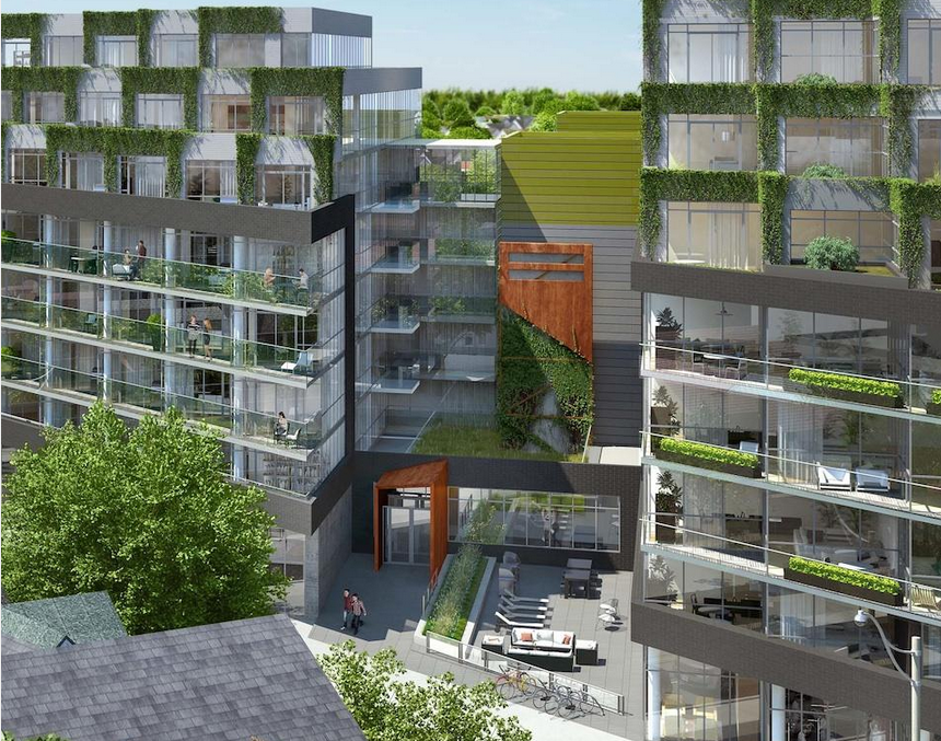
RAW Design, a local architecture firm with a portfolio of innovative mid-rise infill projects, crafted the buildings to the site and low-rise residential surroundings, breaking down the scale through massing and detailing. Vegetation that grows on each of its stepped metal terraces at the top floors imparts a softness to the elevation, inextricably part of the ‘look’ of the building that Triumph is committed to providing.

Linking element between Phase 1 (right) and 2 (left), image courtesy of Triumph Developments

The project required an amendment to the existing zoning by-law to convert it from industrial to residential and mixed use. How has the project been received by the community?

It was well received. We've had no community pushback and lots of support from planners and the councillor. The community asked if commercial space was possible and we integrated that idea into the design.

What sorts of establishments would you like to see occupying the first floor retail/commercial spaces?

We are not looking for large franchises. This is a trendy neighbourhood. We are subdividing the space and hoping to get a variety of small shops, a daycare, maybe a bookstore…

There is more than the typical mix of unit types here. Who is your intended end-user? Is there anything larger than a 2-bedroom plus den?

We have a vast array of styles catered to a lot of different tastes: units tailored to the young professional, units with patios, units for families, including 3- and 4-bedrooms... Our biggest unit is 1400sf. We also have five 2-storey townhomes.

Looking west towards Phase 2 at Howard Park Residences, image courtesy of Triumph Developments


What building amenity program did your team develop that, from your standpoint, is in line with what residents want and need, practically speaking?

Because of the nature of the neighbourhood, there are lots of local amenities within walking distance. To keep construction costs and condo fees down, we provide typical meeting rooms, lounge, a media room, and gym but no pool.

The base building is charcoal-coloured brick and glass and then at the 6th floor, there is a shift both in plan and in exterior cladding. What material is used for the remaining storeys?

It is metal cladding and it goes with the window system. It is also perforated to allow plants to grab onto it.

Incorporating vegetation on the façade will give the building a very interesting presence on the street and from afar. This amount of 'building green' is unprecedented in Toronto...

The cascading vines, green roofs and planters will be maintained by the Condo Board as part of the 'common area’, and not up to each individual owner to maintain. That will keep it looking uniform. There is no stormwater tank but water will be dealt with on site through a combination of stormwater management solutions.

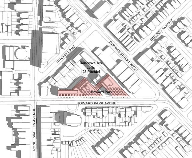
Relative locations of Howard Park and Roncesvalles Lofts by Triumph Developments

The site has access to transit (streetcar, subway, one of the stops of the new Union Pearson Express), lots of grade-level bike storage and a great Walk Score. What is the buildings’ parking ratio? Any provision for electrical vehicles?

The parking ratio is around 65-70% suites to parking stalls. At the moment, we’re seeing only 1 out of every 2 units asking for parking and the explanation is that the building is so well serviced by transit. On the other hand, bicycle spots are aplenty and they are in big demand. As for electrical vehicles, that is not final yet. In Phase 2, we provide storage lockers on the upper levels – so that residents have a locker almost across the hall. It became possible because we had to be creative in utilizing the oddly shaped resultant spaces in the core so we located storage lockers and services there.

It is great that parking and service access will be situated along the shared laneway off Howard Park Ave, making the lengthy (650') Howard streetfront more pedestrian-friendly and accessible for building, townhome and retail entries. Was it a challenge to locate it behind the building?

It might have been easier to situate it between the two buildings but it would have destroyed the look of the complex, and we didn’t want to interrupt the sidewalk. This way it’s off the laneway into Phase 1 and the parking garage under both buildings is all connected.

The building integrates many green initiatives: infill site, brownfield, green roofs, geothermal, stormwater, bike storage, etc. Are you going to take it through the LEED certification process?

Not LEED, although the plaque would look great on the wall! I’ve gone through the process as a trade on other projects and it is painstaking and very difficult administrating all the paperwork. We will comply with Toronto Green Standard Tier 2.

Looking west towards Phase 2 at Howard Park Residences, image courtesy of Triumph Developments

Incorporating geothermal systems (for heating and cooling) in condo building is not common practice in Toronto but the City gives government rebates and interest-free loans to help residential developers ‘go green’. Would you have incorporated it anyways because of the policy of your company or were government financial incentives necessary to make it reach the ROI you were expecting?

We didn’t get any government incentives. We started the process 3 years ago. Geothermal made economic sense in the long term because, if well implemented, it will save on the operation of the building.

Triumph has a keen focus on advancing and promoting sustainability, much like developers like TAS, Minto, and Tridel claim. Any market difference between them and yourselves?

Our scale of projects is smaller. The green initiatives on our buildings are maybe not as cost effective at this scale as Minto would do it. But we’re doing it because it’s the right thing to do – that’s the initial motivation – not for marketability reasons.

You have a European background. What aspects of European planning and design would you like to see inform building in Toronto?

Families living in mid-rise buildings is very common in Europe and we don’t see it as much here but I think there is a demand and a trend moving in that direction. I’d like to see buildings inserted into established neighbourhoods so families have access to amenities for their day-to-day, where they can can live and work close by, and people may even be able to go home for lunch. Large courtyard features, shared backyards, schools within walking distance, and several generations living in the same building – these are intimate living examples that I was familiar with. There is a sense of family and unity. We had these ideas in mind for our first project, Roncesvalles Lofts, and they continue to be valid for Howard Park. It is not a 25-storey structure; this is a place that makes sense to have an 8-storey building. It is a ‘community’ where you get to know your neighbours. The project will house 96 units – not a huge amount of people – and it is not intended to be transient with mainly short term rentals. Hopefully people move here and stay for a lifetime.

Stephanie Calvet is an architect and architectural writer based in Toronto. She can be found at www.stephaniecalvet.com

Toronto's Harmony Village Sheppard Offers Boomers Healthy Active Living by stephanie calvet

(this is an article I wrote for UrbanToronto) For some time now real estate and aging-related research experts have been predicting the massive sell-off of big homes by baby boomers seeking smaller quarters. With the kids out of the nest and retirement approaching, people are looking to simplify their lives and trim expenses, housing being the major one. This expected downsizing trend has yet to be reflected in national housing data, and many doubt it will become a large enough exodus to affect home prices. Boomers have solid reasons for moving from their existing home, however.

CEO of City Core Developments, Jack Pong, is confident of this demographic shift and his company’s new market research supports his theory. Their online survey polled 508 randomly selected Ontario homeowners 50 years of age and older who are considering purchasing or renting real estate, and it showed that 59 per cent are looking to downsize within 5 years. Top reasons cited were: reducing maintenance work, lowering the cost of living, moving to a smaller home, and increasing their ability to travel more. Many plan to tap home equity to help finance their retirement.

Rendering of Harmony Village Sheppard, image courtesy of City Core Developments

“This approaching wave of downsizing will further boost the condo market, especially for facilities that are offering the upscale comforts and lifestyle communities that Boomers will be demanding,” explains Pong. “This current survey confirms that this demographic places the highest importance on maintaining an independent lifestyle in an urban setting.”

Pong is the developer behind Harmony Village Sheppard, a residential complex planned for today’s baby boom and senior generations in Toronto’s Scarborough district. Now set for public launch, the Page+Steele/IBI Architects’-designed development will consist of two 33-storey towers joined by a shared four-storey podium structure at Sheppard and Warden Avenues. The feel is more traditional than "urban village vibe", and it is meant to promote an integrated community that offers comfort and convenience.

Living Wall at Harmony Village Sheppard, image courtesy of City Core Developments

The vision for the project as set forth by its developer was to reach the next generation of seniors by moving beyond what is currently available in the market, and exploring new opportunities to provide a life enriching environment. Harmony Village Sheppard offers a new approach to condo living and is designed to help residents sustain a healthy and physically and socially active lifestyle without having to leave home. The “age-in-place” concept provides a full range of amenities and services people need as they move toward retirement, including on-site home healthcare and full meal plans. Universal design concepts are also built into suites; think lowered light switches, raised electrical outlets, and easy-access shower entrances.

Restaurant at Harmony Village Sheppard, image courtesy of City Core Developments

The 35,000 sq. ft. indoor amenity space comprises: a state-of-the-art aquatic centre; multiple dining venues including a fine dining restaurant and cappuccino bar; entertainment room; library; and, full service beauty salon. On-site year-round leisure and event programming will offer a plethora of activities from art classes and cooking demonstrations to gardening and swimming. And, just as thoughtfully considered as the interior are the exterior spaces, coordinated by NAK Design Group, such as a lushly landscaped forecourt, Zen garden and community terrace where residents can enjoy rooftop planting beds.

Zen garden at Harmony Village Sheppard, image courtesy of City Core Developments

Stephanie Calvet is an architect and architectural writer based in Toronto. She can be found at www.stephaniecalvet.com

Sustainable Design a Key Component of DUKE Condos by stephanie calvet

(this is an interview I gave and article I wrote for UrbanToronto) Stephanie Calvet sat down with Michelle Xuereb, architect and sustainability strategist at Quadrangle Architects, to discuss the green aspects of DUKE Condo’s design. The mid-rise building, which takes its name from an amalgam of Dundas and Keele streets in The Junction, is under development by TAS.
indesign-project-duke_1

TAS has been trumpeting the lengths they are going to, to create a sustainable condominium building in Toronto's Junction neighbourhood since launching DUKE Condos last year. It is encouraging to see a developer raise the bar beyond what the building requirements call for.

For TAS, it is about building community, about being a good neighbour, and understanding there is a social, economic, cultural and ecological side to everything. TAS is motivated to build their business philosophy, outlined in their ‘Four Pillars of Sustainability’, into all of their projects.

Was the decision at DUKE to ‘go green’ to the degree that it is in anticipation of new energy efficiency regulations in the building code?

For this site, they have to comply with City of Toronto Tier 1 and the Green Roof Bylaw. Anything above that is their own initiative.

High window-to-wall ratios are a current condominium design practice in Toronto, a feature that seems market-driven, not rooted in energy performance. How do we reconcile that with the fact that significant energy savings are available in building envelopes with less glazing?

I think it is actually more developer driven, and also driven by economics. Putting up a window wall system is straightforward and quick – it makes everything happen faster. Sales took off on this building and it is not floor-to-ceiling glass. I believe you have to put something out there so people realize they want it. DUKE has a specific character and people are attracted to that – and the scale is right, the materiality feels good, and it is just standard materials: windows, brick, and some metal siding. It is quite simple but it is a different approach than just cladding in glass.

Which aspect of the building’s design do you think has the biggest impact in terms of sustainability? Through which methods did you assess net energy savings?

The envelope is key. It’s about getting window-to-wall ratio down— 40-50% is where you want to be—using the best glazing possible, and reducing thermal bridging as much as possible. The window will always be the weakest link in the building so the more you can shrink that aperture, the less heat you’re losing. At DUKE we’re using aluminum frames and the glazing is argon filled with a low-e coating. At Quadrangle, we design what we think is the right thing to do and we have to be asked to do less. We feel we have to lead that way. The bonus from the recent Toronto Green Standard changes is that it makes it a level playing field for all developers – everyone has to do this. We do energy modelling early in the process.

indesign-project-duke_5

There’s great citywide interest in local and organic food. DUKE’s south side terraces are being lined with built-in planters that can be used for home gardening. Are you ‘leading the way’ by incorporating this feature into the design or is it in response to social shifts and increased demand for urban agriculture in residential developments?

There are various non-profit organizations out there advocating food policy in buildings, trying to push legislation, trying to speak to developers about how to make food happen. We too are working with these companies to help promote and push these initiatives – for one, we put food production ideas in our renderings. There’s no reason your front garden can’t have edible food. And TAS has been doing it from their side as well. We are all hoping that it really takes off. And the planters came out of another reason as well: affording neighbours to the south some privacy by having the depth of this green buffer, rather than just a railing. When there are multiple reasons why an element makes sense, it’s likely to stay ingrained in the building, and not get value engineered out.

Standard suites include engineered hardwood flooring, water-conserving fixtures, energy efficient appliances, programmable thermostats, and Energy Recovery Ventilators (ERV) to reduce energy demands and enhance air quality. Have these innovations come down in price so that the developer can provide them as part of the standard offerings?

There are a lot of things that have become more standard, like low-VOC flooring or paint, and it has become a requirement to provide energy metering to each suite. ERVs haven’t really come down in cost – the additional ductwork costs everybody more – but TAS has elected to do this anyway because it’s about improving indoor air quality and it’s something they can market.

A total of 25% of the parking stalls will be equipped with an electrical outlet for plug-in and provisions were made for future energizing of the other spaces. Will you provide a central bank of dedicated charging stations? What does that mean for the electrical capacity of the building for each space to have the possibility of EV chargers? Why go this route instead of the (less costly) car-share option?

This is a goal of TAS’ to do this. At one point we had a car share vehicle space within the building but there’s enough within the neighbourhood. The way things are going in the future, it will become more and more economical to have a plug-in electric vehicle. People in North America are pretty attached to their individual car ownership. To provide infrastructure for people to have plug-in electric is about future-proofing the building. But as for how it’s specifically going to work at DUKE, whether they will run it to a panel that is individually metered, we haven’t finalized it yet.
indesign-project-duke_2

As per the city’s Green Roof Bylaw, certain % coverage of the roof is required to be a green roof, based on the building’s gross floor area. Which system will you provide at DUKE?

It will be a drought-resistant, low-profile, extensive green roof (vs intensive – where you can plant trees and shrubs). Probably a tray system. Green roofs raise your top of roof that much higher, so you have to be careful of how you distribute the heights because you lose potential area if the roof is too thick, plus you have to consider structure. There is always a trade-off.

The benefits of a green roof are multifold. Do you believe that in the near future, sky-gardens will become both desirable and inevitable as part of a growing cityscape?

I wish it would become more prevalent because we see it as a positive attribute. Right now, green roofs cost more money and the market isn’t necessarily looking for it, so we’re not there yet. And the Bylaw % requirements aren’t high enough in terms of how much you are obligated to provide for anything more than something quite basic, i.e. a low-profile extensive roof. If the developer wants to build a lot more, it’s just additional expense and if they can’t use it as a marketing tool, chances are they won’t opt to go that route.

How do you think we can best encourage that sustainable strategies be followed on all building projects, from conception through construction to furnishing?

There have to be financial incentives and legislation, otherwise it won’t happen, as well as the fact the City of Toronto itself has taken a leadership position on this: 15% better than the current building code. That level is really the 2017 version of the code. It’s those sorts of energy initiatives – being a certain percentage better than code – that have been happening at the municipal and the provincial level, which have been pushing the envelope.

There is always cost involved with change, i.e. change from traditional to sustainable construction practices. Consumer awareness about conservation and low impact development issues is key and people might be interested in ‘doing the right thing’, but when the rubber meets the road, they aren’t always willing to pay more. What could be the facilitating mechanism that will encourage consumers to make the extra effort for eco-friendly avenues knowing that payback will come later?

I’d say it’s the consumer, the purchaser. At the end of the day, it’s the cost per square foot, and they want to know they are getting a certain kind of countertop. Right now, what I’m hearing from marketing folk is that people don’t want to pay for ‘green’ initiatives, they think that the buildings should come with them. The green is just part of the story that people are expecting to see as opposed to it being an add-on, and having to pay more for it. To me what would be interesting would be a developer who would work really hard to bring those numbers (maintenance fees) down and the way to do that would be to provide an extremely durable building.  

Stephanie Calvet is an architect and architectural writer based in Toronto. She can be found at  www.stephaniecalvet.com
Nest Condos Adds Density and Vibrancy to Toronto's St. Clair W by stephanie calvet

(this is an article I wrote for UrbanToronto) The rising demand for urban life calls for increasing residential density. In Toronto, the Official Plan calls for much of the new development to be built along our main thoroughfares; it's called the Avenues plan. Developers and architects who are sensitive to context can create architecture that contributes in a meaningful way to the visual identity of these predominantly low-rise corridors. A growing number of innovative infill developments on Toronto's Avenues prove that mid-rise can be attractive and practical. Examples of this sort are popping up on Ossington, Queen (both East and West), King Street East, Dundas Street West, and so on.

urbantoronto-9448-33166

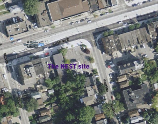
One such residential development coming to the market is called The Nest, by Toronto builder The Rockport Group. This 9-storey condominium block will anchor the southwest corner of St. Clair West and Hendrick Avenue in the city’s budding Hillcrest Village. On part of the site now stands a KFC wrapped by a swath of parking. We are happy to see that coming down.

A mature neighbourhood that dates back to the early 1900s, Hillcrest is populated with large turn-of-the-century homes and lush tree-lined streets. The area was originally a large estate known as Bracondale Hill until 1909 when it was divided up into an exclusive subdivision. These days, the established low-rise neighbourhood is popular for its parks, independent shops, cafés, supermarkets and streetcars along St. Clair Avenue. The Nest is the first significant new structure on this stretch of St. Clair since the rebuilding of the St. Clair streetcar line in 2010.

NestAerS900

The convenience of the new separate right-of-way for the streetcar is now attracting new retailers, restaurateurs, and residents alike. The Nest itself will contribute 10,000 sq ft of ground level retail to the street.

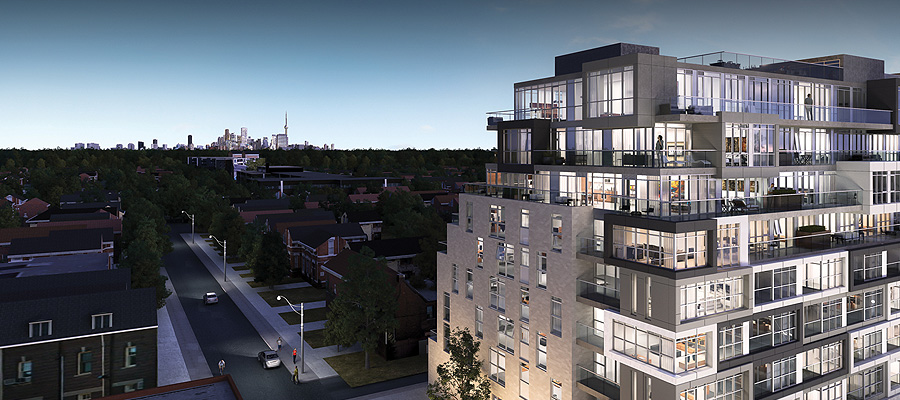
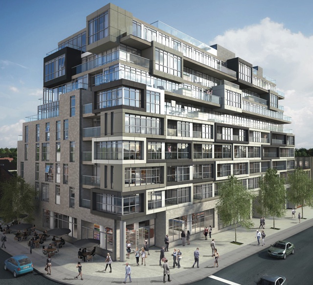
Designed by Toronto-based RAW Design, the building looks like an asymmetrical stacking of box upon box. The surface of the façade jogs in and out, with projecting bays clad in complementing shades of greys and white, and balconies or terraces strung in between. This interplay of volumes and voids creates a unique texture and spatial composition. From an interior perspective, the building’s layout forms units in a range of sizes and configurations - 48 different types amongst its total 123 suites, to be exact. Each has floor-to-ceiling windows to maximize sightlines and sunlight inside.

NestAerNWCrop800

Above the 5th floor, the structure begins to terrace back on the south side, providing suites with views looking towards the city skyline. North-facing residences overlook bustling St. Clair Avenue. The building is clad in brick and German-engineered glass-fibre reinforced concrete or ‘fibreC’, a sustainable product that evokes natural materials like stone, twigs and straw. Nearly every dwelling has private outdoor space, which varies in size, up to nearly 570 sq ft at the penthouse level.

NestSWAerDay640

For large gatherings, the building provides residents with communal multipurpose space on both the main and roof levels. “We like projects where we can create a community where people can feel at home,” said Jack Winberg, chief executive officer for The Rockport Group. A large, welcoming flex space on the first floor comprises a full kitchen, library and fireplace, opening onto an outdoor patio. Similarly, comfortable indoor amenity space on the rooftop is extended into what is envisioned as an ‘outdoor living room’ and provides plenty of lounge area and a built-in kitchen/BBQ station for multi-group entertaining. A green roof on the east side wraps the building to the south, softening the terrace’s edge.

NestAmen960

The builder partnered with local firms II by IV Design for the suite and common area interiors and Janet Rosenberg & Studio on the design of the landscaped portions.

NestRoof960

Rockport has taken an approach to whole-building sustainability in this project which exceeds the City’s Tier 1 Green Standards with various measures to help to decrease its carbon footprint, including: geothermal heat pump; insulated windows; energy efficient lighting; low-flow fixtures; and, individual suite metering for utilities consumption.

The Nest is interesting not just for its variety and inventiveness but its green initiatives. Perhaps this thoroughly modern, modestly scaled addition will serve as a model for the sort of development this city needs. With Nest and other similar buildings in the works, hopefully they will convince sceptics that intelligently designed mid-rise is a viable option in a growing city that has almost taken the term ‘vertical living’ to the extreme. Innovative infill urban communities such as this one add to the eclectic urban fabric that is Toronto.
Toronto's CentreCourt Developments’ Core Condos Step Onto The Scene by stephanie calvet

(this is an article I wrote for UrbanToronto) Core Condos is the latest addition to CentreCourt Developments’ portfolio of downtown residential towers targeting the urban professional. With INDX, Karma, and Peter Street Condominiums underway, Core Condos is another opportunity for those who want to live, work and play in the downtown core.

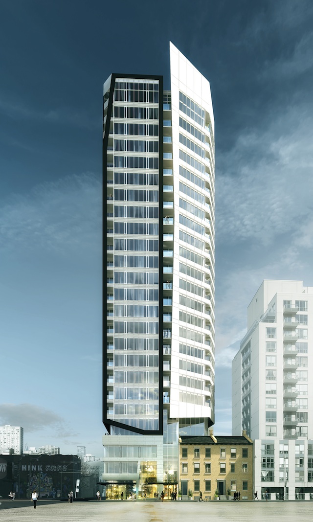
Core Condos Podium

The site for the new 24-storey tower is the northeast corner of Shuter and Dalhousie Streets, just blocks from the Eaton Centre, St. Michael’s Hospital and Ryerson University. It meets the developers’ corporate philosophy in two key aspects: in terms of location, it allows their demographic buyer to be in close proximity to work, transit and amenities; and secondly, in terms of value. “How we offer value proposition to the end consumer is really a combination of great design, both interior and exterior, and price point,” says Andrew Hoffman, president and founder of CentreCourt Developments.

The project went through several iterations until the City and the previous developer Queensgate reached an agreement on height and general massing. Queensgate continues on as a joint venture partner with a minority interest in the project but it is CentreCourt, who bought the land in November 2013, that is leading the development. Armed with a new vision—while still working within the building envelope parameters established earlier—it has partnered once again with Page + Steele / IBI Group Architects for the overall building design and with Cecconi Simone on the interiors.

CoreCondosExtW640

The tower exterior is divided into two components separated by an architectural slot, which helps to break down the massing. It is clad in curtain wall glazing and metal panel with skewed facets that are largely sculpted. The white, slightly taller element looks east while the western face is outlined with a defining black trim and interrupted by balconies. From a design standpoint, the building has a distinctive look that “suits the urban professional who wants something in terms of architecture that is modern and stands out from the rest,” says Shamez Virani, Vice President of CentreCourt Developments.

CoreCondosExtS640

The project will provide a total of 220 residential units ranging in size from 390 square feet to 775 square feet, a small commercial space at grade, and 84 parking spaces in a five-level underground parking structure. The building’s main residential entry will be located on Shuter Street and the retail entry and parking and service access will be situated on Dalhousie.

On the site currently are buildings numbered from 64 to 70 Shuter Street, listed on the City of Toronto's Inventory of Heritage Properties. According to the Heritage Impact Assessment prepared by E.R.A. Architects, two of the four existing buildings, 64 and 66, have undergone an “extensive remodelling of their exterior and interior” and as a result, will not be retained. The podium will incorporate a portion of the roof, two chimneys, and south façade of 68 and 70: a 3-storey, 19th century Georgian-style row house with buff coloured brick and limestone lintels and sills by architect John Tully, who also designed Walnut Hall, similar row houses which once stood further down the street.

64-70 Shuter Street

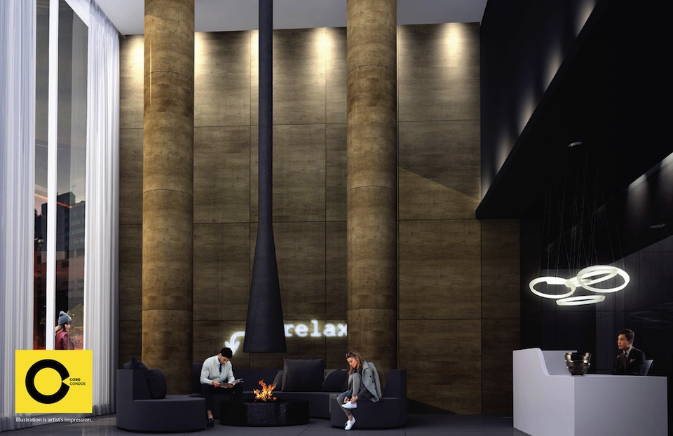
The team developed a building amenity program that, from its standpoint, is in line with what its end user, the young professional, wants and needs, practically speaking. Features such as pool and spa are replaced in favour of a large 3,000 square foot open-concept lounge space with café/bar, beanbag and hanging chairs where residents can “socialize and just kick back, outside of their suite,” adds Hoffman. A landscaped exterior terrace wraps the N, E, and W sides of the building, also at the fourth level. In the same vein, the ground floor lobby is a double-height space with fireplace and central seating that is intended to impress every time a resident enters/exits the building. Residents are likely to walk to work and to neighbouring amenities, as opposed to being more reliant on a vehicle.

Entrance lobby at Core Condos

Core Condos is currently in pre-development and will be launched for sale early this year.

Architect Craig Webb expands on plans for Mirvish+Gehry Toronto by stephanie calvet

(This is an article I wrote for UrbanToronto) Close to five months since UrbanToronto first broke the story of the extraordinary Mirvish+Gehry development plan for Toronto's Entertainment District, a second public consultation regarding the proposal was held on the evening of Tuesday February 19th at Metro Hall. Hosted by Ward 20 Councillor Adam Vaughan, on hand to give details and answer questions were Craig Webb, representing architect Gehry Partners, Peter Kofman representing developer Projectcore, and owner of the site and driving force behind it, theatre impresario and art collector David Mirvish.

Image

Prior to the presentation, the public had an opportunity to view schematic floor plans, sections, elevations, and a scale model of the proposal within the context of the neighbourhood. Where the first consultation in December introduced the proposal to the public and recorded the resultant concerns of those in attendance, in this meeting Craig Webb opened with a far more detailed account of the plans for the development as they currently stand. He was accompanied by members of the technical team from Gehry Partners and developer Projectcore.

Image

Webb began by expressing the firm's excitement to be working in Toronto again, four years after the completion of the addition to the Art Gallery of Ontario (AGO). Webb reminded the audience of Gehry's subsequently reawakened connection to his hometown and his continued desire to create projects of significance to the city. To provide a glimpse of the working process, Webb showed Gehry's first loose sketch of his vision revealing three towers as very sculptural forms rising from a combined base.

Image

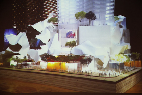
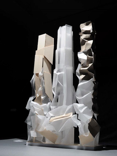
Later in the presentation Webb flashed the image below of a recent model, as he did at the OCAD University announcement the previous week for the Princess of Wales Centre for Visual Arts, and stated "this is where Frank really wants to take the project", no doubt a confounding moment for those straining to understand how the expressive quality captured will translate to a finished building design. The idea is to create podiums with a unified design from which three towers emerge as if from clouds, each with a unique architectural identity.

Image

Webb explained that at the AGO it was important to Gehry to relate that building to the smaller scale of the nearby residential houses, thus that design was scaled horizontally. In contrast, the firm is taking a different approach at this location, sited as it is amongst larger buildings. The team has been looking at how to integrate the scale of the historic city with what's coming in the future, a dilemma that any city builder wrestles with. Toronto has a lot of very tall buildings that are sprouting up right now, but according to Webb, the "interrelation with the street facade is really the key to this project." When studying the existing streetscape, the team identified two key readings: 1) the historic buildings of 4 to 5 storeys establish a lower datum line; while 2) the adjacent Lightbox and similarly tall buildings of 6 to 8 storeys establish a second datum line. The podium height of the new project takes its cue from that second level.

Gehry's office has had what Webb characterizes as vigorous conversations with City Planning about what the King Street 'wall' or 'edge' should be, and about how it should engage the sidewalk. Both sides are working to establish what the goals are for that frontage, in terms of accessibility, openness, and sidewalk width. A partial section through the site (image below) illustrates how the building meets the ground and gives one a sense of the generous sidewalk space that Gehry is trying to achieve. "We really think that the sidewalks need to be widened from what's currently 3-3.5 metres up to 6 metres in some areas so we intend to push the building façades back." The section exceeds City standards in terms of providing an adequate pedestrian zone, a planting zone, as well as additional area which is intended to be used as public gathering space, including restaurant spill-out.

Image

It's this all-important podium that, as Webb describes, "creates edges of the public realm, which creates the cityscape, and which in turn creates neighbourhoods". The strategy that Gehry is taking is to "create a very landscaped and terraced podium to this building. It starts at the street edge and—moving up the building—at the level of the first datum, the building begins to step back, terracing the façade and creating outdoor spaces. We're trying to create a multi-level environment with a lot of public use. The ground level is mainly retail and restaurant spaces, and those public spaces will step up across the terraces, bringing people higher up into the building. Instead of being a single layer of public uses, we're expanding it vertically."

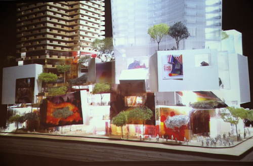
"We intend to undulate the building façade back and forth so that it's not just a straight, street wall, but it has some relief to it and has pockets where restaurants are expected." The images below are of gestural models used by the firm as a starting point to understand the architectural flow and movement of the building. "The intention is to create a lot of transparency, colour, graphic, and excitement."

Image

When it was first revealed in the fall, the model above ellicited some groans from those who misunderstood its intent and were not able to see beyond what they perceived as "toilet paper" adorning it. In the model below a potential treatment of the podium is more developed. Webb expects many more models will be created before a final plan is formulated.

Image

Webb emphasized that although the models do not represent a finished design, the interior designs are further along than a massing study. They have been worked out very carefully in terms of structure, elevator core servicing, and even preliminary suite layouts.

Webb walked the audience through the floor plans, beginning with the ground level plan, pictured below. "Our intent is to activate all four sides of the site." Instead of merely relying on bustling King Street, the team feels there are advantages to putting retail frontages on the more intimate side streets as well.

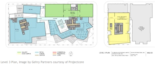
Below, retail space is indicated in blue, while the residential lobby components, whose 'front door address' Gehry feels is more appropriately suited to the smaller streets, is orange. Loading and parking access is shown in brown, while commercial office entry areas appear in red. OCAD U's entrance, shown in yellow, is on Duncan Street, the school's main south campus artery, while direct street access to the Mirvish Collection is indicated in green from Pearl Street.

Image

The podium itself is 6 storeys in height and retail and restaurant spaces wrap the lower 3 floors. Creating a diagonal connection through the project site between King and John streets is a public arcade access that will climb from street level via stairways and escalators, and culminate on the 3rd floor. The street level lobbies to the upper level retail areas are indicated in light blue in the image above.

Image

Level 2 is programmed with more retail and an atrium space that connects to the floor below. In addition, a restaurant with terrace is envisioned on the NW corner, overlooking what the City is planning as the 'John Street Cultural Corridor.'

Image

Active public uses and landscaped south-facing terraces continue on the 3rd floor, with the first section of the extensive, 3-storey Mirvish art collection, also beginning here. OCAD U’s expanded facilities, organized on two floors in the Phase 1/easterly tower, include a faculty exhibition space here on level 3, and the art instruction and studio space on level 4.

Image

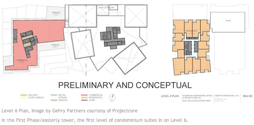
Some commercial office space is planned for the podiums on levels 4, 5, and 6, and it can be seen in red above and below. The Mirvish Collection galleries continue on these levels as well.

Image

Image

Image

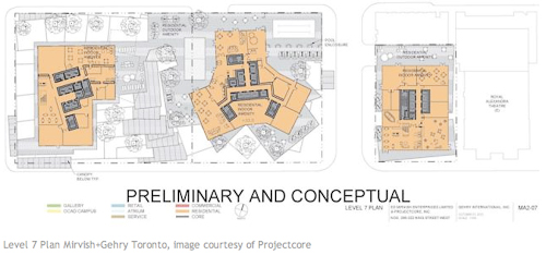
A residential terrace, with outdoor amenity and garden space of varying sizes and orientations, are provided on top of both podiums at the 7th level. Residential indoor amenities, which can open to the exterior, are also situated here. Condominium units rise on the floors above, with the towers at 82, 84, and 86 storeys. The unit count is approximately 2700, but that will likely change as the layouts are developed, and around 300 parking spaces are currently proposed.

Webb ended his presentation saying "When we started the project, David Mirvish asked Frank to create three great sculptures for the skyline of Toronto. That's what we intend to do. We're not there yet but we're going to rise to the challenge."