Manhattan's Hudson River Park by stephanie calvet

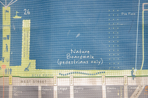
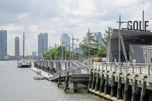
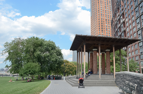
On a recent trip to NYC, I saw wonderful urban planning strategies at Hudson River Park. It offers a huge variety of recreational activities and landscaped public spaces throughout its 550-acre footprint and sets a useful precedent for the ongoing development of Toronto's waterfront. Canada's largest city's skyline has been rapidly changing, in part due to a blitz of condo construction. Guided by Waterfront Toronto, the city has spent billions to revitalize a once heavily industrial lakefront and transform it into beautiful and sustainable new communities and parks. Now a private entity is proposing to expand a small inner-city island airport on the waterfront through jet aircraft and extended runways, paving 500m into the harbour and Lake Ontario.

Below are images of Hudson River Park in NYC. I imagine what the area would look like with an airport disgorging thousands of passengers per day. I think of its impact on neighbouring communities and services, on cultural activities, and on the quiet enjoyment of the waterfront by citizens and visitors alike. Alarming.

Manhattan

Manhattan-2

Manhattan-10

Manhattan-2-2

Manhattan Waterfront

Manhattan-3-2

Manhattan-3

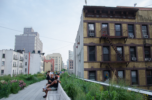
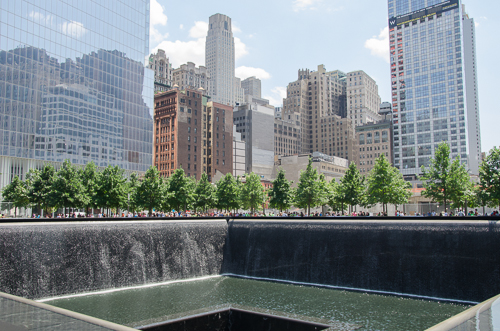
Public spaces like the High Line and the 9/11 Memorial grounds are well worth a mention, and a visit, as well.

Manhattan-11

Manhattan-4

The Freedom Tower

9/11 Memorial

Developer Ken Tanenbaum Talks about Toronto's Pan Am Athlete's Village by stephanie calvet

A takeaway from past Olympic Games’ host cities that spent big in a short burst of activity for the temporary event is a prescient reminder of the potential that well integrated planning for long-term transit and urban regeneration can bring. Toronto now has that same rare opportunity: the city is hosting the 2015 Pan Am/Parapan Am Olympics next summer. While it is relying on mainly existing infrastructure throughout southern Ontario for the sporting venues, an entirely new development is being built just east of downtown to house the 10,000 athletes and officials. I recently met with Kenneth Tanenbaum, Vice Chairman of the Kilmer Group to discuss the Athletes’ Village. Revitalization plans will transform the former industrial site into a mixed-use community with affordable housing, condominiums, a YMCA and a dormitory for George Brown College students, branded post-Games as ‘Canary District’.

A version of this post appeared in the June 30th edition of UrbanToronto.    

Site plan of 2015 PanAm/Parapan Games Athletes’ Village (Canary District)

Tell us how it is that Toronto is about to get a new Athletes' Village and then a new neighbourhood in this former industrial area at the mouth of the Don River.

The genesis of the West Don Lands Pan Am Athletes Village and Canary District really begins with the government of David Peterson in the mid-1980s, which expropriated this land in the Downtown East with a view to allowing the city to grow in this direction. The market and environmental conditions of the site were such that the land sat derelict more or less for 25 years until a moment in time when forces converged with the Pan Am Games being announced, and Waterfront Toronto’s planning mandate was able to finally execute the vision that Peterson’s government had.

How did Dundee and Kilmer collaborate towards this proposal?

Kilmer has been in the heavy civil construction and materials business for three generations. I represent the third generation. I grew up in asphalt paving and aggregates and shifted towards engaging in public/private partnerships. Our firm, Kilmer Van Nostrand, has developed an expertise and set of core competencies in this area. We are not traditional real estate developers. Dundee, on the other hand, brings very deep experience in traditional real estate development. It was a very complimentary set of skills that brought us together and it was through that partnership that we’ve been recruited as the project delivery team.

We are very lucky because all the stakeholders are aligned to a single mission: deliver on time, on budget design excellence.
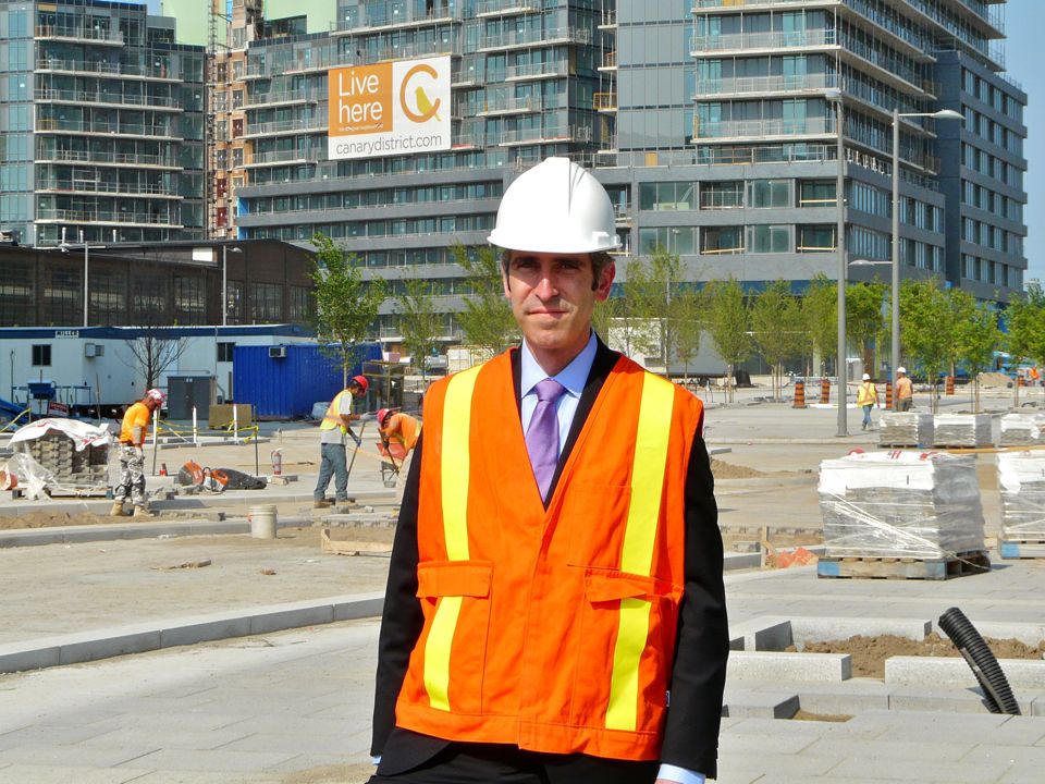
Kenneth Tanenbaum on the Canary District construction site, home to the Toronto 2015 Pan Am Athletes' Village

Big games bids run over budget in general. The demonstrations in Brazil are a current example. Given the background of cost overruns, what are your thoughts on best practices in cost management?

Infrastructure Ontario set up a procurement process that allocated risk properly between the public sector and the private sector. We worked with EllisDon and Ledcor to achieve a GMP or ‘guaranteed max price’ and there is significant skin in the game for those contractors if they are not delivering. DundeeKilmer’s objective is to make sure the team is marching together. Lots of tried-and-true building technologies were used here. We weren’t pioneers in anything.

What lessons have you taken from the 2012 London Olympics or 2010 Vancouver Olympics or other regeneration projects around the world?

Lessons were learned by spending time in Vancouver and interviewing people engaged in project delivery. Infrastructure Ontario, the procurement agency for the province, internalized those lessons and delivered a procurement model that I think set us up for success and which I believe represents a great export opportunity for other cities building Athletes’ Villages. It was an enormous undertaking to design, procure and finance a billion dollars’ worth of work in 90 days, which was the task we were given to do. We brought together a great team of designers, engineers, and contractors to do that.

Hundreds of lessons were learned from jurisdictions that didn’t have the right balance between private risk and public risk. What risks rightfully belong with the private sector? What risks should government continue to take? To Infrastructure Ontario’s credit, they came up with the right balance. I think Waterfront Toronto, insofar as planning was concerned, gave us a canvas on which to paint our architects’ view of the village. That was another important foundational piece for success – the precinct planning by Waterfront Toronto.

One of the areas where Vancouver where got off the rails is they were innovating in green building design. That’s all well and good and there are lots of green elements in our design as well but, when you have to spend $1M a day, everyday, you can’t be innovating or learning on a job site like this. You have to incorporate LEED best practices that are off-the-shelf. The right allocation of risk and the right team gets us to the right results.

The Pan Am Games is the largest event that this city has hosted and will host for a long time. It is a great opportunity for us to celebrate the great things about Toronto – a multicultural, pluralistic society, and a beacon on the planet. We have to tell a great story for Toronto. The Athletes’ Village is just one small element. It is part of the success story but it is not the story. The story is that we have 10,000 athletes and officials coming with their families from 41 countries who may at some point look at Toronto as a place to live, or invest but in the meantime they will be here spending dollars and going to restaurants.

Looking west on Front Street from Canary District to Downtown Toronto

Are you involved in creating any sports facilities?

No. Dundee Kilmer has only one mandate: to deliver the Athletes’ Village, on time and on budget.

Pan Am does not only exist in the Canary District. There are many other areas. How do they connect up? Is there a master plan?

We are building something called the Transportation Centre south of Mill Street, on provincially owned land. It will be effectively part of the secured perimetre where buses will come in and out to move athletes from the Village to their games venues. The strategy of TO2015 was to have the Games be hosted by Southern Ontario so the venues are dispersed in Welland, Milton, Durham Region, Scarborough, and York University. That also enhances their legacy. All the sporting venues that are being used will have a post-Games life. Again, it is a lesson learned from other Olympic or multi-sport games where you have elements that become white elephants. You won’t have that here.

You’ve established some of the criteria for success. How will you know you’ve been successful?

I’ll know if the athletes aren’t sleeping in my basement! In all seriousness, success is an on-time, on-budget delivery of an Athletes’ Village in accordance with the IOC/Pan Am Games specifications. But, to me, the most important measure of success is in realizing a once in a lifetime opportunity to be a part of shaping Toronto’s next great neighbourhood.

Looking east from Canary District, Foundry building to the left.

What is there that exists already that drives momentum for that? Is it managing the overspill pressure from Downtown Toronto?

I think Toronto’s future really pivots on its ability to continue to attract 100,000+ migrants a year. How do we do that in an environment that is governed by provincial policy, Smart Growth, and Places to Grow (focused on intensifying the urban core), and do it in a way that does not lead to more traffic congestion and less liveable neighbourhoods? I think that Canary District really fits the bill in terms of Smart Growth: it integrates walkability, liveability, and transit. I think of the acronym HOME – housing, opportunity (jobs), medical care and education. A number of those elements are being built, or being planned. The YMCA will be an incredible amenity for this neighbourhood in addition to the public realm that really serves as outdoor therapy, which is vital for a healthy city.

You have chosen Canary District as the post-Games residential brand for the area.

The name ‘Canary’ comes from a restaurant at the gateway to this site. The heritage building (which we are restoring) had a bit of a chequered past. It was a school, then a brothel, and then a greasy spoon called Canary Restaurant that was famous for filmmakers and truckers who would stop in this area.

Existing brick buildings at gateway to the site to be restored.

How will the buildings be repurposed after the Games, as condos and apartments?

Immediately after the Parapan Am Games end in August 2015, the Village is turned back to us and we have the task of taking out temporary dividing walls, painting, putting in the hardwood floors and the kitchens – essentially making the units new again.

The biggest challenge from a post-games constructability standpoint is you don’t have the man and material hoists on the outside of the building so you have to preload and use the elevators as much as possible and optimize material in and waste out. There is a lot of planning going into it; in fact, logistics is the most complicated part.
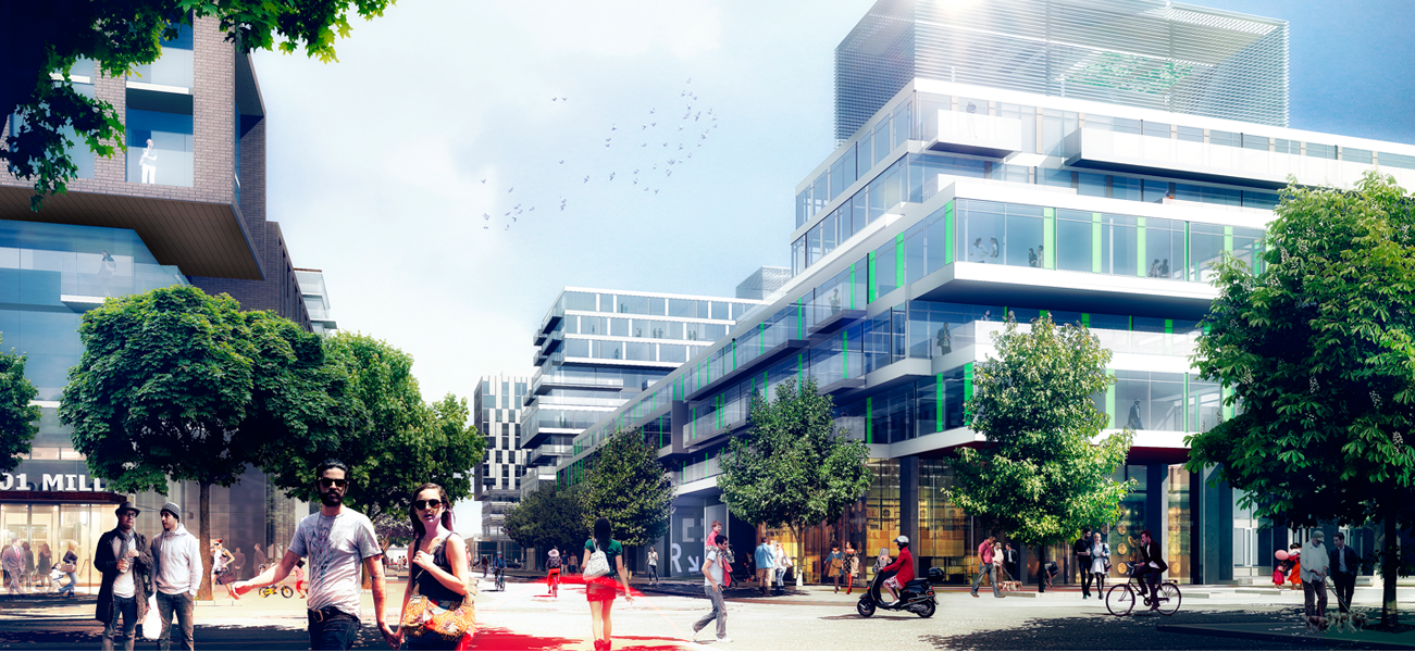
Rendering of Athletes' Village/Canary District. Image courtesy of architectsAlliance.

This area is considered the largest urban village in the city’s history. How will it be different than another major urban revitalization in Toronto, that of Liberty Village?

This was a very long time in the making. It reflects the thoughtful nature of Waterfront Toronto in terms of community and urban planning, and brings in Jane Jacobs’ principles of liveability and density. You won’t have canyons of glass towers here. It will be a much more liveable environment with the ‘eyes on the street’ concept.

So, in terms of differentiators, first it is the historical/planning context. The genesis is different in Downtown East than Liberty Village in that it involves much more master planning and more heritage elements, being adjacent to the Distillery District, and incorporating the brick buildings at the Cherry Street gateway to this site.

Further, I think the province made a very significant investment in the pubic realm, with the 18-acre Corktown Common park, the linear park (along the Front Street spine through the village), and Underpass Park. A brand new tunnel called the Bala Underpass will allow residents to enter Corktown Common without crossing a road and end up on the Don River Trail system and be able to bike to Edwards Gardens, to Sunnybrook. It is not an 18-acre park you’re adjacent to, but more like an 1800-acre park—through what is Toronto’s greatest natural asset, the ravines—and what many Torontonians don’t really get to appreciate because it’s very difficult to access.

The third differentiator from Liberty Village is the proximity to Downtown. We don’t think about Spadina being equidistant from Yonge as Cherry Street is. Torontonians’ view of Downtown is tilted to the west, and what we see is the Village/Canary District beginning to tilt back to a bit more equilibrium. What we are seeing in real time is just a beautiful evolution happening along those Front Street and King Street corridors.

The fourth and final differentiator is the design aesthetic. In addition to public realm piece, what we DundeeKilmer aspire to is the absolute highest level of design excellence. So we brought a team onboard headed by architects Bruce Kuwabara of KPMB and Peter Clewes of architectsAlliance and they in turn recruited a team to create what they called ‘cohesive diversity.’

One element that really excites me is the porous nature of the neighbourhood. The designers were very deliberate in terms of opening the development blocks up to people migrating through them. So, there are laneways that pass through the blocks which is a really nice way to animate the space rather than forcing people to do right angles and walk around buildings, as you have in conventional block development.
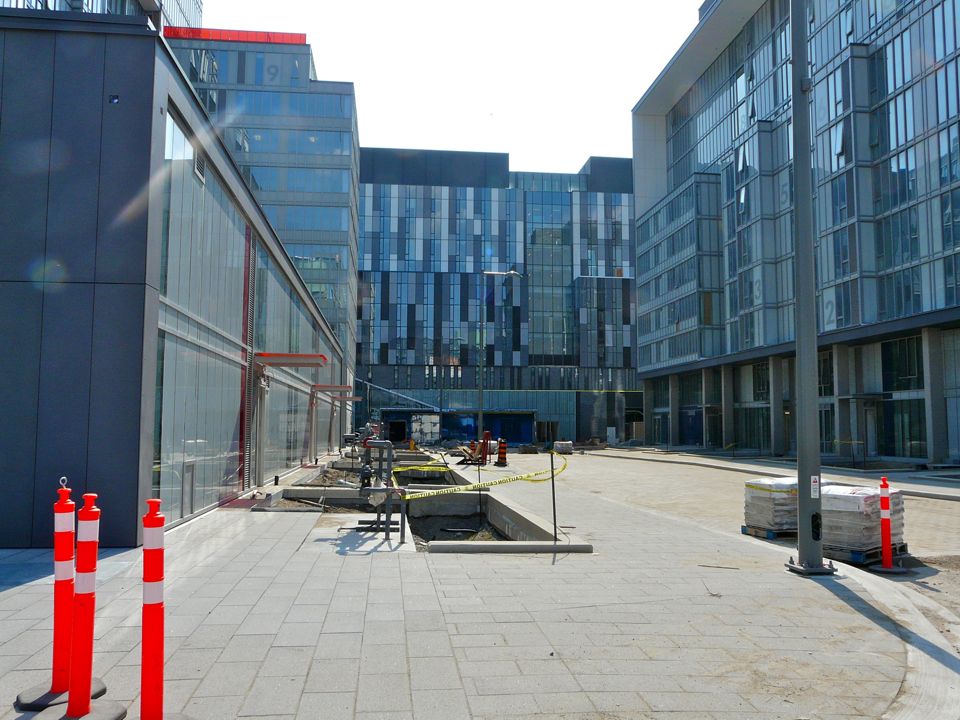
Looking east on Canary District site. George Brown College student residence building in the distance.

Does Canary District become an appendage to Downtown or does it co-habit with Downtown with its own identity?

There are no physical barriers to here (e.g. river, expressway) from Downtown. It should become a natural extension of Downtown with a narrative that is very connected to the Don River and Martin Goodman trails. People talk about what makes for a great neighbourhood and I think it’s about diversity of interests, cultures, and economics. And it’s what makes a city great, it’s natural diversity, it’s the ability to transform, invent, and change. The unique challenge here was to deliver an entire neighbourhood and have it feel like a neighbourhood. A lot of thought went into the design, the programming, the unit mix in buildings (1, 2, and 3 bedroom suites), the type of retail and how it’s programmed to have a health and wellness theme that’s complimentary to the Distillery's retail programming.

The masterplan of the community was generated by architects, planners, and Waterfront Toronto. How was LiveWorkLearnPlay engaged here? They have created many villages and recreational places for Intrawest, with precedents like Blue Mountain and Whistler. But that is not the same as a year-round real liveable place?

I think of it as Waterfront Toronto providing the frame and the canvas on which to paint. They defined certain elements for our architectural team to conform to.

LiveWorkLearnPlay is our retail consultant, retail programmers so-to-speak. It’s not in their mandate to shape the urban fabric. They have the task of running a process to populate the retail opportunities within the Canary District under a general theme of health and wellness. Their mandate doesn’t extend beyond essentially animating the storefronts.

What we’ve relied on LiveWorkLearnPlay for is their expertise in creating the balance of a Village and the task of figuring out the right mix between restaurants, retail, and services.

Stephanie Calvet is an architect and a writer specializing in architecture and design. She can be found at www.stephaniecalvet.com
Turning a forgotten penthouse into office space by stephanie calvet

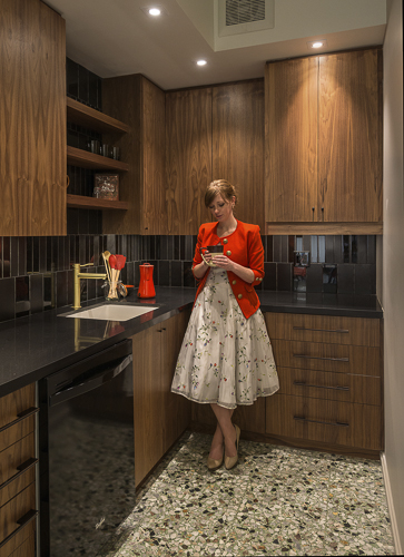
A version of this post appeared in the June edition of  Canadian Facilities Management & Design.  Park Property Management renovation by Quadrangle Architects. Photo by Bob Gundu

When rental company Park Property Management (PPM) required an additional office, it searched its apartment inventory. It unearthed 2,000 square feet perched atop a north Toronto building, 15 storeys up. Long forgotten, the penthouse had been relegated to a storage depot, stashed with cleaning supplies, gym equipment and the superintendent’s found treasures. PPM called on Quadrangle Architects’ Interiors Group to see if there was any hope for its rehabilitation and conversion to a workplace.

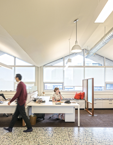
When the designers walked into the space, they immediately saw potential. With its concrete folded plate roof, open span, and enveloping daylight, it was evident that it had good bones. Unfortunately, it served as little more than a glorified broom closet. “This is wonderful!” stated principal and interiors group lead, Caroline Robbie. “How could (one) have been sitting on this for so long and not done anything with it?”

PPM_image2-4

Having outgrown its current digs, PPM needed to manage some 12 buildings from this location. The program was simple: two private offices, workstations for a small number of staff, file storage, a meeting area, a kitchen, and a space to greet visitors. PPM also wanted the flexibility to grow.

Completed in November 2013, the project didn’t involve a great deal of building; the space was mostly in desperate need of a clearing out and freshening up. Original inherited features including the terrazzo floor and radiators were retained, and the exposed concrete folded plate ceiling was stripped of random adhesive tiles and clad in drywall. Small storerooms were demolished and an updated HVAC system was installed. The biggest ticket item was the perimeter’s total window replacement, which in turn had a positive effect on light quality and energy efficiency.

The design direction for the interiors was borne of the building’s early 60s vintage and the space’s strong architectural language: align the interior design with the architecture by emphasizing its mid-century modern heritage. Walnut veneer is used in the millwork, extending to the furniture and accessory pieces, while accent details are co-ordinated in black or satin bronze finish, right down to the tiny tapered cabinet pulls.

The new Mad Men-inspired office blends commercial and residential; PPM, after all, is in the business of where people live. Just as building superintendents and managers come to the office to discuss operations, tenants come to sign leases or negotiate sublets. “We wanted to give it a warm, residential feel, but without seeming false, folksy or artificial,” Robbie said.

PPM_image-vert

Visitors step off the elevator into an intimate vestibule, only seven feet in height. A wiry carpet recalls an entrance mat and the painted black walls are adorned with an overlay of repeating company logos in gold leaf, simulating custom wallpaper. Period-correct wall sconces complement the residential aesthetic.

From there, the low ceiling gives way to reveal a light-filled and lofty open plan space peaking at 12 feet. Simple white lighting fixtures hang overhead. Underfoot, carpet tiles are grouped to resemble area rugs, picking up green, grey and brown tones of the terrazzo flooring.

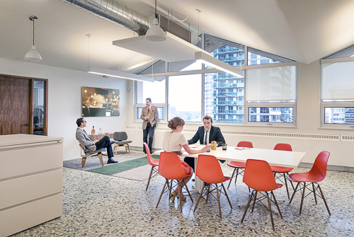
The waiting area, more akin to a living room, is distinguished by a carefully curated collection of signature Eames pieces: lounge chair, coffee table and compact sofa. This classic design furniture by Herman Miller is mixed with a row of crisp white contemporary workstation systems tucked under the profiled ceiling, channeling a retro feel. “It resonates with a certain generation of people but it still looks modern. To me, modernism still looks fresh — it doesn’t look dated,” Robbie said.

Park Property Management_interior. Photo by Bob Gundu

Two private corner offices follow. The remaining open area has a meeting space with bright orange Eames shell chairs and banks of files. The area can easily be added to or reconfigured. A kitchen and powder room complete PPM’s new office.

File storage was a priority. Going paperless is a growing trend, with many workplaces now managing information electronically. But the rental industry, with its paper-based origins, is in a transitional phase. Leases are still penned and copies must remain on site as long as leases are active, amounting to loads of paper records. With that in mind, designers stacked some filing cabinets three high and turned them into work surfaces. They also arranged some filing cabinets singly, so the cabinets can double as upholstered benches. Kept low, they don’t create a wall, visually or practically. “We tried to do it in a way that the stuff didn’t get in the way of the people,” Robbie said.

Park Property Management renovation by Quadrangle Architects. Photo by Bob Gundu

And where they could refurbish, they did, often with a sense of whimsy. A 60s Sputnik chandelier was re-appropriated from another property, and a glitzy pinball machine reinvented by one of the company’s owners was placed upright as artwork.

The renewed interior not only makes more efficient use of the real estate, but it offers a highly functional and comfortable workplace where one had not been envisioned.

“A building’s lifespan has to grow and change over time,” Robbie said. “As a designer, you’re seeing its attributes and its potential where someone else might not.”

Stephanie Calvet is a Toronto-based registered architect and a writer specializing in architecture and design. She has 11 years’ experience working in architecture and planning firms in Boston, designing projects in the hospitality, multi-unit residential, education and healthcare sectors.

Searching the Skies for Inspiration by stephanie calvet

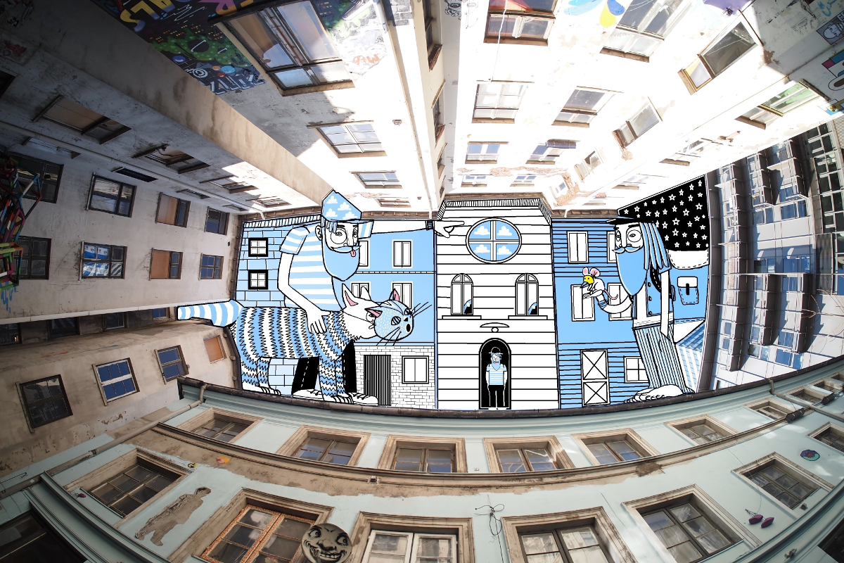
Thomas Lamadieu clearly sees something others don’t. Eyes drawn upwards, the French artist seeks out shapes in the sky framed by courtyard buildings and takes aim with his camera. That negative space has been the inspiration for many photographers. But Lamadieu takes it a step further: combining photography and drawing, he constructs artworks by filling the negative space with playful, 'painted' illustrations.

LamadieuThomas_Avignon


LamadieuThomas_1

For this series, entitled SkyArt, Lamadieu has amassed images from travels through Germany, France, Belgium and Canada. There is a kind of vertigo in his pieces; he captures the images with a fish-eye lens. The courtyards' geometries are the only limits for his unbounded imagination.

Lamadieu has a gift for drawing out meaning in the urban architecture around him. I don't know the story behind the bearded fellow who figures so prominently in his work, though I could take a guess... Nevertheless, I really like these magical doodles and I hope you do too.

OLYMPUS DIGITAL CAMERA


OLYMPUS DIGITAL CAMERA


OLYMPUS DIGITAL CAMERA


LamadieuThomas_Berlin


LamadieuThomas_3


LThomas_Marburg-Montreal


Live-Work Units by stephanie calvet

(this is an article I wrote for UrbanToronto) From a historical perspective, there is nothing groundbreaking about the live-work model. People have been living and working under one roof for centuries; think shopkeepers with their dwellings upstairs. Artists have built on that paradigm, transforming warehouses to accommodate the amenities of a home as well as open studio space to create and store finished artwork securely.

While commercial loft space – retrofitted with the necessary utilities – has always been a hot commodity amongst the creative community, the advent of live-work space has made the concept of living close to one’s work even more appealing, and – as developers realize – marketable.

This trend seems to fit well with our changing economy. With the recession many have shifted to self-employment, but more than that, the norms have changed. The stable, sequential career paths of a few decades ago are far less common, and a growing number of people work from home, facilitated by technology and online connectivity. Although many live-work spaces are marketed specifically towards retaining local, professional artists, the set-up gives greater opportunity to entrepreneurial residents. It describes a new take on an old idea.

Interior Rendering

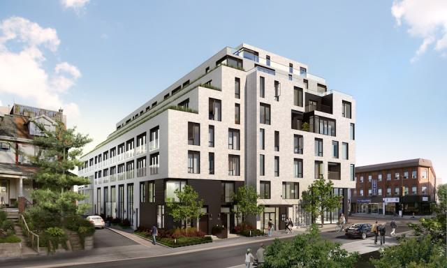
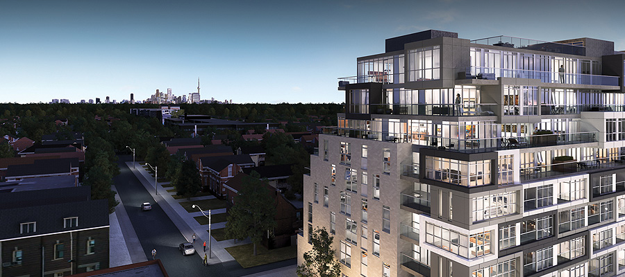
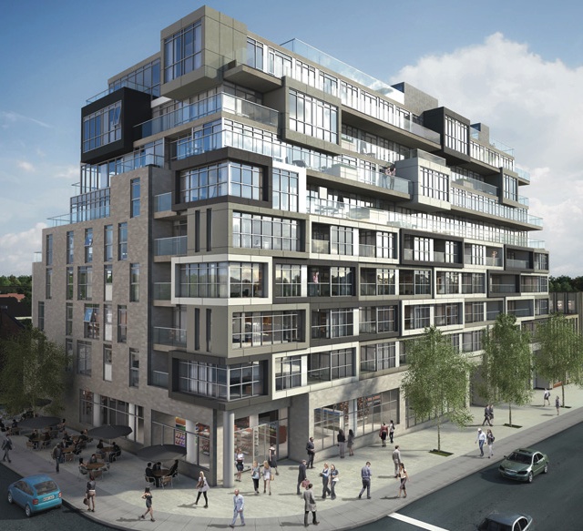
There are a number of facilities designed and built especially with a live-work purpose in Toronto’s building stock. One of the newest is DUKE, a mid-rise residential development by Quadrangle Architects for TAS in the retro Junction neighbourhood. The seven-storey structure will add 109 condos to the area, including five live-work units aimed at creative entrepreneurs.

Street view of live-work units at DUKE Condos. Rendering courtesy of TAS.


Southeast corner of DUKE Condo, designed by Quadrangle Architects for TAS.


While the building will turn its most animated face to Dundas Street West, featuring a mix of high-ceilinged retail shops at grade, located along the quiet laneway to the rear of the building, with south facing frontage, will be the 2-storey live-work units.

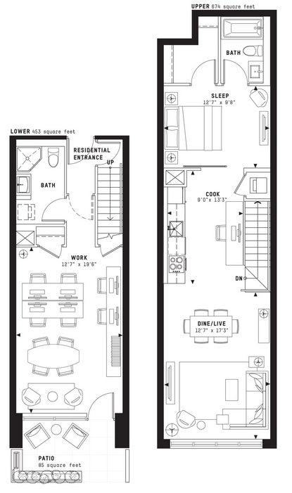
These suites are well suited to artists, designers, small business and anyone who needs a distinctive work address, with living quarters above.

With direct access from the street, their lower level is designed such that the front can serve as a showroom or work area with a back section that has storage and a washroom.

Screen Shot 2014-05-06 at 9.22.23 AM


It is a reinvention of creative urban living where owners can conduct business during the day and return to their private quarters off-hours. The units are decently sized, averaging 1150sf with one model at 1548sf.  Each has a small patio at the front to provide a bit of privacy from the sidewalk.

image010


Also on offer are 2-storey townhomes nestled among the houses along Indian Grove – a more conventional living space for urban families.

Stephanie Calvet is an architect and a writer specializing in architecture and design. She can be found at www.stephaniecalvet.com

Film Enthusiasts Flock to Toronto's Hot Docs 2014 Festival by stephanie calvet

Hot Docs 2014 has arrived in Toronto, a city that hosts over 70 film festivals annually. It features 197 different selections from 43 countries covering a wide range of topics—essentially the best documentary films from across the globe made in the last year. I've narrowed down a small sampling: some are urban stories; others look at poverty, popular culture or women's issues; while others highlight Russian, Asian and Southern European cultures. For a detailed screening schedule see hotdocs.ca.

Sacro GRA  (Tales from Rome's Ring Road)

Sacro_GRA_screenshot

Sacro_GRA

Sacro GRA

Running along the perimeter of Rome, the Grande Raccordo Anulare (translated literally as the Great Ring Junction) is a motorway of remarkable scale and prominence connecting all corners of the city. Taking inspiration from Italo Calvino’s book Invisible Cities—a pensive exploration of the concepts of city, memory and imagination—seasoned filmmaker Gianfranco Rosi crafts a winding tale of distinct narratives bridged by a colossal, sweeping stretch of pavement. From the paramedic worker tending to collision victims along the GRA to the botanist studying audio recordings of the interior of palm trees in order to detect and poison the destructive pests dwelling within, Rosi follows these offbeat stories and elusive characters with an astute, observational gaze. This winner of the Venice Golden Lion is an enchanting portrait of life along a vast, arterial stretch of urban highway and the everyday moments that take place on the edges of The Eternal City.  Lisa Plekhanova       Watch Official Trailer

SLUMS: Cities of tomorrow

Slums_Cities of Tomorrow

2014-Slums_Cities_of_Tomorrow_3

 Slums: Cities of Tomorrow

One billion people on our planet—one in six—live in shantytowns, slums or squats. Slums: Cities of Tomorrow challenges conventional thinking to propose that slums are in fact the solution, not the problem, to urban overcrowding caused by the massive migration of people to cities. The film explores communities in India, Morocco, Turkey, France, New Jersey and Quebec, offering an intimate look at the inhabitants and families who, through resilience and ingenuity, have built homes that suit their needs for shelter. Experts like Robert Neuwirth (Shadow Cities), Jeremy Seabrook (Pauperland) and architect Nicolas Reeves explode the notion that a slum must be a breeding ground for criminal activity. The reality is quite different: slums are as diverse as the cities they surround, often offering a more accurate representation of what community ought to mean—an experience where sharing is essential and social hope can flourish. Lynne Fernie     Watch Official Trailer

Tomorrow We Disappear

Tomorrow We Disappear

Screen Shot 2014-04-25 at 11.07.35 PM

Tomorrow We Disappear

Described as India’s “tinsel slum,” the Kathputli artist colony in New Delhi is home to over 1,500 families of puppeteers, acrobats, painters and magicians. That’s all about to change. When the government sells the land to private developers, traditional life is set to be razed for the city’s first skyscraper. Where outsiders see the slum’s rancid water and shacks, debut filmmakers Adam Weber and Jimmy Goldblum find stunning colours in death-defying performances. Whether bathed in sunlight or exploding against night skies, magnificent fire-eaters, sleight of hand magicians and glorious puppets radiate beauty in crisp, brilliant detail. But will the artists’ resolve to preserve their culture overcome the push for progress? As in-fighting breaks out among colony leaders, spilling out into confrontations with developers and government, the clock ticks onwards to the bulldozing date. Gorgeous and inspiring, Tomorrow We Disappear is a splendid tribute to fading artistry and the tenacity of tradition. Myrocia Watamaniuk        Watch Official Trailer 

The Creator of the Jungle

The Creator of the Jungle

The Creator of the Jungle

 The Creator of the Jungle

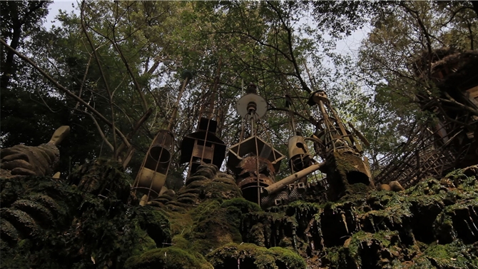
Just outside a Catalonian village, a recluse has been building elaborate tree houses and more in a bid to life as he chooses, as Tarzan. Forced by local officials to tear down his architectural creations in the name of modernization, The Creator of the Jungle rebuilds as soon as he can. Years later an American curator discovers Garrell, our self-styled Tarzan, and his creations, and records them. Now, with the curator's footage and Garrell's homemade Tarzan films, director Jordi Morató explores the mind and creations of a man uniquely driven to build and inhabit a world of his own making. Craig White       Watch Official Trailer

Pipeline

Pipeline_hot docs 2014

Pipeline

Cross seven borders and even more social classes as cameras follow the route of a Russian natural gas pipeline from Siberia to sunny Europe. Eccentric people, quirky locales and ever-Westernizing political climates astound in this award-winning visual road trip.  Savvy and beautiful, Pipeline visually traces the disparity between people who live above untold wealth and those who actually enjoy it.      Watch Official Trailer

Penthouse North

Penthouse North

Penthouse North

Agneta Eckemyr, an aging Swedish actress turned fashion designer, lives in a roof terrace penthouse with a stunning view of New York's Central Park, $2500 rent to pay monthly, but no income anymore. Penthouse North tells the story of former tour-de-force now at a breaking point, trying to keep her piece of the city even as the cards are now stacked against her. Craig White

Advanced style

Advanced Style

Advanced Style

A hat-obsessed, bike-riding, part-time vintage store employee who trades shifts for clothing items. A mild-mannered lounge singer with the longest, most carefully groomed eyelashes you’ve ever seen. The advice-spouting owner of the popular boutique Off Broadway. These are the subjects of director Lina Plioplyte’s inspiring documentary Advanced Style. Pulled from the strongest entries on renowned fashion photographer Ari Seth Cohen’s popular blog, Advanced Style tells the fabulous true tales of seven of New York’s most stylish elderly women. Ranging in age from 62 to 95, these women flaunt their eclectic styles and embrace their individuality through their clothes and personal stories. Filled with colourful vitality, each vignette bursts with life, humour and, of course, style. Like the mantra for its characters, Plioplyte’s affirming doc reminds us that age is just a number and beauty is forever. Michael Lerman     Watch Official Trailer

Everything will be

Everything Will Be

Everything Will Be

Vancouver has one of the most famous and bustling Chinatowns in North America, but the patrons that the Chinese grocery merchants depend upon are moving out to the suburbs as condos begin to replace the older homes in the area. Will Chinatown survive? In Everything Will Be by Eve & the Fire Horse director Julia Kwan, a new neon art installation in the neighbourhood assures EVERYTHING IS GOING TO BE ALRIGHT, but it is cold comfort for many in a gentrifying city. Craig White  

The songs of rice

The Songs of Rice

The Songs of Rice
The Songs of Rice
Winner of the Fipresci Award at the Rotterdam film festival, The Songs of Rice is a kaleidoscopic homage to the staple food, rice. Through the window of rice cultivation in rural Thailand, we see how harvest celebrations, bullfights, music and firework displays intertwine with the land and its traditions.       Watch Official Trailer

The Beijing Ants

The Beijing Ants

The Beijing Ants

Move over Tokyo, London and New York! Beijing, where rents have reached over $11,000 CAD per square metre, is soon to be the most expensive city in the world. With prices out of reach, house-hunter and filmmaker Ryuji Otsuka decides to target the suburb of Tongzhou instead. The Beijing Ants provides a snapshot of a couple’s maddening experience with a society in transition, revealing as much about changing attitudes as it does about the rising cost of living. Shot using hidden and handheld cameras, the apartment search is given a citizen activist aesthetic. Conflict lurks in the family’s dealings with movers, police, landlords and local business owners. Racial slurs, threats and contract negotiations not normally caught on camera are aired for public consumption in this cautionary tale about capitalism and customer service in modern China. Behold the rise of a new consumer, one who agitates as well as she negotiates. Angie Driscoll     Watch Official Trailer

Engineering Greener Development: Bioswales to Bioretention by stephanie calvet

(this is an article I wrote for UrbanToronto) Our climate is changing—our range of weather is getting more extreme—and at the same time we are more aware than ever of our need to use energy wisely. The dramatic environmental, social, and economic consequences related to climate change reinforce the need to plan for energy sustainability in a way that balances growth and environmental integrity.

We have been looking at energy efficient building design initiatives, but it's time we also consider the larger impact of site planning. While UrbanToronto more often looks at high-density development, it is important to remember that building is rapidly taking place in more suburban locations throughout the GTA, where people are seeking larger lots and lower densities. Those communities are always going to be more resource intensive, but there are ways to mitigate that impact, and planners can evaluate how they are designed from an energy perspective. You can achieve savings in a broad sense, for example, by creating communities that are more walkable, simply by virtue of land use planning techniques that concentrate development to reduce the amount of vehicle trips that are necessary to achieve day-to-day needs.

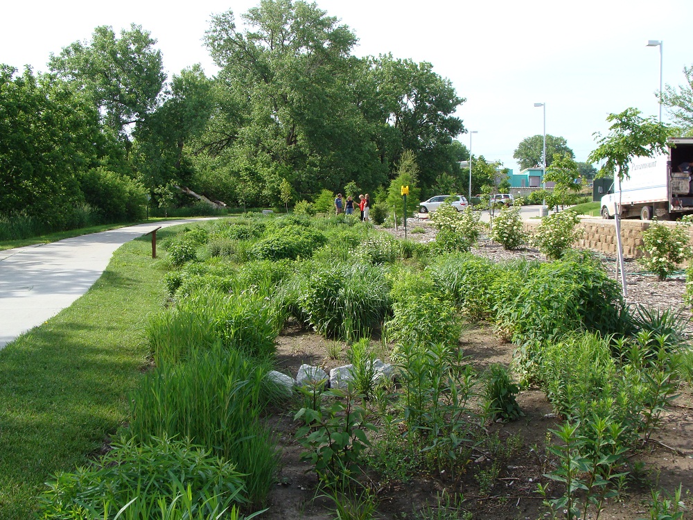
Stormwater management ponds are designed to collect and retain urban stormwater and release it slowly. Photo courtesy of LSRCA.

Municipalities see to issues like stormwater management, low impact development (LID), domestic water savings targets, and master planning that adheres to transit-supportive and walkability guidelines.

Stormwater has become a very serious concern for municipalities. What it really refers to is water balance. By paving over naturalized surfaces and creating more hardscapes, we change the flow of water on a site. This continued paving leads to a cumulative increase in runoff volume and flow duration that results in increased streambank erosion and sedimentation, the risk of flooding, and high concentrations of contaminants. Despite having stormwater controls in place, the health and quality of many urban rivers and streams continues to decline. And if last year’s record rainfall is any indication, climate change only exacerbates the problem.

In 2012, Enbridge Gas Distribution along with Sustainable Buildings Canada launched a green building initiative called Savings By Design (SBD) in response to a mandate of the Ontario Energy Board. The program encourages residential and commercial developers to build more sustainably by providing financial incentives and support for projects that reach an energy reduction target of 25% better than the Ontario Building Code 2012.

While the program is primarily driven by the energy savings of a building, with developers focused on its envelope and HVAC systems, Enbridge's SBD program also works with municipalities to broaden the scope to address the larger site issues.

The pivotal part of SBD is the charrette, an intensive design workshop, which gathers a group of green building experts, engineers, architects and contractors together to evaluate a project proposal in its earliest phase. Through the program’s Integrated Design Process (IDP), the team looks at various solutions and identifies the most effective ways to construct a building for optimum energy performance. When dealing with a larger terrain involving a community or site plan, the group expands to include ecologists, geologists, and planners.

Green landscaping within impervious surfaces, such as parking lots, can help reduce runoff.

We spoke with municipal planning experts who bring a stormwater management and natural heritage protection point of view to the table. They have collaborated with developers and SBD to test out a number of sustainability objectives on projects ranging from industrial lands to residential subdivisions.

Mike Walters, General Manager of the Watershed Management Department at the Lake Simcoe Region Conservation Authority, is dedicated to maintaining and enhancing pre-development hydrologic site conditions. According to Walters, we need to make big changes if we want to achieve our water quality, quantity and aquatic targets and accommodate new urban growth. “It will require more green infrastructure (e.g. LID); new policy, regulation and enforcement; and, exploring other ‘end-of-pipe’ strategies.”

The development industry can benefit from a more integrated, holistic design approach. “Where you’re at in the planning process will impact what you can do,” says Dan Stone, planner and Manager of Economic Development & Sustainability at the Town of East Gwillimbury. Ideally, it is at the very start, at the pre-consultation level, before there is a road network or a plan in place. The collaborative approach taken by SBD contributes toward the design by determining where you can infiltrate and by suggesting street layouts, location of parks, configuration of sidewalks, and how to reduce the amount of impervious area.

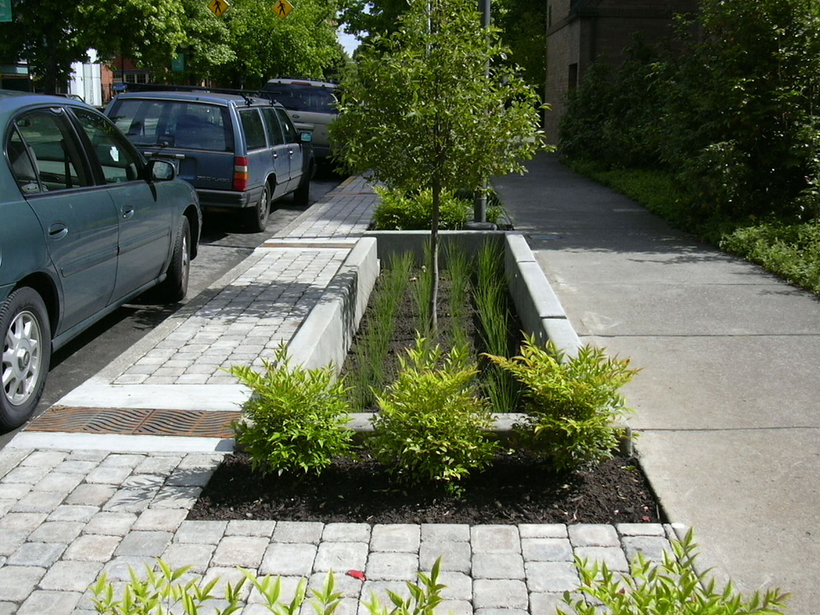
Landscaped spaces can transform street surfaces into living stormwater management facilities. Photo by Artful Rainwater Design.

The benefits of the SBD program are numerous. For one, the access to multi-disciplinary specialists who can advise on the design is free (the charrette is paid for by Enbridge). Then, of course, there are incentives if performance standards are met. And, adds Stone, “There is the good press associated with working with the municipality and trying to achieve its sustainability goals; the local community and Councillors appreciate the effort. It’s a completely voluntary program. No risk, no obligation.”

But, the key benefit that resonates most with developers is an approval process that unfolds more smoothly and with fewer surprises. The process is typically lengthy and the development industry is sensitive to that fact: nowhere is the adage ‘Time is money’ more apt.

“The beauty of the IDP is that it puts a lot of good decision making at the front end of the process. You engage with the regulatory authorities early on and get a clear understanding of the municipality’s priorities and a sense of what kind of things are non-starters. You’re giving the proponents the heads up for things to watch out for. That to me, from a municipal planning perspective, is the best value added. Developers can try to perfect their application and get it approved faster – and to market quicker – because they got insights at the very front end,” says Stone.

By implementing Low Impact Development principles, water can be managed in a way that reduces the impact of built areas and promotes the natural movement of it within a watershed. “You’re putting clean water back where it belongs so it can support natural features. This program looks at water not as waste but as a resource, and that’s what I like about it too,” says Walters. But it is more than just applying stormwater Best Management Practices, like vegetated swales, rain gardens, infiltration basins or porous pavers. It requires a change in urban design principles and public acceptance.

“We’ve had developers take innovative steps and risks associated with stormwater management. The environment will win, they will win, the process is quicker, and there is an incentive from Enbridge. What is the downside?” asks Walters.

The industry seems to be responding. “I don’t think the value is from any one individual project,” says Stone. “The value is what the program has been able to add to the whole discussion about sustainable development.”

For more information on the Savings by Design program, visit the website http://www.savingsbydesign.ca/

Stephanie Calvet is an architect and a writer specializing in architecture and design. She can be found at www.stephaniecalvet.com

New Ryerson gallery has simple, dynamic design by stephanie calvet

A version of this post appeared in the April edition of  Canadian Facilities Management & Design Paul H. Cocker Architecture Gallery, Department of Architectural Science, Ryerson University. Photo by Shai Gil.

The new Paul H. Cocker Architecture Gallery Ryerson University in Toronto is a simple but dynamic design intervention.

Completed in October 2013 at a cost of $465,000, the renovated space within the Department of Architectural Science building adds a contemporary sensibility to the robust concrete interior of a dated facility. It not only enhances its functionality, but also gives it a more powerful presence.

Facing the building’s main entry, the gallery opens up the public space in a dramatic fashion. Its gleaming white envelope pushes into famed Canadian architect Ron Thom’s brutalist atrium, sharply contrasting its heavy concrete structure. Red felt wraps the entrance’s exaggerated frame to create a “ceremonial threshold”, while oversized glass pivot doors have the potential for various configurations. Unbounded by the space, white floor tiles visually extend the gallery limits and spill out into the atrium, their surface flush with the quarry tiles.

Ryerson’s Department of Architectural Science had previously lacked a secure, formal gallery. The school put out the call for proposals for the design of a flexible, multipurpose space within its existing facilities. Gow Hastings Architects (GHA) was awarded the project, allowing the local firm to build on its previously completed works at the school, including office renovations, grad labs and a bold red branding exercise.

GHA was drawn by the challenge to find potential within the existing structure, says principal Valerie Gow, who likens renovations to “opening a can of worms.”

As with most projects, this one wasn’t without its unique challenges. The gallery project inadvertently coincided with a total building HVAC upgrade. Fortunately, it happened early enough in the design stage that the designers could make the necessary mechanical changes and co-ordinate all services to fit above the established datum line without compromising the ceiling plane.

Splayed pivot doors at Paul H. Cocker Architecture Gallery, Department of Architectural Science, Ryerson University, Toronto. Photo by John Howarth.

Before the building’s transformation, visitors faced a blank wall clad in particleboard, which concealed storage. By reconfiguring the first floor interior layout and relocating the storage area, a small team of architects led by Gow carved out a rounded 3,120 square feet of bright white gallery space, distinct in character from the rest of the facility.

The perimeter wall is faceted to maximize the mountable flat display area. While this wall steals space from the graduate studio directly behind it, its gentle curve softens the intrusion. It is also covered with red felt, optimizing pin-up wall space for drawings and sketches.

Large but thin porcelain tiles, in accentuated lengths, radiate across the floor. A sticky film with a graphic in a non-slip texture can be applied to the tiles. In this way, the floor becomes another canvas for display, an application the architects had not anticipated.

To the immediate right of the gallery entry is a white feature wall listing university donor and sponsor dedications, fitted with a small bench. Its opposite side serves as a backdrop for students to showcase their digital fabrications.

Aside from marking the threshold, the felt wall covering has many practical uses, particularly where hard surfaces abound. It is tactile and tack-able, provides sound absorptive qualities and visually warms the space with colour.

The glazed wall between the first-floor studio and the atrium was set back in order to gain additional floor area, and pin-up space was achieved with a two-sided magnetic white board floating in the centre of the wall. It provides general privacy to the typically messy studio space beyond, while offering visitors glimpses into it.

With space to host critiques and travelling exhibits, and as a venue for the student body and faculty to display their work and research, the new gallery has become an extension of the three-storey lobby atrium, which is the primary gathering space for department-wide events and activities. Adjustable track lighting and a hanging metal framing system enable the gallery space to be completely reinterpreted with each new show.

Paul H. Cocker Architecture Gallery, Department of Architectural Science, Ryerson University, Toronto. Photo by John Howarth.

The gallery’s modest insertion is designed to reflect the institution’s collegial and collaborative spirit. In fact, GHA even engaged students in the project, assigning them the feature wall’s ever-changing exhibition and incorporating student-made display cubes into the gallery’s initial opening.

“I just love the energy of students,” Gow says. “Working together with them is lively and makes the design richer. It reminds me of being back in the school environment myself.”

Faculty members from other departments have expressed interest in using the space — an opportunity for the cross-pollination of ideas. While the gallery remains a successful interior intervention, there are discussions in the works of how its presence might be articulated on the building exterior.

Stephanie Calvet is a Toronto-based registered architect and a writer specializing in architecture and design. She has 11 years of experience working in architecture and planning firms in Boston, designing projects in the hospitality, multi-unit residential, education and healthcare sectors.

Totem Condos Stacks Up Well Against Average High-Rises by stephanie calvet

(this is an article I wrote for UrbanToronto) The poignant nature of the high-rise is to identify itself in the urban skyline. Toronto has developed a tall condominium vernacular of floor-to-ceiling glazing but if you ask many a Torontonian, the city is saturated with much of the same: the generic glass tower that does little to make a positive long-term contribution to the public realm.

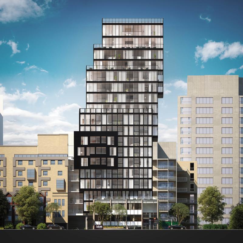
Totem Condos is a new residential building downtown by Worsley Urban Partners in conjunction with local architectural practice RAW Design. The 18-storey structure will house 120 units as well as a three-level below-grade parking garage with slots for cars and bicycles. The building has a very compact footprint and uses its space to the maximum, with very little left to waste.

Totem Condos, Worsley Urban Partners, RAW Design

RAW continues the evolution of the local condominium architecture with a proposal that sets itself apart from the rest. The building was conceived as a series of glass and dark steel framed boxes, carefully stacked. The eye is drawn skyward as the building’s geometry gently shifts left and right. Small blue ‘fins’ on the south elevation provide some additional visual interest, reflecting light in unique ways, and, when viewed from the interior, creating angled sightlines. In contrast to the sleek surfaces, stone cladding at the base provides texture where the building meets grade.

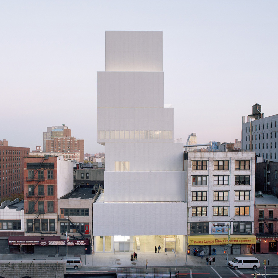
Lower Manhattan’s award-winning New Museum, a showcase for contemporary art and an icon of urban modernism, inspired the design. Taking cues from the block forms in its surroundings, the Museum stacks seven anodized aluminum mesh-clad rectangular boxes one on top of the other. The shifting of the boxes as they ascend yields a variety of open, fluid, and light-filled internal spaces and gives the building its dramatic shape.

New Museum of Modern Art, Hisao Suzuki, SANAA

The design firm responsible for the branding and marketing of Totem is The Walsh Group – and it’s not your typical ad agency. Under the creative direction of Shakeel Walji, the firm had a strong hand in influencing the built form. “We consult, direct the architect or interior designers working in conjunction with the developer to see what kind of look we want to create. It’s more of a collaborative effort between all parties involved and we like it that way because we feel the product is better, and we feel confident in moving forward in selling.” This sharing of creative control is not always welcome and can rub some team members the wrong way.

But Walji is quick to praise the building’s bold design, saying, “This is a better reading of a point tower in the city compared to most.” He refers to what he finds are all too similar forms in the skyline as a direct result of the need to comply with either mid-rise or high-rise guidelines, which he claims, limit innovation. His criticism is cutting. “The architects spend a lot of time developing the podium on which the building sits, take a coffee break as the building rises, and then there’s a cap at the top. Totem doesn’t have that reading at all.”

Totem Condos, Worsley Urban Partners, RAW Design

Totem is located in ‘the village’ on Dundonald, a leafy street lined with 2- and 3-storey Victorian homes that retains much of its early 20th century appearance as a residential subdivision northeast of Yonge and Wellesley. The site is currently home to the Commercial Travellers’ Association of Canada Building. The 2½-storey structure, built in 1956, was included on the city’s inventory of heritage properties in 2010, acknowledging the cultural heritage value of its Modern design, popular in post-war Toronto. Highly representative of the style, it features a grid of solids and voids with turquoise-hued glazed brick, travertine, aluminum and concreted cladding; façades are organized into bays where concrete piers divide tiers of strip windows with travertine spandrels and panels.

It is separated from the street by a small landscaped courtyard. The original structure will become the base of Totem, adding context, history and texture to the building’s design. Although the prevailing character of Dundonald is composed of low-rise buildings that make up the balance of the streetscape, the scale jumps up: immediately to Totem’s west is the 24-storey brick-clad Continental Tower apartment building from the early ‘70s. Behind it is 22 Condominiums, a glazed 23-storey residential tower at 22 Wellesley St. East by Peter Clewes of architectsAlliance.

Existing building on site of 17 Dundonald Street: Commercial Travelers Association of Canada Building

Although City Council has since overturned the office building’s heritage designation, large elements of its modernist façades will be retained and will inform the overall design of the development. Integrated into Totem’s base, the original building will be dismantled and re-built, while above, offset floor plates will cantilever at various levels.

“The City, the TTC (which owns adjacent land), the planners and councillor were very interested to see how we could make this building happen, how we could have a piece of architecture that we could all be proud of,” says Walji. “Our city needs more of this. We should keep elevating the things we offer.”

“When we have architects that develop buildings that are of some stature, that adds to the visual language of our cityscape. It will be more inviting, more tantalizing. NYC is a great example—every corner is like a little gem—it’s memorable.”

Totem Condos, Worsley Urban Partners, RAW Design

Building form aside, the amenities are pretty swish and, “above and beyond your basics,” notes Walji. The second level will house a gym, a private dining room, and a lounge/bar that opens onto a small exterior space for dining and BBQ.

A roof deck tops the tower and its programming provides the access to outdoors where the building’s mainly small recessed balconies fall short. Residents can enjoy a dining area and lounge with a fire pit and panoramic city views.

The building has a Walk Score of 100 and a large appeal of the location is the access to the Wellesley TTC station. Its street entrance is set in one of the four bays on the north façade, where the building's main entry was previously situated, under a protective angled canopy. Totem residents can walk through a secured passageway from the main floor lobby directly into the subway station. “This was the biggest selling feature used to entice brokers to investors and buyers”, says Walji “and it’s the first building in Toronto to have it.”

Totem Condos, Worsley Urban Partners, RAW Design

Stephanie Calvet is an architect and architectural writer based in Toronto. She can be found at www.stephaniecalvet.com
Mario Ribeiro of Triumph talks Howard Park Residences by stephanie calvet

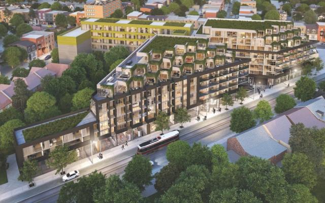
(this is an interview I did and article I wrote for UrbanToronto) UrbanToronto’s Stephanie Calvet sat down with C.E.O. Mario Ribeiro of Triumph Developments to talk about Howard Park Residences, an urban infill project at the intersection of Dundas and Howard Park in Toronto's Roncesvalles neighbourhood. The first phase, an 8-storey building (far right)   is under construction. Now the company is bringing its Phase Two western counterpart to the market. They will be joined by a multi-storey linking element, with the common entry and courtyard located between the two.

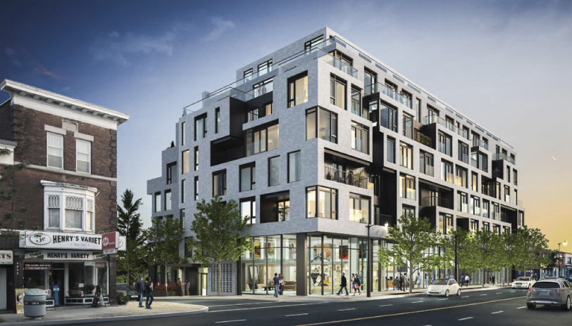
Looking north towards Howard Park Residences, Phases 1 & 2, image courtesy of Triumph Developments

7401374654_72c472c3d2_b

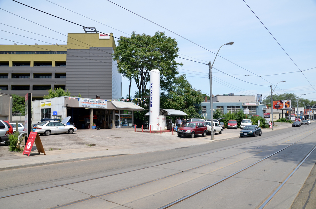
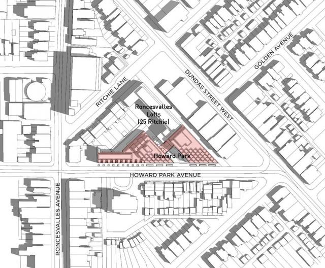
The site, with its odd triangular geometry, was previously home to a service station, aging garages and warehouses (see above). Removing these former industrial activities is an opportunity to tie eclectic Dundas and Roncesvalles Avenues, and to rethink the site as an active part of the public flow with a typology that combines high build density with a commercial program.

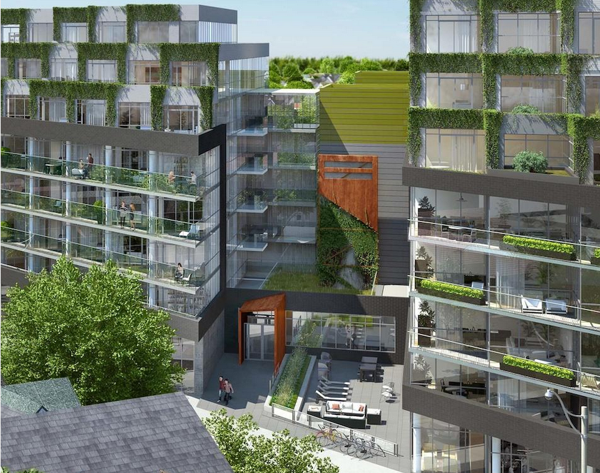
RAW Design, a local architecture firm with a portfolio of innovative mid-rise infill projects, crafted the buildings to the site and low-rise residential surroundings, breaking down the scale through massing and detailing. Vegetation that grows on each of its stepped metal terraces at the top floors imparts a softness to the elevation, inextricably part of the ‘look’ of the building that Triumph is committed to providing.

Linking element between Phase 1 (right) and 2 (left), image courtesy of Triumph Developments

The project required an amendment to the existing zoning by-law to convert it from industrial to residential and mixed use. How has the project been received by the community?

It was well received. We've had no community pushback and lots of support from planners and the councillor. The community asked if commercial space was possible and we integrated that idea into the design.

What sorts of establishments would you like to see occupying the first floor retail/commercial spaces?

We are not looking for large franchises. This is a trendy neighbourhood. We are subdividing the space and hoping to get a variety of small shops, a daycare, maybe a bookstore…

There is more than the typical mix of unit types here. Who is your intended end-user? Is there anything larger than a 2-bedroom plus den?

We have a vast array of styles catered to a lot of different tastes: units tailored to the young professional, units with patios, units for families, including 3- and 4-bedrooms... Our biggest unit is 1400sf. We also have five 2-storey townhomes.

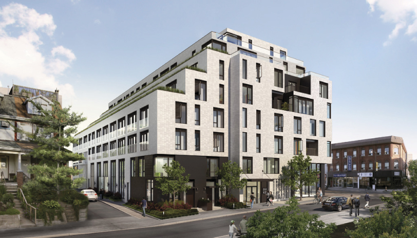
Looking west towards Phase 2 at Howard Park Residences, image courtesy of Triumph Developments


What building amenity program did your team develop that, from your standpoint, is in line with what residents want and need, practically speaking?

Because of the nature of the neighbourhood, there are lots of local amenities within walking distance. To keep construction costs and condo fees down, we provide typical meeting rooms, lounge, a media room, and gym but no pool.

The base building is charcoal-coloured brick and glass and then at the 6th floor, there is a shift both in plan and in exterior cladding. What material is used for the remaining storeys?

It is metal cladding and it goes with the window system. It is also perforated to allow plants to grab onto it.

Incorporating vegetation on the façade will give the building a very interesting presence on the street and from afar. This amount of 'building green' is unprecedented in Toronto...

The cascading vines, green roofs and planters will be maintained by the Condo Board as part of the 'common area’, and not up to each individual owner to maintain. That will keep it looking uniform. There is no stormwater tank but water will be dealt with on site through a combination of stormwater management solutions.

Relative locations of Howard Park and Roncesvalles Lofts by Triumph Developments

The site has access to transit (streetcar, subway, one of the stops of the new Union Pearson Express), lots of grade-level bike storage and a great Walk Score. What is the buildings’ parking ratio? Any provision for electrical vehicles?

The parking ratio is around 65-70% suites to parking stalls. At the moment, we’re seeing only 1 out of every 2 units asking for parking and the explanation is that the building is so well serviced by transit. On the other hand, bicycle spots are aplenty and they are in big demand. As for electrical vehicles, that is not final yet. In Phase 2, we provide storage lockers on the upper levels – so that residents have a locker almost across the hall. It became possible because we had to be creative in utilizing the oddly shaped resultant spaces in the core so we located storage lockers and services there.

It is great that parking and service access will be situated along the shared laneway off Howard Park Ave, making the lengthy (650') Howard streetfront more pedestrian-friendly and accessible for building, townhome and retail entries. Was it a challenge to locate it behind the building?

It might have been easier to situate it between the two buildings but it would have destroyed the look of the complex, and we didn’t want to interrupt the sidewalk. This way it’s off the laneway into Phase 1 and the parking garage under both buildings is all connected.

The building integrates many green initiatives: infill site, brownfield, green roofs, geothermal, stormwater, bike storage, etc. Are you going to take it through the LEED certification process?

Not LEED, although the plaque would look great on the wall! I’ve gone through the process as a trade on other projects and it is painstaking and very difficult administrating all the paperwork. We will comply with Toronto Green Standard Tier 2.

Looking west towards Phase 2 at Howard Park Residences, image courtesy of Triumph Developments

Incorporating geothermal systems (for heating and cooling) in condo building is not common practice in Toronto but the City gives government rebates and interest-free loans to help residential developers ‘go green’. Would you have incorporated it anyways because of the policy of your company or were government financial incentives necessary to make it reach the ROI you were expecting?

We didn’t get any government incentives. We started the process 3 years ago. Geothermal made economic sense in the long term because, if well implemented, it will save on the operation of the building.

Triumph has a keen focus on advancing and promoting sustainability, much like developers like TAS, Minto, and Tridel claim. Any market difference between them and yourselves?

Our scale of projects is smaller. The green initiatives on our buildings are maybe not as cost effective at this scale as Minto would do it. But we’re doing it because it’s the right thing to do – that’s the initial motivation – not for marketability reasons.

You have a European background. What aspects of European planning and design would you like to see inform building in Toronto?

Families living in mid-rise buildings is very common in Europe and we don’t see it as much here but I think there is a demand and a trend moving in that direction. I’d like to see buildings inserted into established neighbourhoods so families have access to amenities for their day-to-day, where they can can live and work close by, and people may even be able to go home for lunch. Large courtyard features, shared backyards, schools within walking distance, and several generations living in the same building – these are intimate living examples that I was familiar with. There is a sense of family and unity. We had these ideas in mind for our first project, Roncesvalles Lofts, and they continue to be valid for Howard Park. It is not a 25-storey structure; this is a place that makes sense to have an 8-storey building. It is a ‘community’ where you get to know your neighbours. The project will house 96 units – not a huge amount of people – and it is not intended to be transient with mainly short term rentals. Hopefully people move here and stay for a lifetime.

Stephanie Calvet is an architect and architectural writer based in Toronto. She can be found at www.stephaniecalvet.com

Advancing Green Building Innovation Through Design Charrettes by stephanie calvet

There’s a wealth of resources available for anyone minded to go the route of sustainable building, including plenty of information, best practices, assessment tools, and precedents. Builders are looking to deliver a practical, marketable and cost effective product. While developing more responsibly may be a goal for some, barriers to changing practices often come down to cost and lack of consumer awareness. Unfortunately, in the reality we currently find ourselves in, the most effective way to encourage sustainable strategies for building projects is through legislation and financial incentives. Savings By Design (SBD) is one such initiative. The first program of its kind in Canada, SBD was launched in 2012 by Enbridge Gas Distribution in collaboration with Sustainable Buildings Canada (SBC) to facilitate an easier transition to green building innovation. As a key stakeholder, Enbridge’s interest is in total energy savings and therefore it devised a way to help make higher-efficiency performance more attainable to commercial and residential builders by providing funding and support during the design, construction and commissioning stages of projects. It also fulfills a mandate of the Ontario Energy Board.

The overarching goal is that buildings achieve 25% energy savings -- or more -- over the minimum requirements of the Ontario Building Code (OBC) 2012.

Enbrige-sponsored IDP charrette at Earth Rangers Centre. Photo by Stephanie Calvet.

What makes the program unique is its collaborative, results-driven, process-based approach. Those enrolled have access to SBC’s broad network of green building experts who collectively evaluate a building proposal in its planning or early schematic phase and whose feedback can significantly improve the outcome of its final design. The methodology that is used is called Integrated Design Process (IDP) and it is focused on designing for the entire building life cycle. It helps builders identify optimal solutions for enhancing energy efficiency, occupant health and ecological benefits through customized workshops.

At the heart of the program is the IDP 'charrette', a pivotal full-day activity that brings these building industry professionals together to explore a number of design scenarios in an open discussion forum. It also gives the building team the opportunity to define priorities for improvement and to test those concepts through energy modelling.

UrbanToronto's Stephanie Calvet recently attended one of these charrettes.

Held at the Earth Rangers Centre in Woodbridge, Ontario, this full-day event gathered a team of individuals with a wide range of expertise – engineers, contractors, building specialists, modelling experts, and independent observers. At the table was the developer/client Great Gulf with a proposal for a large suburban development consisting of 450 homes with a mix of detached and townhome styles.

Prior to the charrette, a Visioning Session between proponents and SBC was held in order to ascertain clients’ sustainability objectives with regards to their project. This initial meeting focuses on aspirations and core purposes and it establishes the goals that ultimately guide the charrette.

'Energy team' charrette participants review energy modelling results. Photo by Stephanie Calvet.

Depending on the scale and complexity of a project, participants are organized into teams. In accordance with IDP, the program also considers factors beyond energy efficiency that contribute to building sustainability. For this particular project, two groups were created: the more technical ‘energy team’ focused its efforts on the building envelope and mechanicals (space and water heating); and, the ‘sustainability team’ addressed site strategies and indoor environmental quality.

The objective of the ‘energy team’ is to study a preliminary project design and identify methods for it to meet energy efficiency performance targets. Although many elements contribute to heat loss, the biggest losers are, by far, the windows and walls. Therefore, when considering energy improvements, it is most logical to consider providing the best possible building envelope that meets the budget prior to upgrading mechanical systems.

From the perspective of the developer, the objective is to understand the potential impacts to cost and schedule to exceed the code regulations and other potential energy targets while also meeting the expectations of the buyer, maximizing density and profitability. For residential builders, there is an incentive of up to $2,000 per home (up to a maximum of 50 homes or $100,000) for achieving energy performance 25% better than OBC 2012.

The program requires that the buildings be modelled to show net energy savings.

'Energy team' charrette participants review wall assebly energy modelling results. Photo by Stephanie Calvet.

During the charrette the team examined measures, assemblies and technologies to achieve modelled performance improvements over the benchmark reference (code) building. Assessments were done using BIM software that can model the impacts of the modifications on building environmental performance as they are considered, on the fly, with the SBD real-time model as an evaluation tool. Exterior wall composition was studied in great detail, as were glazing options and the effects of basement full under-slab insulation vs perimeter only. Alternative configurations at a similar cost were also explored, presenting builders with different avenues to meet their criteria.

The incorporation of external shades, LED lighting, programmable thermostats, and Energy Star appliances as potential upgrades was also discussed.

The ‘sustainability team,’ on the other hand, addressed site design approaches such as: water conservation, soil and waste issues, and the benefits of low impact development.

With an emphasis on creating tightly contained buildings to minimize heat loss – a strategy that’s been in place since the 1950s – there has been renewed awareness for the need to improve indoor air quality (IAQ), as it relates to the health and comfort of building occupants. Source control, filtration and the use of ventilation to dilute contaminants are the primary methods. Facilitators at the event presented practical guidelines for designing healthful indoor environments (i.e. specify low-VOC products) and suggested strategies for quality control (i.e. seal and protect ductwork during construction).

The team also discussed material options to upgrade durability as well as marketing opportunities for builders exploring the integration of sustainable practices into their brand. Some ways to make the case may include negotiating with suppliers, creating economies of scale, and demonstrating return on investment.

Working sessions continued throughout the afternoon and SBC gave an informative presentation of stormwater management best practices. Participants reconvened at the end of the day for a summary of discussions and a presentation of the modelling findings.

Enbrige-sponsored design charrette held at Earth Rangers Centre. Photo by Stephanie Calvet.

In conclusion, the builders came away with various options to go forward and were pleased to discover that with slight modifications to the homes’ existing design, exceeding reference energy performance by 25% is well within reach. A final report that summarizes the results of all these efforts will be presented to them.

The charrettes have become a sought-after tool for driving sustainable thinking in the Canadian building industry. Programs like Savings by Design not only incentivize builders to develop more responsibly through financial incentives but they also provide access to a multi-disciplinary team of designers and experts to help them achieve their goals.

For more information on the Savings by Design program, visit the website  http://www.savingsbydesign.ca/

Stephanie Calvet is an architect and architectural writer based in Toronto. She can be found at www.stephaniecalvet.com
Toronto's Harmony Village Sheppard Offers Boomers Healthy Active Living by stephanie calvet

(this is an article I wrote for UrbanToronto) For some time now real estate and aging-related research experts have been predicting the massive sell-off of big homes by baby boomers seeking smaller quarters. With the kids out of the nest and retirement approaching, people are looking to simplify their lives and trim expenses, housing being the major one. This expected downsizing trend has yet to be reflected in national housing data, and many doubt it will become a large enough exodus to affect home prices. Boomers have solid reasons for moving from their existing home, however.

CEO of City Core Developments, Jack Pong, is confident of this demographic shift and his company’s new market research supports his theory. Their online survey polled 508 randomly selected Ontario homeowners 50 years of age and older who are considering purchasing or renting real estate, and it showed that 59 per cent are looking to downsize within 5 years. Top reasons cited were: reducing maintenance work, lowering the cost of living, moving to a smaller home, and increasing their ability to travel more. Many plan to tap home equity to help finance their retirement.

Rendering of Harmony Village Sheppard, image courtesy of City Core Developments

“This approaching wave of downsizing will further boost the condo market, especially for facilities that are offering the upscale comforts and lifestyle communities that Boomers will be demanding,” explains Pong. “This current survey confirms that this demographic places the highest importance on maintaining an independent lifestyle in an urban setting.”

Pong is the developer behind Harmony Village Sheppard, a residential complex planned for today’s baby boom and senior generations in Toronto’s Scarborough district. Now set for public launch, the Page+Steele/IBI Architects’-designed development will consist of two 33-storey towers joined by a shared four-storey podium structure at Sheppard and Warden Avenues. The feel is more traditional than "urban village vibe", and it is meant to promote an integrated community that offers comfort and convenience.

Living Wall at Harmony Village Sheppard, image courtesy of City Core Developments

The vision for the project as set forth by its developer was to reach the next generation of seniors by moving beyond what is currently available in the market, and exploring new opportunities to provide a life enriching environment. Harmony Village Sheppard offers a new approach to condo living and is designed to help residents sustain a healthy and physically and socially active lifestyle without having to leave home. The “age-in-place” concept provides a full range of amenities and services people need as they move toward retirement, including on-site home healthcare and full meal plans. Universal design concepts are also built into suites; think lowered light switches, raised electrical outlets, and easy-access shower entrances.

Restaurant at Harmony Village Sheppard, image courtesy of City Core Developments

The 35,000 sq. ft. indoor amenity space comprises: a state-of-the-art aquatic centre; multiple dining venues including a fine dining restaurant and cappuccino bar; entertainment room; library; and, full service beauty salon. On-site year-round leisure and event programming will offer a plethora of activities from art classes and cooking demonstrations to gardening and swimming. And, just as thoughtfully considered as the interior are the exterior spaces, coordinated by NAK Design Group, such as a lushly landscaped forecourt, Zen garden and community terrace where residents can enjoy rooftop planting beds.

Zen garden at Harmony Village Sheppard, image courtesy of City Core Developments

Stephanie Calvet is an architect and architectural writer based in Toronto. She can be found at www.stephaniecalvet.com

Sustainable Design a Key Component of DUKE Condos by stephanie calvet

(this is an interview I gave and article I wrote for UrbanToronto) Stephanie Calvet sat down with Michelle Xuereb, architect and sustainability strategist at Quadrangle Architects, to discuss the green aspects of DUKE Condo’s design. The mid-rise building, which takes its name from an amalgam of Dundas and Keele streets in The Junction, is under development by TAS.

indesign-project-duke_1

TAS has been trumpeting the lengths they are going to, to create a sustainable condominium building in Toronto's Junction neighbourhood since launching DUKE Condos last year. It is encouraging to see a developer raise the bar beyond what the building requirements call for.

For TAS, it is about building community, about being a good neighbour, and understanding there is a social, economic, cultural and ecological side to everything. TAS is motivated to build their business philosophy, outlined in their ‘Four Pillars of Sustainability’, into all of their projects.

Was the decision at DUKE to ‘go green’ to the degree that it is in anticipation of new energy efficiency regulations in the building code?

For this site, they have to comply with City of Toronto Tier 1 and the Green Roof Bylaw. Anything above that is their own initiative.

High window-to-wall ratios are a current condominium design practice in Toronto, a feature that seems market-driven, not rooted in energy performance. How do we reconcile that with the fact that significant energy savings are available in building envelopes with less glazing?

I think it is actually more developer driven, and also driven by economics. Putting up a window wall system is straightforward and quick – it makes everything happen faster. Sales took off on this building and it is not floor-to-ceiling glass. I believe you have to put something out there so people realize they want it. DUKE has a specific character and people are attracted to that – and the scale is right, the materiality feels good, and it is just standard materials: windows, brick, and some metal siding. It is quite simple but it is a different approach than just cladding in glass.

Which aspect of the building’s design do you think has the biggest impact in terms of sustainability? Through which methods did you assess net energy savings?

The envelope is key. It’s about getting window-to-wall ratio down— 40-50% is where you want to be—using the best glazing possible, and reducing thermal bridging as much as possible. The window will always be the weakest link in the building so the more you can shrink that aperture, the less heat you’re losing. At DUKE we’re using aluminum frames and the glazing is argon filled with a low-e coating. At Quadrangle, we design what we think is the right thing to do and we have to be asked to do less. We feel we have to lead that way. The bonus from the recent Toronto Green Standard changes is that it makes it a level playing field for all developers – everyone has to do this. We do energy modelling early in the process.

indesign-project-duke_5

There’s great citywide interest in local and organic food. DUKE’s south side terraces are being lined with built-in planters that can be used for home gardening. Are you ‘leading the way’ by incorporating this feature into the design or is it in response to social shifts and increased demand for urban agriculture in residential developments?

There are various non-profit organizations out there advocating food policy in buildings, trying to push legislation, trying to speak to developers about how to make food happen. We too are working with these companies to help promote and push these initiatives – for one, we put food production ideas in our renderings. There’s no reason your front garden can’t have edible food. And TAS has been doing it from their side as well. We are all hoping that it really takes off. And the planters came out of another reason as well: affording neighbours to the south some privacy by having the depth of this green buffer, rather than just a railing. When there are multiple reasons why an element makes sense, it’s likely to stay ingrained in the building, and not get value engineered out.

Standard suites include engineered hardwood flooring, water-conserving fixtures, energy efficient appliances, programmable thermostats, and Energy Recovery Ventilators (ERV) to reduce energy demands and enhance air quality. Have these innovations come down in price so that the developer can provide them as part of the standard offerings?

There are a lot of things that have become more standard, like low-VOC flooring or paint, and it has become a requirement to provide energy metering to each suite. ERVs haven’t really come down in cost – the additional ductwork costs everybody more – but TAS has elected to do this anyway because it’s about improving indoor air quality and it’s something they can market.

A total of 25% of the parking stalls will be equipped with an electrical outlet for plug-in and provisions were made for future energizing of the other spaces. Will you provide a central bank of dedicated charging stations? What does that mean for the electrical capacity of the building for each space to have the possibility of EV chargers? Why go this route instead of the (less costly) car-share option?

This is a goal of TAS’ to do this. At one point we had a car share vehicle space within the building but there’s enough within the neighbourhood. The way things are going in the future, it will become more and more economical to have a plug-in electric vehicle. People in North America are pretty attached to their individual car ownership. To provide infrastructure for people to have plug-in electric is about future-proofing the building. But as for how it’s specifically going to work at DUKE, whether they will run it to a panel that is individually metered, we haven’t finalized it yet.

indesign-project-duke_2

As per the city’s Green Roof Bylaw, certain % coverage of the roof is required to be a green roof, based on the building’s gross floor area. Which system will you provide at DUKE?

It will be a drought-resistant, low-profile, extensive green roof (vs intensive – where you can plant trees and shrubs). Probably a tray system. Green roofs raise your top of roof that much higher, so you have to be careful of how you distribute the heights because you lose potential area if the roof is too thick, plus you have to consider structure. There is always a trade-off.

The benefits of a green roof are multifold. Do you believe that in the near future, sky-gardens will become both desirable and inevitable as part of a growing cityscape?

I wish it would become more prevalent because we see it as a positive attribute. Right now, green roofs cost more money and the market isn’t necessarily looking for it, so we’re not there yet. And the Bylaw % requirements aren’t high enough in terms of how much you are obligated to provide for anything more than something quite basic, i.e. a low-profile extensive roof. If the developer wants to build a lot more, it’s just additional expense and if they can’t use it as a marketing tool, chances are they won’t opt to go that route.

How do you think we can best encourage that sustainable strategies be followed on all building projects, from conception through construction to furnishing?

There have to be financial incentives and legislation, otherwise it won’t happen, as well as the fact the City of Toronto itself has taken a leadership position on this: 15% better than the current building code. That level is really the 2017 version of the code. It’s those sorts of energy initiatives – being a certain percentage better than code – that have been happening at the municipal and the provincial level, which have been pushing the envelope.

There is always cost involved with change, i.e. change from traditional to sustainable construction practices. Consumer awareness about conservation and low impact development issues is key and people might be interested in ‘doing the right thing’, but when the rubber meets the road, they aren’t always willing to pay more. What could be the facilitating mechanism that will encourage consumers to make the extra effort for eco-friendly avenues knowing that payback will come later?

I’d say it’s the consumer, the purchaser. At the end of the day, it’s the cost per square foot, and they want to know they are getting a certain kind of countertop. Right now, what I’m hearing from marketing folk is that people don’t want to pay for ‘green’ initiatives, they think that the buildings should come with them. The green is just part of the story that people are expecting to see as opposed to it being an add-on, and having to pay more for it. To me what would be interesting would be a developer who would work really hard to bring those numbers (maintenance fees) down and the way to do that would be to provide an extremely durable building.  

Stephanie Calvet is an architect and architectural writer based in Toronto. She can be found at  www.stephaniecalvet.com

OAA Presents Green Building Strategies with Architecture 2030 by stephanie calvet

(this is an article I wrote for UrbanToronto) There are plenty of global initiatives in place to encourage the building industry to do its part in eliminating greenhouse gas (GHG) emissions through sustainable design. The most transformative one by far is the 2030 Challenge, a rigorous plan of action advocating for a carbon-neutral built environment by the year 2030. The Ontario Association of Architects (OAA) is bringing this ambitious initiative to Ontario with an educational program to assist the province’s architecture and construction community to achieve the Challenge’s goals in a way that creates environmental, economic and social value.

To do so, the OAA is partnering with AIA+2030 (American Institute of Architects) and offering its members 10 four-hour learning sessions, created to provide specific strategies to becoming 'carbon-neutral', which is defined as using no fossil fuel, GHG-emitting energy to operate.

The initiative, dubbed OAA+2030 Professional Series, is adopted and updated from the AIA+2030 Professional Series, a partnership between Architecture 2030 and AIA Seattle. Numerous professional organizations and governments have endorsed The Challenge as part of their commitment to promote sustainable design. The City of Seattle was one of the first cities to sign on, initiating the Seattle 2030 District, an interdisciplinary public-private collaborative working to create a groundbreaking high-performance central area where all buildings – new and existing – will be built and renovated to aim for carbon neutral status.
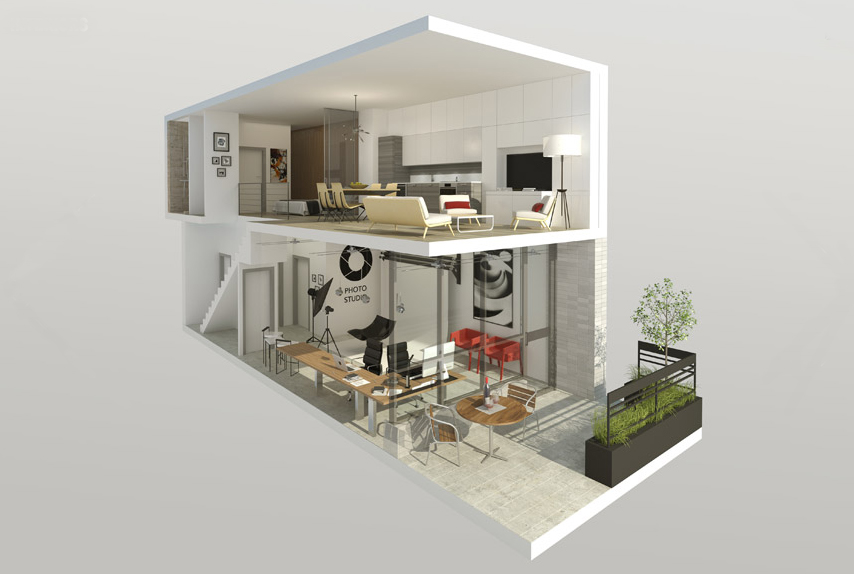
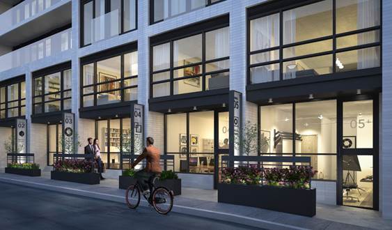
Algonquin1

Sessions run from late January through to the end of October 2014, in both Toronto and Ottawa, and give architects and design professionals the knowledge and leverage to guide decisions that will create sustainable, next-generation buildings. The comprehensive program is the first of its kind in Canada and covers topics like climate-responsive design, lighting strategies and renewable energy opportunities.

In 2002, architect Edward Mazria founded Architecture 2030, a solutions-based non-profit non-partisan organization, in response to global climate change. According to its findings, buildings not only consume much more energy than any other sector but, as the party responsible for nearly half of U.S. annual CO2 emissions*, have been identified as the largest contributor to climate change. Its mission is to rapidly transform the built environment from the major contributor of GHGs to a central part of the solution to the climate and energy crises. At a fundamental level, it involves changing the way communities and infrastructure are planned and built. The foundation of its work lies in the widely adopted 2030 Challenge, which asks the global design community to implement the following targets:

  • All new buildings, developments and major renovations shall be designed to meet a fossil fuel, energy consumption performance standard of 60% below the regional average for that building type.
  • At a minimum, an equal amount of existing building area shall be renovated annually to meet a fossil fuel, energy consumption performance standard of 60% of the regional average for that building type.
  • The fossil fuel reduction standard shall be increased to:
    • 70% in 2015
    • 80% in 2020
    • 90% in 2025
    • Carbon-neutral in 2030

These targets may be accomplished by implementing innovative sustainable design measures, generating on-site renewable power and/or purchasing (20% maximum) renewable energy.

Algonquin Centre_interior

“The 2030 Challenge is not meant to replace any current green building rating system but rather it challenges all systems to a higher level of sustainable achievement,” says Richard Williams, member of the OAA Sustainable Built Environment Committee and Toronto moderator of the OAA+2030 course. “It sets a progressively higher bar for the design and development community to rise toward.”

And the principles and practices for realizing low-carbon and resilient built environments are increasingly accessible. At Greenbuild last November, Mazria announced the official launch of 2030palette.org, the organization’s latest innovation to drive global implementation of the 2030 Challenge. The website, which provides a wealth of best practices and recommendations as well as links to outside sources, approaches green architecture at every scale, from single building elements to entire regions.

The Royal Architectural Institute of Canada (RAIC) offers building case studies to examine on its website. Amongst those are the Algonquin Centre for Construction Excellence, designed by Diamond Schmitt Architects and Edward J. Cuhaci and Associates Architects, pictured above.

For more information on the OAA+2030 Professional Education Series, visit: http://www.oaa.on.ca/.

*The Building Sector was responsible for nearly half (44.6%) of U.S. CO2 emissions in 2010. By comparison, transportation accounted for 34.3% of CO2 emissions and industry just 21.1%. According to the U.S. Energy Information Administration (EIA), the Building Sector consumes nearly half (47.6%) of all energy produced in the United States. Seventy-five percent (74.9%) of all the electricity produced in the U.S. is used just to operate buildings. Globally, these percentages are even greater.

Green Building Goal Within Reach of More Builders and Developers by stephanie calvet

(this is an article I wrote for UrbanToronto) We all know that going green is good for the environment, our health, and hopefully our pocketbooks. As much as it's important for us all as individuals to consider what kind of an environmental impact we make, it can be tough finding ways to make significant changes individually. As a group of people with similar interests—that being the UrbanToronto readership in this case—there may be more opportunities to participate in change if UrbanToronto takes the time to report on what’s happening in this arena.

With 20% of Canada’s greenhouse gas emissions coming from our buildings, a more fully involved development industry has the potential to effect a significant amount of positive change for our future. In addition to the environmental impacts, the corporate world has a sound financial case to strive for energy efficiency as well, for example reduced operating costs particularly in the face of the inevitable rise of fuel prices, and improved marketability and goodwill when the companies are perceived to be socially and environmentally responsible.

At all levels the government is supporting change as well, driving increasingly stringent building codes, supporting the uptake of energy efficient and renewable technologies, and adopting building performance standards like LEED or Toronto's Tier One and Tier Two Green Standards as optional construction paths.

Considering the inherent benefits to pursuing improved energy efficiency and environmentally conscious building practices, it makes sense as to why these two groups are active in this area. Knowing this, it may seem counter-intuitive that an energy distributor would be a source of financial incentives supporting builders in this pursuit, but that's the case. As part of its social responsibility and in support of a demand side management mandate implemented and governed by the Ontario Energy Board, Enbridge Gas Distribution has created a market transformation program it calls Savings by Design (SBD). This green building initiative is promoted to new construction builders and developers, constructing part 3 and part 9 buildings in the Enbridge Gas Distribution franchise area. As we sit squarely in the heart of this territory, the program could be "coming to a building near you", so we are learning about it and passing on the info, hoping to be a part of the change too.

DCL Medical Centre-2

Launched in January 2012, in collaboration with Sustainable Buildings Canada, the comprehensive Savings By Design program targets four key areas: energy, stormwater, resource use, and engagement. To help make higher-efficiency performance more attainable, Enbridge is providing funding and support during the design, construction and commissioning stages of projects. To qualify, projects must be in the planning or design phase, have a minimum aggregate area of 100,000 sf.

“This is something totally new that Enbridge Gas Distribution has never done before,” we were told by energy advisor Mary Sye, who developed the program in collaboration with manager Shannon Bertuzzi, several key stakeholders and business partners. It brings together owners and green building experts at the earliest phase of a project to explore a wide range of strategies, from resource conservation to renewable energy generation, and identifies the mix of technologies that can be incorporated into the design to maximize the building’s environmental performance.

The building is then modeled to estimate the potential natural gas and electricity savings, and a report is created. According to energy advisor and colleague, Carmine Faiella “At the end of the day, applicants have a picture of how much more efficient than the Ontario Building Code their proposed project is going to be.”

There's a lot to know about the program, and as UrbanToronto likes to get technical, we will be looking at various aspects of it over the next while, hoping to explain how this program should improve the buildings in which you will live and work in the future by looking at some of SBD's early adopters. For our initial installment, we were pointed in the direction of DCL Healthcare Properties Inc., the first company to take part in SBD.

DCL Medical Centre-5

Healthcare buildings are energy-intensive, making it a sector ripe for more initiatives that promote green thinking. DCL is trying to do just that. Its CEO, Frank Deluca, toured medical clinics in Romania, marveling that not only were they highly sustainable—certified to BREEAM Excellence, the world's leading design and assessment method for sustainable buildings—but they were built at one-third the cost of similar facilities in North America.

A visit to his own doctor’s uninspiring office in Ontario left Deluca with nothing to marvel about. He points to outdated and inefficient medical facilities, strained by the growing demands of an aging population. So, Deluca seized the opportunity presented by the SBD program to partner with municipalities in constructing clinics to take the burden off regional hospitals and, at the same time, showcase what is possible in green healthcare building design.

Now, DCL is developing one of the most highly performing, privately owned healthcare projects in North America. The project is aiming to achieve a number of industry firsts, including North America's first proposed BREEAM certified green medical office building. With over 250,000 green buildings certified to BREEAM globally and over a million registered for assessment, DCL could be set to lead a new charge in green building design for Canada.

DCL's business model is based on replicating an energy efficient standardized design in targeted growth communities across Ontario. Niagara Falls, deemed “prime for the Boomer Urban Exodus,” was selected as the site for the first DCL Medical Centre. Other locations being considered include Ajax, Oshawa, Ottawa, Stouffville, and a dozen more. Each clinic will be a “community healthcare hub,” occupied exclusively by medical service providers; general practitioners, dentists, opticians, pharmacy, laboratory and ultrasound facilities. “If we cluster functions within one location,” notes Deluca, “we already have a positive impact on the environment.”

DCL Medical Centre-4

The core configuration is a 4-storey, 50,000 sq ft structure that can be scaled up or down by adding or removing floors, depending on the needs of the local community. Integrated ‘smart’ building technologies will allow tenants to regulate temperature, lighting, communications, and security. For improved indoor air quality, it features operable windows for natural ventilation, low VOC interior finishes and UV technology for air scrubbing. “Tenants will immediately see the benefits,” adds Deluca. “But it goes beyond that because, as an owner, I am also interested in energy efficiency. Making the interior and exterior lighting system 100% LED has a huge advantage for us from an energy savings standpoint.” Other sustainable measures include geothermal heating and cooling, daylight harvesting (the building is 60% glazing), light shelves and Hempcrete walls.

DCL’s interests run deep because not only will it build the facility, but the firm will also own and manage its operations long-term. “Because I envision a 10 to 20 year holding period, I am very concerned about what I select to put in that building," says Deluca. “As the owner, there is a real motivation to make sure it is running at a high performance level.”

DCL Medical Centre-3

Enbridge facilitated an intensive brainstorming session called an Integrated Design Process charrette where a multidisciplinary team of industry experts evaluated the building proposal through the analysis of its form, materials, context and technical systems and then created a baseline model to illustrate its potential performance. They helped identify optimal solutions for improving energy efficiency, occupant health and comfort, as well as ecological benefits.

Deluca remarked on the success of the session, “You need an integrated team. Everybody has to be thinking together at the same level – ‘What’s our goal?’” Design improvements that resulted were numerous, including the shaping of the atrium in order to minimize heat build-up, strategically locating high performance glass, and, with Deluca’s encouragement, the decision to run an energy-saving variable refrigerant flow system on two of the four floors, instead of forced air. That type of HVAC technology is not typically used in healthcare buildings in Ontario. “We’ll use our facility as a giant test lab,” added Deluca.

When Deluca first heard about the SBD program, he was surprised. “Why would Enbridge give me the tools to figure out how to be that energy efficient? I commend them. I quickly learned there are a lot of smart, passionate people within that program who are trying to push the sustainable and high performance benchmark. I support it because it is a fantastic opportunity to have them on board, helping with this initiative, and I got to build a great team through the design process. Why not take advantage of all that available intellectual capital?”

DCL Medical Centre

The Niagara project is moving ahead quickly. With site plan approval and discussions with practitioners well underway, DCL is hoping to break ground by June, 2014. Other sites may not be far behind. The new medical facility not only advances sustainable building practices in healthcare but also seeks to far exceed targets and establish a new standard for ‘green’.

For more information on the Savings by Design program, visit the website http://www.savingsbydesign.ca/

Nest Condos Adds Density and Vibrancy to Toronto's St. Clair W by stephanie calvet

(this is an article I wrote for UrbanToronto) The rising demand for urban life calls for increasing residential density. In Toronto, the Official Plan calls for much of the new development to be built along our main thoroughfares; it's called the Avenues plan. Developers and architects who are sensitive to context can create architecture that contributes in a meaningful way to the visual identity of these predominantly low-rise corridors. A growing number of innovative infill developments on Toronto's Avenues prove that mid-rise can be attractive and practical. Examples of this sort are popping up on Ossington, Queen (both East and West), King Street East, Dundas Street West, and so on.

urbantoronto-9448-33166

One such residential development coming to the market is called The Nest, by Toronto builder The Rockport Group. This 9-storey condominium block will anchor the southwest corner of St. Clair West and Hendrick Avenue in the city’s budding Hillcrest Village. On part of the site now stands a KFC wrapped by a swath of parking. We are happy to see that coming down.

A mature neighbourhood that dates back to the early 1900s, Hillcrest is populated with large turn-of-the-century homes and lush tree-lined streets. The area was originally a large estate known as Bracondale Hill until 1909 when it was divided up into an exclusive subdivision. These days, the established low-rise neighbourhood is popular for its parks, independent shops, cafés, supermarkets and streetcars along St. Clair Avenue. The Nest is the first significant new structure on this stretch of St. Clair since the rebuilding of the St. Clair streetcar line in 2010.

NestAerS900

The convenience of the new separate right-of-way for the streetcar is now attracting new retailers, restaurateurs, and residents alike. The Nest itself will contribute 10,000 sq ft of ground level retail to the street.

Designed by Toronto-based RAW Design, the building looks like an asymmetrical stacking of box upon box. The surface of the façade jogs in and out, with projecting bays clad in complementing shades of greys and white, and balconies or terraces strung in between. This interplay of volumes and voids creates a unique texture and spatial composition. From an interior perspective, the building’s layout forms units in a range of sizes and configurations - 48 different types amongst its total 123 suites, to be exact. Each has floor-to-ceiling windows to maximize sightlines and sunlight inside.

NestAerNWCrop800

Above the 5th floor, the structure begins to terrace back on the south side, providing suites with views looking towards the city skyline. North-facing residences overlook bustling St. Clair Avenue. The building is clad in brick and German-engineered glass-fibre reinforced concrete or ‘fibreC’, a sustainable product that evokes natural materials like stone, twigs and straw. Nearly every dwelling has private outdoor space, which varies in size, up to nearly 570 sq ft at the penthouse level.

NestSWAerDay640

For large gatherings, the building provides residents with communal multipurpose space on both the main and roof levels. “We like projects where we can create a community where people can feel at home,” said Jack Winberg, chief executive officer for The Rockport Group. A large, welcoming flex space on the first floor comprises a full kitchen, library and fireplace, opening onto an outdoor patio. Similarly, comfortable indoor amenity space on the rooftop is extended into what is envisioned as an ‘outdoor living room’ and provides plenty of lounge area and a built-in kitchen/BBQ station for multi-group entertaining. A green roof on the east side wraps the building to the south, softening the terrace’s edge.

NestAmen960

The builder partnered with local firms II by IV Design for the suite and common area interiors and Janet Rosenberg & Studio on the design of the landscaped portions.

NestRoof960

Rockport has taken an approach to whole-building sustainability in this project which exceeds the City’s Tier 1 Green Standards with various measures to help to decrease its carbon footprint, including: geothermal heat pump; insulated windows; energy efficient lighting; low-flow fixtures; and, individual suite metering for utilities consumption.

The Nest is interesting not just for its variety and inventiveness but its green initiatives. Perhaps this thoroughly modern, modestly scaled addition will serve as a model for the sort of development this city needs. With Nest and other similar buildings in the works, hopefully they will convince sceptics that intelligently designed mid-rise is a viable option in a growing city that has almost taken the term ‘vertical living’ to the extreme. Innovative infill urban communities such as this one add to the eclectic urban fabric that is Toronto.

Vintage Canada Contrasted With Demise of Traditional Photography by stephanie calvet

(this is an article I wrote for UrbanToronto) The Ryerson Image Centre celebrates the opening of four new photography exhibitions tonight, and for those with a love for vintage photos of Toronto and other locations and events throughout Canada, there is a real reason to smile. For the first time in its history, every image from the renowned Black Star Collection that was filed under the heading 'Canada' will be on public view.

BW-RIC_UT

The more than a quarter of a million photographs in the Black Star Collection describe the personalities, events and conflicts of the twentieth century. This invaluable historical archive and visual record was gifted to Ryerson University in 2005. In Black Star Subject: Canada, a collaboration between interdisciplinary artist Pierre Tremblay and curator Don Snyder, every one of the 1,853 photographs filed under the subject heading 'Canada' is animated and displayed on the Salah J. Bachir New Media Wall at the entrance to the gallery. It features images of all major cities, agriculture, mining and industry of every province; images of prime ministers from Mackenzie King to John Turner; and, images of a nation undergoing unprecedented growth.

The historic Black Star images form a visual counterpoint to the exhibits of contemporary Canadian photographers Robert Burley and Phil Bergerson to be found within the Diamond Schmitt Architects-designed walls.

urbantoronto-9410-32876

Since 2005, photographer Robert Burley has documented the demise of film manufacturing facilities and industrial darkrooms in Canada, USA, and Europe. With the decline of traditional photographic materials and methods, companies like Kodak and Polaroid, among the most innovative and profitable corporations of their time, have become victims of a digital age.

The large-format colour prints that make up The Disappearance of Darkness address the swift breakdown of a century-old industry and its resulting economic impact. Burley’s photographs explore the large, windowless factories of Kodak, Polaroid, Agfa, and Ilford as well as little known places where, for the past century, rolls of film were churned out on a massive scale. A series of photos chronicles the end of the 23-hectare Kodak Canada plant in Toronto’s Mount Dennis neighbourhood before its closure and demolition in 2005. Building 9 is the only remaining structure—one which will soon find itself integrated in with a station and yard for the Crosstown LRT.

Kodak_063c 001

Over the course of dozens of road trips, photographer Phil Bergerson slowly worked his way through hundreds of towns and cities across the United States. He photographed street scenes and everyday objects in the social landscape tradition akin to that of predecessors Robert Frank and Nathan Lyons.

Though entirely absent of people, the photographs he brought back form a portrait of the country at the time and a nod to its past. Emblems and Remnants of the American Dream is a collection of documentary style images with recurring themes of religion, commercial fantasies, violence and patriotism that he discovered in street art, crudely made signs, and modest store displays.

urbantoronto-9410-32875

Emerging artist Elisa Julia Gilmour produces analog photographic and cinematic work that captures fleeting moments in the human experience. The recent graduate's installation Something in Someone’s Eye features a series of four cinematic portraits that alternate between small movements and photographic stillness. Using the now-discontinued colour reversal Kodak Ektachrome film, the work brings life to a material that will completely disappear in time.

The opening reception is tonight, from 6-8pm. Exhibitions of the work of Robert Burley, Phil Bergerson and Pierre Tremblay run from January 22nd until April 13th at the Ryerson Image Centre at 33 Gould Street. Elisa Julia Gilmour’s work is on view in the Student Gallery from January 22nd until March 2nd. Entrance is free. For more information, see http://www.ryerson.ca/ric/ 

Toronto's CentreCourt Developments’ Core Condos Step Onto The Scene by stephanie calvet

(this is an article I wrote for UrbanToronto) Core Condos is the latest addition to CentreCourt Developments’ portfolio of downtown residential towers targeting the urban professional. With INDX, Karma, and Peter Street Condominiums underway, Core Condos is another opportunity for those who want to live, work and play in the downtown core.

Core Condos Podium

The site for the new 24-storey tower is the northeast corner of Shuter and Dalhousie Streets, just blocks from the Eaton Centre, St. Michael’s Hospital and Ryerson University. It meets the developers’ corporate philosophy in two key aspects: in terms of location, it allows their demographic buyer to be in close proximity to work, transit and amenities; and secondly, in terms of value. “How we offer value proposition to the end consumer is really a combination of great design, both interior and exterior, and price point,” says Andrew Hoffman, president and founder of CentreCourt Developments.

The project went through several iterations until the City and the previous developer Queensgate reached an agreement on height and general massing. Queensgate continues on as a joint venture partner with a minority interest in the project but it is CentreCourt, who bought the land in November 2013, that is leading the development. Armed with a new vision—while still working within the building envelope parameters established earlier—it has partnered once again with Page + Steele / IBI Group Architects for the overall building design and with Cecconi Simone on the interiors.

CoreCondosExtW640

The tower exterior is divided into two components separated by an architectural slot, which helps to break down the massing. It is clad in curtain wall glazing and metal panel with skewed facets that are largely sculpted. The white, slightly taller element looks east while the western face is outlined with a defining black trim and interrupted by balconies. From a design standpoint, the building has a distinctive look that “suits the urban professional who wants something in terms of architecture that is modern and stands out from the rest,” says Shamez Virani, Vice President of CentreCourt Developments.

CoreCondosExtS640

The project will provide a total of 220 residential units ranging in size from 390 square feet to 775 square feet, a small commercial space at grade, and 84 parking spaces in a five-level underground parking structure. The building’s main residential entry will be located on Shuter Street and the retail entry and parking and service access will be situated on Dalhousie.

On the site currently are buildings numbered from 64 to 70 Shuter Street, listed on the City of Toronto's Inventory of Heritage Properties. According to the Heritage Impact Assessment prepared by E.R.A. Architects, two of the four existing buildings, 64 and 66, have undergone an “extensive remodelling of their exterior and interior” and as a result, will not be retained. The podium will incorporate a portion of the roof, two chimneys, and south façade of 68 and 70: a 3-storey, 19th century Georgian-style row house with buff coloured brick and limestone lintels and sills by architect John Tully, who also designed Walnut Hall, similar row houses which once stood further down the street.

64-70 Shuter Street

The team developed a building amenity program that, from its standpoint, is in line with what its end user, the young professional, wants and needs, practically speaking. Features such as pool and spa are replaced in favour of a large 3,000 square foot open-concept lounge space with café/bar, beanbag and hanging chairs where residents can “socialize and just kick back, outside of their suite,” adds Hoffman. A landscaped exterior terrace wraps the N, E, and W sides of the building, also at the fourth level. In the same vein, the ground floor lobby is a double-height space with fireplace and central seating that is intended to impress every time a resident enters/exits the building. Residents are likely to walk to work and to neighbouring amenities, as opposed to being more reliant on a vehicle.

Entrance lobby at Core Condos

Core Condos is currently in pre-development and will be launched for sale early this year.