(this is an article I wrote for UrbanToronto) The poignant nature of the high-rise is to identify itself in the urban skyline. Toronto has developed a tall condominium vernacular of floor-to-ceiling glazing but if you ask many a Torontonian, the city is saturated with much of the same: the generic glass tower that does little to make a positive long-term contribution to the public realm.
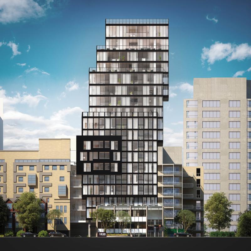
Totem Condos is a new residential building downtown by Worsley Urban Partners in conjunction with local architectural practice RAW Design. The 18-storey structure will house 120 units as well as a three-level below-grade parking garage with slots for cars and bicycles. The building has a very compact footprint and uses its space to the maximum, with very little left to waste.
RAW continues the evolution of the local condominium architecture with a proposal that sets itself apart from the rest. The building was conceived as a series of glass and dark steel framed boxes, carefully stacked. The eye is drawn skyward as the building’s geometry gently shifts left and right. Small blue ‘fins’ on the south elevation provide some additional visual interest, reflecting light in unique ways, and, when viewed from the interior, creating angled sightlines. In contrast to the sleek surfaces, stone cladding at the base provides texture where the building meets grade.
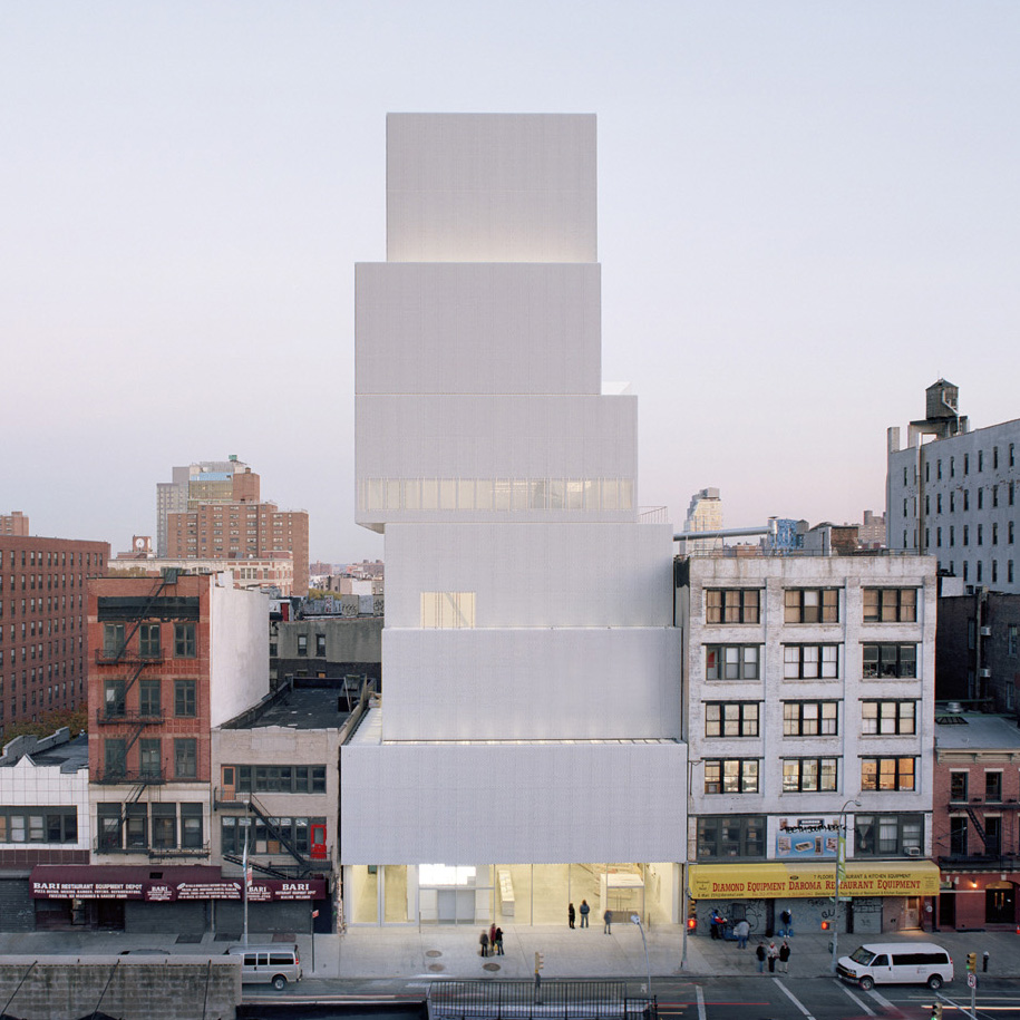
Lower Manhattan’s award-winning New Museum, a showcase for contemporary art and an icon of urban modernism, inspired the design. Taking cues from the block forms in its surroundings, the Museum stacks seven anodized aluminum mesh-clad rectangular boxes one on top of the other. The shifting of the boxes as they ascend yields a variety of open, fluid, and light-filled internal spaces and gives the building its dramatic shape.
The design firm responsible for the branding and marketing of Totem is The Walsh Group – and it’s not your typical ad agency. Under the creative direction of Shakeel Walji, the firm had a strong hand in influencing the built form. “We consult, direct the architect or interior designers working in conjunction with the developer to see what kind of look we want to create. It’s more of a collaborative effort between all parties involved and we like it that way because we feel the product is better, and we feel confident in moving forward in selling.” This sharing of creative control is not always welcome and can rub some team members the wrong way.
But Walji is quick to praise the building’s bold design, saying, “This is a better reading of a point tower in the city compared to most.” He refers to what he finds are all too similar forms in the skyline as a direct result of the need to comply with either mid-rise or high-rise guidelines, which he claims, limit innovation. His criticism is cutting. “The architects spend a lot of time developing the podium on which the building sits, take a coffee break as the building rises, and then there’s a cap at the top. Totem doesn’t have that reading at all.”
Totem is located in ‘the village’ on Dundonald, a leafy street lined with 2- and 3-storey Victorian homes that retains much of its early 20th century appearance as a residential subdivision northeast of Yonge and Wellesley. The site is currently home to the Commercial Travellers’ Association of Canada Building. The 2½-storey structure, built in 1956, was included on the city’s inventory of heritage properties in 2010, acknowledging the cultural heritage value of its Modern design, popular in post-war Toronto. Highly representative of the style, it features a grid of solids and voids with turquoise-hued glazed brick, travertine, aluminum and concreted cladding; façades are organized into bays where concrete piers divide tiers of strip windows with travertine spandrels and panels.
It is separated from the street by a small landscaped courtyard. The original structure will become the base of Totem, adding context, history and texture to the building’s design. Although the prevailing character of Dundonald is composed of low-rise buildings that make up the balance of the streetscape, the scale jumps up: immediately to Totem’s west is the 24-storey brick-clad Continental Tower apartment building from the early ‘70s. Behind it is 22 Condominiums, a glazed 23-storey residential tower at 22 Wellesley St. East by Peter Clewes of architectsAlliance.
Although City Council has since overturned the office building’s heritage designation, large elements of its modernist façades will be retained and will inform the overall design of the development. Integrated into Totem’s base, the original building will be dismantled and re-built, while above, offset floor plates will cantilever at various levels.
“The City, the TTC (which owns adjacent land), the planners and councillor were very interested to see how we could make this building happen, how we could have a piece of architecture that we could all be proud of,” says Walji. “Our city needs more of this. We should keep elevating the things we offer.”
“When we have architects that develop buildings that are of some stature, that adds to the visual language of our cityscape. It will be more inviting, more tantalizing. NYC is a great example—every corner is like a little gem—it’s memorable.”
Building form aside, the amenities are pretty swish and, “above and beyond your basics,” notes Walji. The second level will house a gym, a private dining room, and a lounge/bar that opens onto a small exterior space for dining and BBQ.
A roof deck tops the tower and its programming provides the access to outdoors where the building’s mainly small recessed balconies fall short. Residents can enjoy a dining area and lounge with a fire pit and panoramic city views.
The building has a Walk Score of 100 and a large appeal of the location is the access to the Wellesley TTC station. Its street entrance is set in one of the four bays on the north façade, where the building's main entry was previously situated, under a protective angled canopy. Totem residents can walk through a secured passageway from the main floor lobby directly into the subway station. “This was the biggest selling feature used to entice brokers to investors and buyers”, says Walji “and it’s the first building in Toronto to have it.”
Stephanie Calvet is an architect and architectural writer based in Toronto. She can be found at www.stephaniecalvet.com


