DRAWN T.O., The Toronto Urban Sketch Blog by stephanie calvet

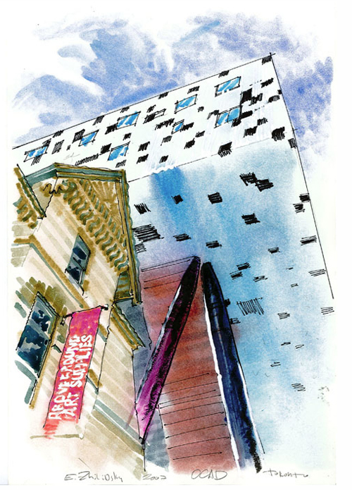
eugene-zhilinsky_toronto-1.jpg

Jerry Waese_Toronto-1 With the bleak weather lately, I’ve needed all the inspiration I can find. Lo and behold, I discovered it in the visual dispatches of Urban Sketchers (USK), a blog site showcasing sketches of artist correspondents around the world.

USK is a nonprofit whose mission is “to raise the artistic, storytelling and educational value of location drawing” and so from Lisbon to San Fran to Tokyo, sketchers employ varying media to record the visual experiences of where they live and travel, and use the site as an online outlet to share their observations. Some like pencil and ink to express themselves, while others get down ‘n dirty with conté or pastel. Whatever your means, drawing is good for you.

Eugene Zhilinsky_Toronto-1

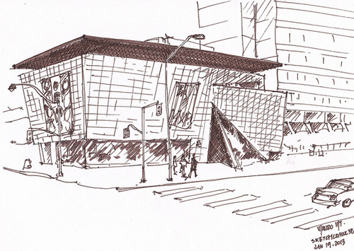
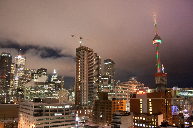
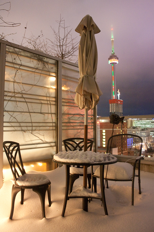
There’s a fellow in Toronto who too is struck with the drawing bug and pairs ballpoint pen sketches and writings in-situ. He has organized Drawn T.O., a regional urban sketch blog (essentially the Toronto chapter of Urban Sketchers), encouraging Torontonians with a passion to draw to get out there and capture their city on paper. A frigid -9˚C temperature might not lend itself to a detailed streetscape scene but a furtive gesture drawing of the city’s soaring structures. If you’re so inclined, send your sketches to Richard at rjohnson@nationalpost.com.

murphys-lawb

Mauricio Munoz_Toronto-1

Images courtesy of Toronto sketchers: Jerry Waese, Eugene Zhilinksky, Richard Johnson and Mauricio Munoz.

For anyone interested in participating on a global scale, the 4th International Urban Sketching Symposium will take place in Barcelona this July. Instructors (including architects, illustrators, artists, and educators) from four different continents will lead workshops aimed at helping participants frame compositions from complex urban scenes, develop their personal style, master painterly effects, and create drawings rich in narrative.

4th International Urban Sketching Symposium

Urban Sketchers Manifesto: 1. We draw on location, indoors or out; 2. Our drawings tell the story of our surroundings; 3. Our drawings are a record of time and place; 4. We are truthful to the scenes we witness; 5. We use any kind of media; 6. We support each other and draw together; 7. We share our drawings online; 8. We show the world, one drawing at a time.

 See site for inspiration, information and worldwide sketch crawls near you.

‘WALK IT OUT’ – A panel discussion with Toronto’s chief city planner by stephanie calvet

Urban Toronto_Walking-3 Public conversations about city building are taking place in Canada’s largest urban centre. Most recently, one panel, engaging parents, child educators, heath professionals and big city-thinkers, aims to create a healthier, more walkable Toronto for children.

University of Toronto’s Faculty of Kinesiology & Physical Education hosted “What Happened to Walking?” – Encouraging active school travel in Toronto. Professors on the panel shared their research findings from the ongoing BEAT project (Built Environment and Active Transport), which studies the topic from multiple perspectives: physical and mental health; financial costs; urban landscapes; and, the child’s point of view (including fears, obstacles). While within certain distances walking is still the most common mode, it has been on the decline and children are heavier and weaker than ever.

Urban Toronto_Walking

The evening’s keynote speaker Jennifer Keesmaat emphasized the importance of this simple and meaningful childhood experience rooted in nostalgia. Who doesn’t have stories about walking to/from school, or about exploring one’s surroundings while dillydallying on the way home? The symposium was one of the first opportunities to hear from the newly-appointed chief planner for the City of Toronto.

Keesmaat, an approachable young urbanist (and mother), claims that by having vastly separated our uses (read: sprawl) and privileging moving vehicles, “children have been designed out of public space.” Predominantly driving environments, with their countless turning lanes and blank façades, are unworthy of children’s curiosity. They are isolated, unsafe, and unfriendly for anyone, much less kids! Walking is more imperative than ever and our immediate surroundings need to be more conducive to travel on foot.

In light of the city’s unprecedented growth (Toronto is the condo epicentre) and staggering infrastructure deficits, are we, maybe, at the cusp of a change? A new theory entitled ‘Peak-Car’* suggests that in various cities of the world we are witnessing an aggregate levelling off in average car mileage perhaps the result of car saturation and changing mobility patterns: fewer people owning cars, walking more.

And while the Greater Toronto Area (GTA) is investing significantly in regional transportation, Keesmaat stresses the need to “create places where we see walking as a fundamental part of our transportation planning.” We can support a walking culture by giving pedestrians priority, not only by providing safer circulation but also by thinking about “how we embody a space and a place”. There is strong local support for developing denser, sustainable, walkable neighbourhoods near shops and services, and a desire to move away from car-centric environments.

Urban Toronto_Avenues

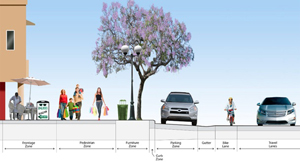
The City has identified key avenues (above) to cultivate as "walking habitats" – attractive, all-season pathways characterized by wide sidewalks and buffers, greenery, and buildings that don’t overwhelm the street and that allow sunlight to hit the pedestrian realm. Creating environments where everyone can share in a high quality of life, and building neighbourhoods and walking habitats that are supported by great public transit and cycling networks is really, as Keesmaat says, “an equality and justice issue.” And while infrastructure presents its challenges, she iterates that the way to ultimately increase healthy modes of commuting begins, you guessed it, with parents.

Moderating the panel discussion, Christopher Hume, an outspoken architecture critic and urban issues columnist of the Toronto Star, remarked on the irony that “we have to argue for walking”, and the fact that “we have to devise policies” to make this most basic of human functions possible.

Although the focus of the talk was on how to promote greater independent mobility among children, it shifted to the functioning of the built environment as a whole and the larger issue of how citizens relate to the city. Hume criticizes the motorized-mindset and states that the ambivalence we’ve shown is a “reflection of how we feel about the environment in which we live. We cannot afford convenience any longer.” If we truly believe that cities should be designed for people, it will require making cultural choices and hard sacrifices in order to reclaim the streetscape and re-design it to be shared amongst people and cars.

Never has the job of planners been more important. If in fact true, the underlying principles of ‘Peak-Car’ give practitioners “much more freedom to think about what kind of cities they want.”* They curate a set of design guidelines and best practices that can be integrated into policy in order to encourage more healthy use of public spaces like streets and sidewalks. Toronto has plenty of precedents to learn from...

Street Section_1

images-2

To see this public speakers’ series lecture, click here.                                     *Toronto Chief Planner Jennifer Keesmaat made reference to a London Times article on ‘Peak-Car theory’.  See her official blog at http://ownyourcity.ca/

Heritage Architect Julian Smith on ‘Re-imagining the historic urban landscape’ by stephanie calvet

“What gives a physical place meaning? How do we decide which historic sites are culturally significant?” Cultural Landscape theory is an attempt to provide new answers to these often-debated questions. It emphasizes that the traditional distinction between the physical and the cultural landscapes is an artificial one and that nature and culture should not be seen as conflicting but rather as part of an all-encompassing ecosystem, a vision not unlike that held by indigenous communities. In such a view, human habitats display the diversity and richness of their different cultural subgroups and achieve a sustainable equilibrium with their environment.

As part of an ongoing series of talks, Toronto’s Centre for City Ecology recently invited leading heritage architect and educator Julian Smith to give a lecture entitled ‘Re-imagining the historic urban landscape ’ in which he explores the meaning of cultural landscape and how we create it in our communities. Smith has established an international reputation for his work in the conservation, restoration and adaptive reuse of historic properties, and cooperates with UNESCO and the World Bank, but his most challenging role is as Executive Director at Willowbank, an educational institution “at the cutting edge of a global shift towards a more ecological and sustainable approach to heritage conservation.”

Willowbank promotes cultural heritage and emphasizes the apprenticeship tradition (hands-on craft skills). In addressing Willowbank’s approach to the historic urban landscape, Smith prefaces with the distinction between historical landscapes, which have prior historic significance and can be observed, and cultural landscapes, which exist in the cultural imagination and have to be experienced to be understood.

Smith summarizes a 300-year history of motivations for Conservation into four biases: Antiquarian – the archaeologist spins great stories about culture from physical remnants of earlier civilizations; Commemorative – the historian protects and tells the story of the historic place through reconstructions or ‘stage sets’; Aesthetic – the architect/architectural historian recreates heritage vocabulary (think Colonial Williamsburg-inspired wallpaper); and, most recently, the Ecological bias that emphasizes a more holistic view of the interconnectedness of buildings/landscapes/artefacts as way of understanding the world whereas earlier biases expressly used the ‘object’ in isolation. This 21st century approach is based on the notion that artefact and ritual come together to create cultural reality.

When we talk about how communities understand place we are dealing with perceived realities, which consider the cultural landscape, not actual or physical reality, i.e. GIS map. Rituals map the city. Case in point: everyone in the audience was instructed to map a small common section of Toronto (an exercise Smith often has students do). The results typically demonstrate that when people think of cities, they plot their rituals, such as commute, festivals, or processions.

“One of the great things about cities is that you can have cultural landscapes that overlay each other and multiple cultural realities existing in the same place.” Smith cites a number of local examples of these places of overlap which frequently are the most fascinating parts of cities: Boulevard St. Laurent, a commercial and multicultural artery in Montreal; or, Kensington Market, a distinctive neighbourhood in downtown Toronto with an unpretentious, bohemian-esque vibe. In the latter’s case, nothing evolved according to planning principles but was rather the result of a pattern of (illegal) unregulated activity and that is precisely what gives this area its vitality. Smith thinks this part of the city deserves recognition as a cultural landscape that overrides both the province’s Planning Act and Heritage Act and needs to be protected as such.

Smith highlights Evergreen Brickworks, an innovative multi-use community environmental centre housed in a series of heritage buildings that successfully blur the boundaries between public and private spaces. He argues that architects/planners have been limited by architectural constraints or relied too long on property lines and rights when thinking of how we occupy the city. “Planners are still groping with what it means to lose those distinctions. Our approach has become so aesthetic and commemorative,” says Smith. “You have to maintain cultural landscapes of city layered on top of each other (otherwise you gentrify).” We need creative thinking; a dynamic definition of cultural change; and, to allow the evolution of buildings and places with contemporary layers such that they are in harmony, and not just freeze them in historic settings.

This type of discussion is particularly interesting for a dynamic environment like Toronto that is growing and changing at a rapid pace by virtue of the constant influx of people. It seems that only by integrating commerce, culture and community can we achieve a balance between urban growth and quality of life on a sustainable basis. The Centre for City Ecology, whose mandate is to “raise levels of urban literacy so that ordinary Torontonians can join in a robust conversation about city building,” engages the community to create meaningful spaces for a more liveable city. It hosts lectures at the Urbanspace Gallery at 401 Richmond St West, a heritage building providing spaces for the creative sector.

For more information on the lecture series, check the CCE's website http://www.cityecology.net/. Click here to see the video of Julian Smith’s November 14 presentation. 

World Town Planning Day 2012 by stephanie calvet

From CIP website:  "World Town Planning Day is currently celebrated in some manner in about 30 countries on four continents. To celebrate this international event held annually on November 8th, the Canadian Institute of Planners (CIP) and its affiliates distribute e-Posters to members across the country and to organizations around the world." For the fourth year in a row, the collaboration of a growing list of planning organizations – from Australia, Canada, South Africa, UK, USA, New Zealand – continues to support a joint “virtual” conference for planners from around the globe in honour of World Town Planning Day. The conference takes place on November 6 - 7, 2012 and is completely online, as a part of an effort to reduce the carbon footprint caused by presenter/participant travel.

"The international organization for World Town Planning Day was founded in 1949 by the late Professor Carlos Maria della Paolera of the University of Buenos Aires to advance public and professional interest in planning, both locally and overseas. WTPD is promoted each year by the International Society of City and Regional Planners (ISoCaRP) headquartered at The Hague, The Netherlands."

This year’s conference brings together leading practitioners and experts on the topic “Smart Communities Connect.” The purpose of this conference is to hear ideas from around the world on how we are planning for mobility and how new technologies – like mobile apps and other smart solutions – impact planning. Download the programme or visit the conference's dedicated website.

Art + Science in ‘Chasing Ice’ by stephanie calvet

Toronto, a city whose cultural calendar packs in close to 70 film festivals a year, wrapped up the 13th annual Planet in Focus with a screening of ‘Chasing Ice,’ a stunning environmental documentary of a fearless photojournalist tracking the Arctic’s alarming rate of glacial recession as part of a global outreach campaign.

At the event’s Closing Night gala, international Eco Hero and National Geographic photographer James Balog shared the story of ‘Chasing Ice,’ a long-term photography project aimed at educating the public about the dramatic effects of global warming. And nowhere are they more visibly astounding than in mountains of ice in motion.

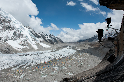
Accompanied by his Extreme Ice Survey (EIS) team, Balog leads expeditions to Greenland, Iceland, northern Canada and the USA to photograph glaciers and install permanent time-lapse cameras on-site in some of the Earth’s harshest conditions. To date, there are 40+ cameras dotting the globe shooting every half hour of daylight, year-round. After months at a time, the EIS crew returns to retrieve the images and assembles them into time-compressed video animations that illustrate a rapidly shifting landscape – a disappearing world forever caught on film. This scientific evidence is irrefutable proof of drastic climate change. The documentary features breathtaking stills that leave viewers agape and spellbinding sequences that garnered it Excellence in Cinematography at Sundance.

Armed with a background in Geomorphology and a fondness for the wild, Balog switched early on from a career in academic science to nature photojournalism, a craft he honed on his own. Assignments and personal projects have taken him to document endangered animals, old-growth forests and the aftermath of tsunamis. But he now claims to have found his mission in life:  polar ice.

Balog’s passion and need for ‘getting the shot’ override all sense of caution and that has led him to undergo knee surgery four times to-date. Adventurous to the bone, he physically positions himself in any which way to best capture the image: a close-up of an ice sheet or an aerial of crevasses. Throughout the film, Balog perilously wades through ice-cold water, or, donning crampons and a harness, he hangs off the edge of a precipice, or descends into a ‘moulin’, a shaft created by the force of cascading meltwater – in essence, an abyss.

‘Chasing Ice’ is a call to action. It inspires social change. And by marrying art and science, Balog has found what he’s truly meant to do.

Photos courtesy of James Balog. ‘Chasing Ice’ is coming in November to a theatre near you… See the trailer here.

In the Public's Interest by stephanie calvet

Three of the world’s leading practitioners of public-interest architecture addressed The Importance of Being a Socially Sustainable Architect” at IIDEX Canada. Liz Ogbu, Michael Murphy and Janna Levitt related their experiences in the non-profit and private sectors through case studies of compelling work.

1) A former innovator at IDEO.org and Design Director at Public Architecture, Liz Ogbu opened by re-stating the UN’s original definition of sustainability: “development that meets the needs of the present without compromising the ability of future generations to meet their own needs,” drawing attention to social consciousness rather ‘green building’, a term more commonly used nowadays.

Public Architecture engages firms and non-profit organizations in the design of sustainable, public-oriented projects that enhance interactions and communication. Investigating the great potential of waste, it developed “Design for Reuse Primer”* a resource listing projects that incorporate used materials into the language of the building. It demonstrates how to make projects viable to the community by describing the processes and lessons learned in each case study: how materials were worked into the design, how funding was achieved. By telling their story, and “linking fact and emotion” (what it was before, what it could be in the future), it speaks to something greater.

And not only full-fledged buildings have design impact. IDEO.org’s project in Kenya is a small-scale business: a kiosk selling water and products. SmartLife seeks to eradicate poverty by means of public interest design initiatives that integrate building with medical, nutritional and hygienic considerations.

Because of their capacity to reflect on both the big and small scale, “architects have the ability to be systems thinkers, not merely designers of buildings,” says Ogbu. It is a multi-dimensional role: Architect as instigator, facilitator, collaborator, translator, advocate, and designer.
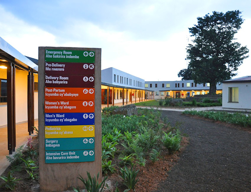
2) Michael Murphy is a founding partner of Boston’s MASS Design Group, a not-for-profit firm that best represents the role of designers in public health. Through the development of hospitals in Rwanda and Haiti, MASS has acquired lessons that may also prove to be particularly relevant to USA and Canada, where the largest growing industry is healthcare infrastructure.

These lessons highlight the importance of: 1) Patient Centricity; 2) Natural ventilation; 3) Transparent systems; 4) Programs for long-term wellness, not reimbursables; 5) Controlling infection to save lives (and avoid litigation!); and  6) Civic infrastructure.

In the USA, healthcare buildings suffer from a plethora of problems, including labyrinthine plans, a lack of natural light, and a prevalence of airborne diseases. Murphy encourages North America to “look beyond its borders and not only produce different business models but rethink the facility into a community model.” A simple strategy, like revisiting the typical layout of a ward in the Butaro hospital in Rwanda, led to an increased connection to the outdoors. By implementing forward-thinking approaches, facilities’ design can be beautiful and dignified, more humane and less reminiscent of a “conveyor belt.”
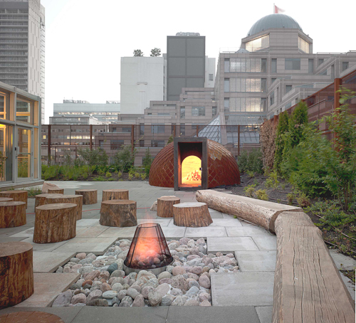
3) Janna Levitt is a Principal of Toronto-based Levitt Goodman Architects, a firm that espouses the learning through making practice by in-house building and doing experimentation alongside. “As architects, every opportunity is an opportunity to innovate,” says Levitt, also an active lecturer, critic, and community activist. The social sustainability aspect of their projects looks at maximum use/re-use, cultural opportunities, and the need to be open to innovation.

The adaptive reuse design of the Native child and Family Services building called for a green roof that could be used by urban First Nations people for counseling, playing, and ceremonial purposes but, when running short on monies, was put in jeopardy. Levitt Goodman worked with the client to secure funds to get it built, not typically in an architect’s scope.

The conversion of a medical building into single room occupancy at Leonard Avenue required a clever consideration of pre-manufactured trailers and shipping containers and a balancing of logistical and procedural elements. In addition to responding to the program and meeting the client’s mandate that no tenant need move out during the renovation, the architects went the extra mile to propose cost-effective rooftop housing as “garden apartments in the sky,” envisioning a way to greatly enhance the residents’ quality of life.

The above-mentioned ideologically-driven architects are each a force to be reckoned with in their own right, although common to all three is their ability to identify design problems and come up with design solutions. As proponents of socially sustainable architecture, they highlight the importance of understanding the needs and desires of the ultimate end users, not just the paying clients, and emphasize the value of working collectively in order to arrive at innovation.

*Public Architecture’s “Design for Reuse Primer” is now available for download. http://www.publicarchitecture.org/reuse/  Images courtesy of firms.

The Bay of Fundy by stephanie calvet

Little known fact: Each day over 100 billion tonnes of seawater flow in and out of the Bay of Fundy during one tide cycle – more than the combined flow of the world’s freshwater rivers.”*

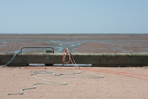
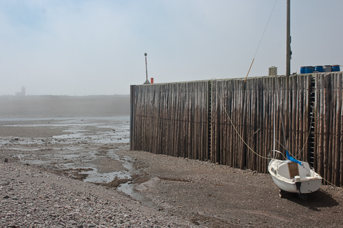
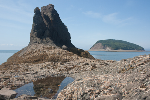
The highest tides on the planet are found in the Bay of Fundy, a 270km-long ocean bay that stretches between the eastern Canadian provinces of New Brunswick and Nova Scotia. The time between a high tide and a low tide is approximately six hours. And so twice a day, every day without fail, the tides recede and expose the vast ocean floor.

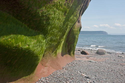
There are exceptional sites in Nova Scotia from which to observe this ecological phenomenon. Five Islands Provincial Park is a spectacular setting for camping and ocean kayaking. At low tide you can walk the seabed and dig for clams in mud flats or comb the beach for fossils and other marine curiosities. And, for the rock enthusiasts, some 225million year-old geological formations –overhanging cliffs and caves eroded by the water's impact through the millennia – are ever so patiently waiting to be explored.

Cape Chignecto Provincial Park is a wilderness-hiking park on a coastal peninsula. Trails sweep through an old-growth forest ecosystem, scale canyons and valleys, and climb towering cliffs where waves lap their base. They pause to reveal dramatic vantage points from where to view the semidiurnal tidal action, whose times and heights vary from one location to the next. (The water rises and falls around the Bay in elevations ranging from 3.5m to 16m, securing the title of World Tidal Dominance!) In Cape Chignecto, there are single or multi-day trails to hit, many of which descend at the beach. Some are so challenging, only the highly skilled should attempt. Consult tide charts in advance for accurate times in order to coordinate a return trip back along the shore. A high tide may delay or worse, leave one perilously stranded along the beautiful yet rugged terrain...

Nova Scotia - The Cabot Trail by stephanie calvet

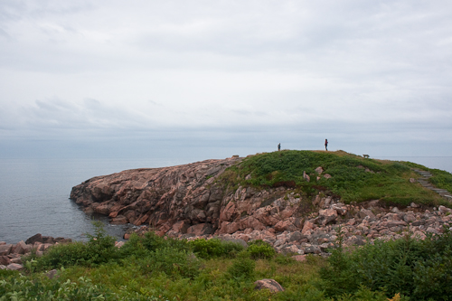
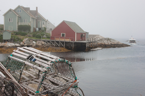
Cape Breton … stunning natural beauty in a rugged coastal setting, untamed by habitation. Sure, there are small Acadian towns, fishing villages and the odd tent pitched along the way. But the land is vast and dramatic. Where is everybody? There is more than enough for everyone here.

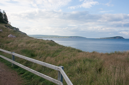
The route winds over mist-laden mountain peaks and valleys, bestowing spectacular views of ocean or lake each and every which way you look. The Cabot Trail is a 298km scenic highway that loops around the island of Cape Breton, a forested plateau bordering the Atlantic. It passes through the Highlands National Park and follows the shoreline of this northernmost tip of Nova Scotia. Rolling out in front of us, the roadway changes from red to green to lavender.

A holiday here is a vacation in the truest sense of the word. There is a quality that engulfs the senses, a serenity that stirs the soul. If not by car, visitors travel by bike, kayak or on foot. Walking trails – 5, 10, 20km long – wind their way through forests and skirt the edge of actively eroding cliffs. The cool, maritime climate and rocky landscape allows for a blend of northern and temperate species of plants and habitats. We share wild berries with the wildlife – if we’re lucky to beat ‘em to it – and enjoy a bounty of fresh seafood at every meal. Gastronomes know how wonderfully scallops and halibut pair with the sweet local wines. There is no shame in admitting it: we’re eating & drinking our way through Nova Scotia.

And water is everywhere. Our Zodiac skims past caves and rock outcrops near the coastline, then fearlessly darts out to deep sea in search of whales. The wait is a short one. The vessel grinds to a halt upon tracking clusters of the migrating mammals. Left and right, we catch glimpses of their glistening skin slipping out from under the surface. Buzzing around us, some whales boldly approach close enough to touch but mostly we watch their breaching from afar, how they expose their fusiform-shaped bodies or slap their tails before submerging again. The numbers that I haven’t seen here in people I see in animals – a generous quota – which also includes dolphins, seals, turtles, eagles, puffins and other seabirds.

It is delightful to not be vacationing with the masses this summer. We have the road and beach to ourselves. Fine folk (like the P.E.I. sisters above) who too have chosen Nova Scotia as their retreat of choice stay in cottages and campgrounds sprinkled throughout the region while some of us prefer to slum it up in charming B&Bs and resorts. Like the motorcyclists travelling in packs, we choose the solitude of the open road. It’s all very civilized out here…

London's Street Art by stephanie calvet

London is front and centre right now. With the Olympics underway, the world will get a chance to see results of the extensive regeneration this top-notch city’s East end underwent in order to host the Games. That area has long been known for being gritty, rough around the edges, and for its proliferation of artists and graffiti. Like anywhere, the future of much of its diversity and creativity is perhaps uncertain, as ‘gentrification’ is often synonymous with ‘regeneration.’ Time will tell how successful the developing areas will become.

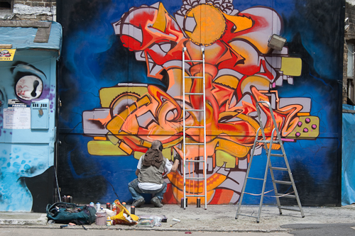
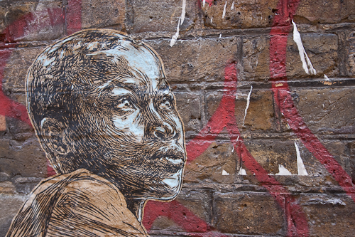
Richard Griffin knows East London’s street art scene inside out and he, or one of his disciples, regularly conducts jam-packed 4hr walking tours through the Shoreditch neighbourhood. ‘Griff’ leads the troops along lanes and back alleys, identifying all sorts of graffiti types (tags, characters, big walls) by introducing visitors to the works of over 40 local and international artists. Some figure prominently in areas of high visibility while others are so obscure they need to be pointed out.

Unless specifically commissioned, elusive artists work in complete anonymity and often late at night. After all, graffiti is illegal. “It is a premeditated, and sometimes highly organized, form of vandalism with a very well-developed sub-culture behind it.”* Sometimes this form of free expression is used to draw attention to decaying or neglected spaces. Oftentimes it is motivated by a desire for fame, be it statement-making (think Banksy’s satirical public works) or gallery promo. [Side note: street artist Ben Wilson has cleverly evaded prosecution with a very bizarre and unique approach. If you’re lucky you’ll spot him sprawled on the sidewalk, painting flattened gobs of chewing gum. It’s all good though – he’s merely transforming existing rubbish into thousands of miniature paintings.] More ‘typical’ graffiti styles you’re likely to see include: Bubble, Fat Cat, Splash, Block, and Wildstyle.

Some pieces are very involved while others are quick and dirty. Some cover an entire wall while others are just small markings lurking low in corners or high on walls (think pixel characters by Invader) that, in the immortal words of Ferris Bueller, “if you blink you could miss it.” Many artists have instantly recognizable styles: Dutchman Roa’s black and white ordinary animals with their focal gaze occupy abandoned lots; New York-based Swoon’s paste-ups created from wood cuts are realistic in style; and, Catalonian Pez’s hyper fish and other characters charm with their infectious smiles. And again there’s Banksy. Works by this protected artist who capitalized on getting really good images up fast by using stencils (considered ‘cheating’ by some) are preserved behind Plexiglas because of their popularity and consequent boosting of property value.

There are various kinds of graffiti artists. There are the widely known ones, there are those who make a good living off their work, and then there are unknown artists, who are neither bothered by money or ambition or are just starting out. Common now are commercial artists that want to work on the street and alternatively, street artists that want to get into galleries. Biggies like Stik –who paints simple stick figures (read: fast) that convey great emotion – are lucky to be living the dream: to travel the world doing one’s art. But more than shoptalk, Griff also shares some of the seedy goings on in the street artists’ worlds: the liaisons, the affairs, and most interestingly, the feuds. Work is vulnerable to being taken out by rival teams or ‘barnacled’ by others in an attempt to siphon off attention. It’s a colourful tour, in more ways than one.

London’s street art scene is constantly changing and Griff knows where the latest and greatest is to be found. Whether it’s from trolling the streets in search of goodies or hits from artists posting their new pieces on Twitter or Facebook, Griff keeps his list updated regularly. Works still hanging around after 2 months are considered ‘old’ here and are “gone over by other artists or buffed away by the Council.”

If you didn’t ‘get’ the world of street art before, you will after this tour because the artwork is the kind of thing that’s best experienced in person. You’ll know your ‘throw-ups’ from your ‘bombs’, a Stik from a Swoon, etc. It now has me looking high and low to scout out and interpret new ones in my own city, Toronto. There’s nothing like being greeted by a giant painted toaster on your way to work.

Tours are available Tuesdays, Saturdays and Sundays. Contact Street Art London to book at http://streetartlondon.co.uk/tours/.

*Richard Tawton occasionally gives graffiti tours in Toronto

Glass Masters by stephanie calvet

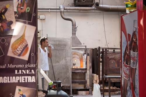
The glass master forms the shape by swinging an amorphous ball of glowing matter through the air, transforming it into a swirl of colour ultimately bound for the annealing kiln. Working demonstrations provide visitors with a glimpse of new manufacturing practices as well as ancient techniques used throughout Murano’s long glass-making history.

Visitors are quick to scoop up jewellery and tableware, and the occasional chandelier or mirror. But don’t be fooled – if it doesn’t say Vetro Artistico ®Murano, it’s not legit. Shopkeepers here are quick to point out that theirs are local products, not from China. (Imitation is rampant, particularly in Venice.) They display genuine goods bearing the original trademark, following stringent controls set forth by the Consorzio Promovetro whose intent is to “conserve and safeguard the island’s thousand-year-old artistic glasswork tradition, while promoting its marketing throughout the world.”

Beautiful examples of traditional, miniature, and contemporary glassware come from prestigious companies like Venini who feature the work of numerous Italian and international artists, and from studios and artisan factories of independent designers such as Carlo Moretti and Cesare Toffolo.

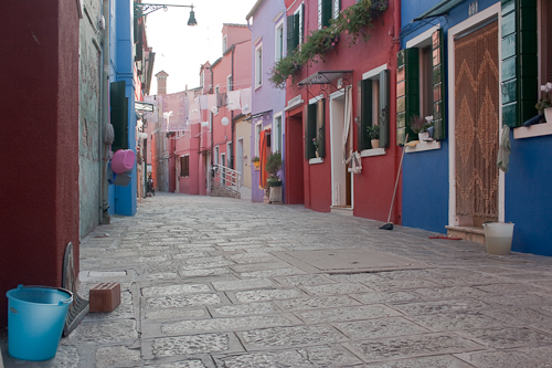
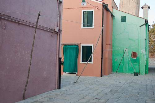
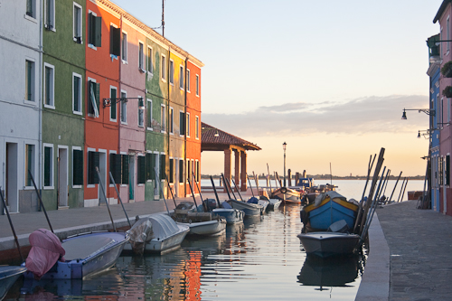
Murano is the largest of the islands in the Venetian Lagoon. The town plan is partly based on the unique morphology of Venice itself – it has nine islets joined by a long canal that weaves through.  And just a vaporetto ride north is the tiny island of Burano, strung with brightly painted façades. Colour takes on a collective importance here. You’ve got to see it to believe it.

Architects and Illustrators by stephanie calvet

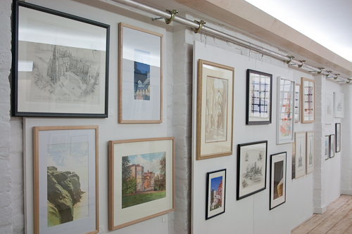
London’s newly established Anise Gallery just wrapped up its first illustration exhibition – a collection of art works by 25 members of the esteemed Society of Architectural Illustration (SAI).

The SAI is the world’s oldest organization of its kind, and represents a community of professional illustrators, animators, model makers and photographers who contribute to architecture through a wide range of disciplines. The gallery showcased a variety of these techniques, from traditional methods such as watercolour and pencil to the latest in computer-generated technology, photo-real imagery and animation.

Located on the historic riverside street Shad Thames, the gallery shares a converted warehouse space with design studio AVR London, a collective of artists and architects who create visionary 3D renderings for architects and developers to be used in the promotion and marketing of their work. Anise Gallery – as a literal and figurative extension of the firm’s workspace and its creative process – is dedicated to fostering and celebrating illustrative talents in multi media.

Architectural renderings frequently start out as freehand sketches – the most immediate method of communicating and visualizing ideas while still leaving plenty of room for interpretation. They hint at the direction a design may take and are then further finessed and formalized. Subsequently, with 3D software those ideas can be converted into realistic shapes that will eventually result in physical structures.

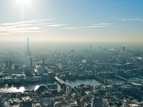
The compilation of works on display included lively travel sketches (carnets de voyage); perspectives laboriously detailed with the finest of pencil markings; and photorealistic digital images that, while based upon accuracy, still maintain a looseness and painterly effect. A series of captivating renderings featured the London skyline and highlighted the city’s latest addition, the glass-robed Shard, Europe’s tallest skyscraper, which is set to open in June.

Anise Gallery is located at 13a Shad Thames, London.

Walls of Dubrovnik by stephanie calvet

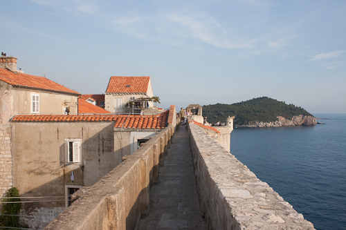
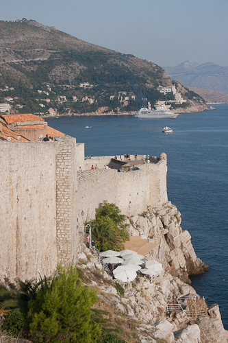
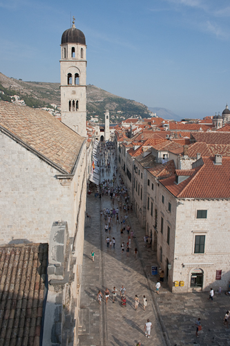
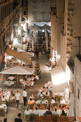
The historic walled city at the southernmost tip of Croatia is as exceptional from the ground as it is from the sky. Massive stone walls run high and low, encircling the Old Town of Dubrovnik and framing an uninterrupted course on the edge of the Adriatic Sea. Dotted with turrets and towers, the two kilometre-long climb reaches its peak at 25m, overlooking terracotta rooftops as far as the eye can see.

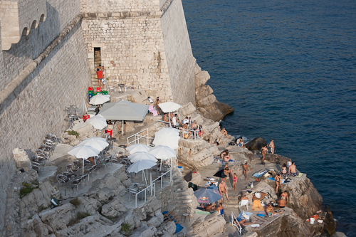
Though built during the Middle Ages, the Great Wall has been reinforced throughout its history, and remains remarkably intact. Some of its fortresses and defensive towers serve as jumping off points for bathers and are even used as bars. Having a nighttime drink on the cascading rock edge is a delightful sensory experience. It’s pitch black – just moonlight, candlelight, and the constant rhythm of the waves.