This is an article I wrote for Canadian Architect magazine.

The Toronto Reference Library (TRL) is the flagship of the world’s busiest urban library system. Occupying over 416,000 square feet, it is a landmark situated adjacent to one of the city’s liveliest intersections—Yonge and Bloor—at the junction of two subway lines. The TRL opened its doors in 1977. Designed by architect Raymond Moriyama, the robust five-storey building was clad in red brick, its mass scaled back by terracing the façade along the diagonal. Bands of mirrored glass suggested an inner world within. The narrow corner entrance, flanked on two sides by a colonnade, drew patrons into the building’s soaring interior. With escalating demands on the library system, the TRL recently completed an extensive five-year phased revitalization led by Moriyama & Teshima Architects, though its cofounder Raymond has since retired.
The renewal of the TRL presented an opportunity to create a library of the future for Torontonians: a technologically advanced public space to meet a growing need for innovation, research and collaboration. Outreach strategies include an expanding range of programming. Here, you can take a workshop, get a flu shot, publish a book, or make a 3D-printed model.
“The key,” says Raymond’s son Ajon Moriyama, who was partner in charge of the revitalization (he has since left the firm), “was creating as much flexibility—physically, operationally and socially—in the space as possible.”
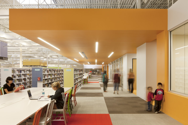
The building buzzes from top to bottom. It is centred on a vast tiered atrium inspired by the Hanging Gardens of Babylon. The interiors are bright, airy and uncluttered. Over the last five years, a series of interventions were thoughtfully integrated: a refurbished gallery, a freestanding theatre, a cultural and literary salon seating 600, enhanced spaces for quiet individual study and group work. A double-height rotunda dedicated to special collections reinterprets the romantic feel of old libraries with a distinctly modern material palette of concrete, titanium and dark wood. Each venue provides opportunities for people to meet, interact and exchange ideas.
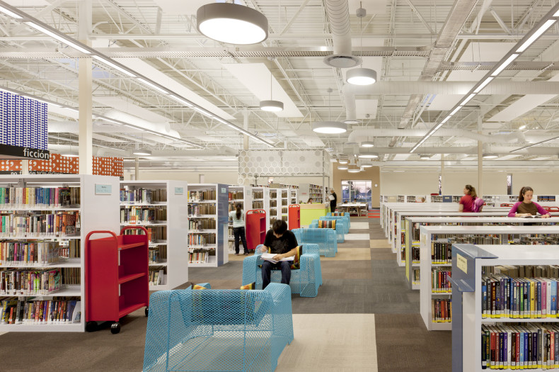
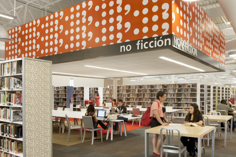
While the TRL’s role as a social gathering place grows, the written word still lies at its core, both in physical and digital form. Over four million items reside on site—novels, periodicals, films and maps. The building employs concealed mezzanines to maximize overall storage capability, amplified through the use of space-saving compact shelves. Open-plan layouts were rezoned for easier self-navigation; stacks were reconfigured to facilitate research. The library continues to explore and adopt emerging technological tools to better monitor collections and support learning and discovery.
Beyond the rows of books and computers are labs and maker spaces—means by which the TRL helps drive digital literacy through experiential learning. Access to laser cutters and audio mixers turns patrons from content consumers into creators.
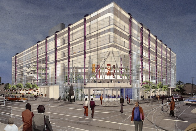
The library’s re-envisioned design recalls Raymond Moriyama’s visionary initial design concept of a glass box, which the City dropped in favour of a brick-clad volume. The revitalization provides a more open and transparent interface with the street: a reading lounge invites glimpses in, a bustling café entices passersby. The formerly dark, deep entrance now takes the dynamic form of a rotated glass cube. At night, it appears as a glowing beacon. The building reclaims its corner site, its evolving mix of paper and pixels drawing from—and contributing to—the downtown milieu.
Stephanie Calvet is a Toronto-based architect and writer.


